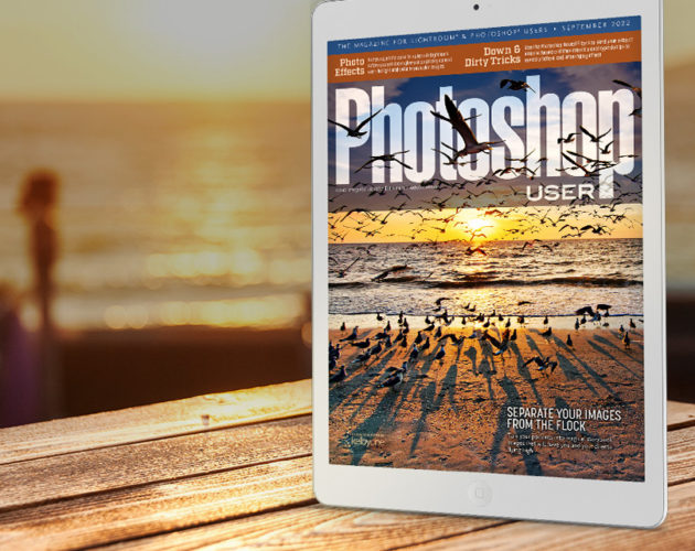
For as long as I can remember, I’ve had a passion for compositing. More than anything, I’ve enjoyed crafting composites that look like they belong on movie posters or book covers. Here are a few recent examples.

For as long as I can remember, I’ve had a passion for compositing. More than anything, I’ve enjoyed crafting composites that look like they belong on movie posters or book covers. Here are a few recent examples.
This tutorial will explain how to create a colorful dot-cutout paper text effect, by rasterizing the type layers, then creating and stroking work paths with a modified round brush. It will also explain the process of adding a couple of adjustment layers to modify the coloring of the final result.
Since Photoshop is capable of producing so many spectacular effects, it’s not often that I turn to third-party software to get the job done. I make exceptions, however, when I stumble across software as remarkable as Filter Forge. Filter Forge features over 4000 creative photo effects and almost 4500 realistic textures. The number of effects and textures is growing by the day because Filter Forge filters are created not by 10 engineers in a lab, but by thousands of users from around the globe.
In today’s lesson, we’ll examine one of the techniques that is most essential to making a composite believable – wrapping light around the subject. I’ll show you the original way of doing this as well as a new way that I stumbled upon quite by accident.
Today, Stephen Burns explains how to create tonal maps to simulate depth of field in your photographs.
Compositing wispy strands of hair is tricky business. In today’s tutorial, we’ll explore strategies for capturing and compositing models that make the process uncomplicated and fun.
This technique is written for Photoshop CS6, but can easily be accomplished in prior versions. I recently picked up a copy of the Michael Jordan biography, Driven from Within, and on p. 11 there is…
The type treatment on the cover of the ‘Best of 2012′ iPad version of Photoshop User magazine displays type that appears to be receding into the distance. The entire effect is created using a few clever layer styles and a gradient overlay. Today, I’ll show you how to produce this sweet look.