EXPRESSIVE COMPOSITE PAINTING
[This article originally appeared in the June 2022 issue of Photoshop User, the Magazine for Lightroom and Photoshop Users. To learn more about Photoshop User and to sign up to read the latest issue for free, click here.]
By Bret Malley
It’s no secret that Photoshop is simply a portal to endless creativity, expression, and just good ol’ digital fun. There are so many different ways to create and so many effects to try out, it can be as daunting as it is enjoyable. Two creative avenues of exploring Photoshop stand out as particularly fun and expressive: the act of compositing multiple images together, and the process of digital painting, making full use of the plethora of brushes and tools at our fingertips. And of course, since this is Photoshop after all, we can even combine these two styles for a fantastic mixed media effect.
When compositing, we leverage the details of our photography to tell stories and control composition. For composites to be compelling, however, seamlessness is often key, and that’s an art unto itself. On the other hand, painting in Photoshop enables us to articulate more with gesture to communicate emotion with our artistry. We can work conceptually with abstract approaches and feeling, not always stuck on the details as we are with photography.
So what happens when we combine these two very different and distinct styles? For one thing, it enables us to synthesize using the best of both worlds. While we’re able to create our own personal narratives with composites, we’re also able to infuse a deeper sense of expression and mood by working in the abstract through painting. Plus, it just looks wicked cool as a final effect.
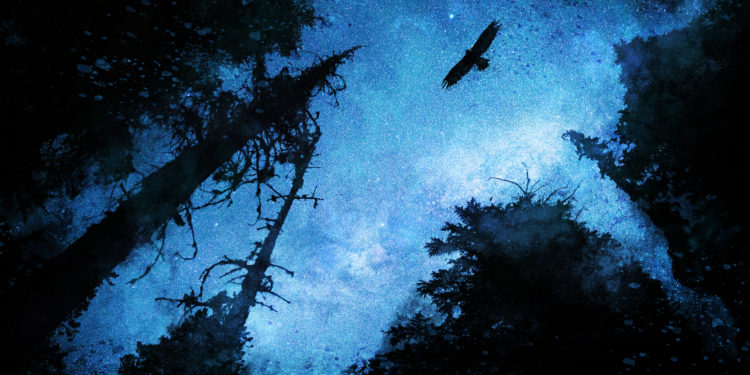
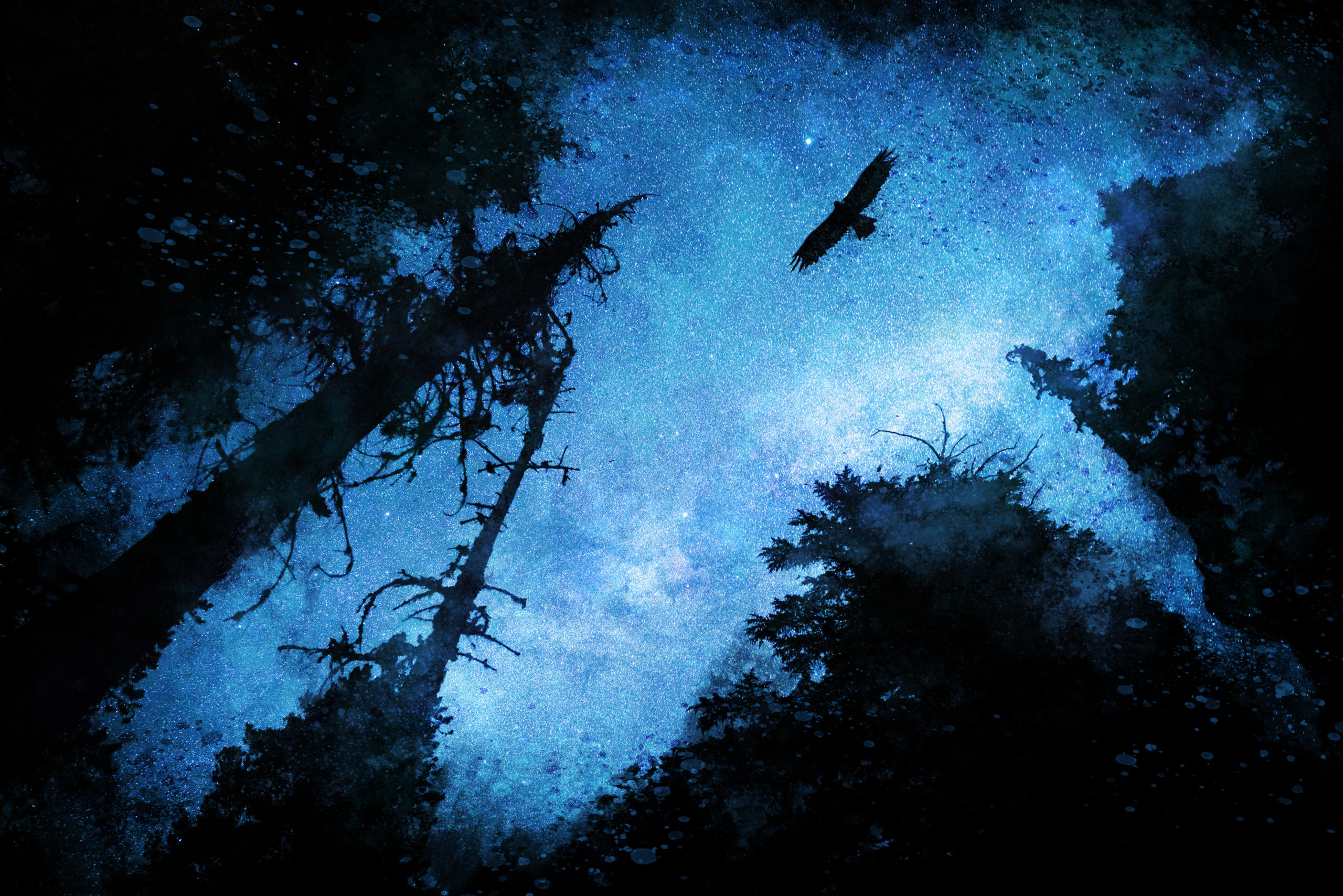
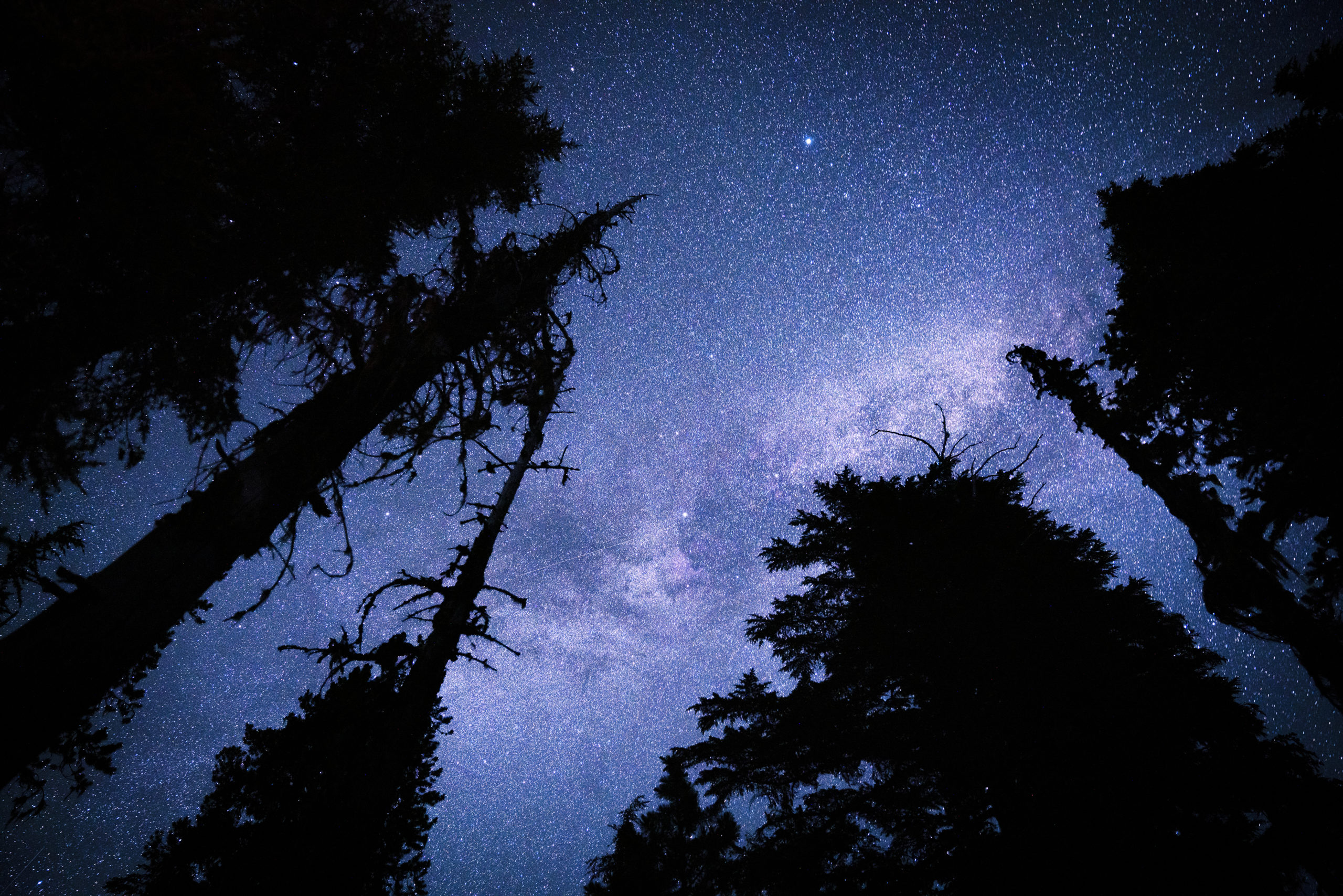
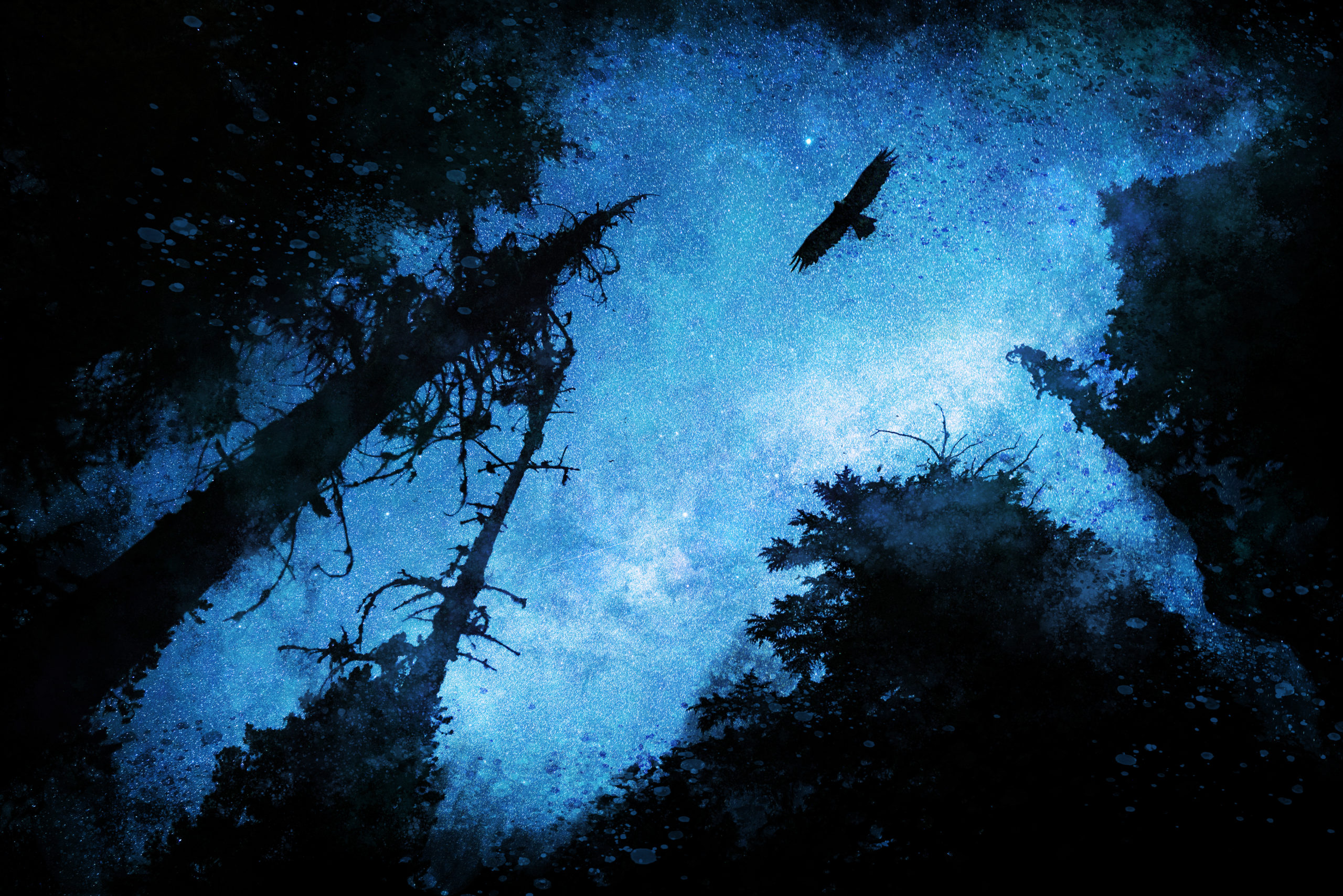
While this process can get as complex as you’d like, we’re going to keep it simple here, working with the essential steps used to create the low-key image effect shown in the image at the beginning of this article that I call, Dark Strike. Just keep in mind that the steps can be used for a variety of images, whether high- or low-key. In either case, it’s important to start with a base image that already has a spark of feeling or memory; something that tugs at the imagination or inspires.
For Dark Strike, the base shot came from a backpacking trip with my son. Deep in the wilderness of the Cascades, we could almost feel the darkness of the forest pressing in, and taking Milky Way shots was a fun (if slightly spooky) experience. Being close to water, the night was alive with all kinds of nocturnal activity, and we did have the humbling feeling of being potential prey. And while the night shots came out stunning on their own, they didn’t quite capture the immersive feeling of being there: the intensity, thrill, and fright that comes with the deep night, miles away from other humans and safety. How then to communicate these other elements and feelings? How do we communicate that story? You guessed it: composite-painting!
DOWNLOAD SETS OF KYLE’S BRUSHES
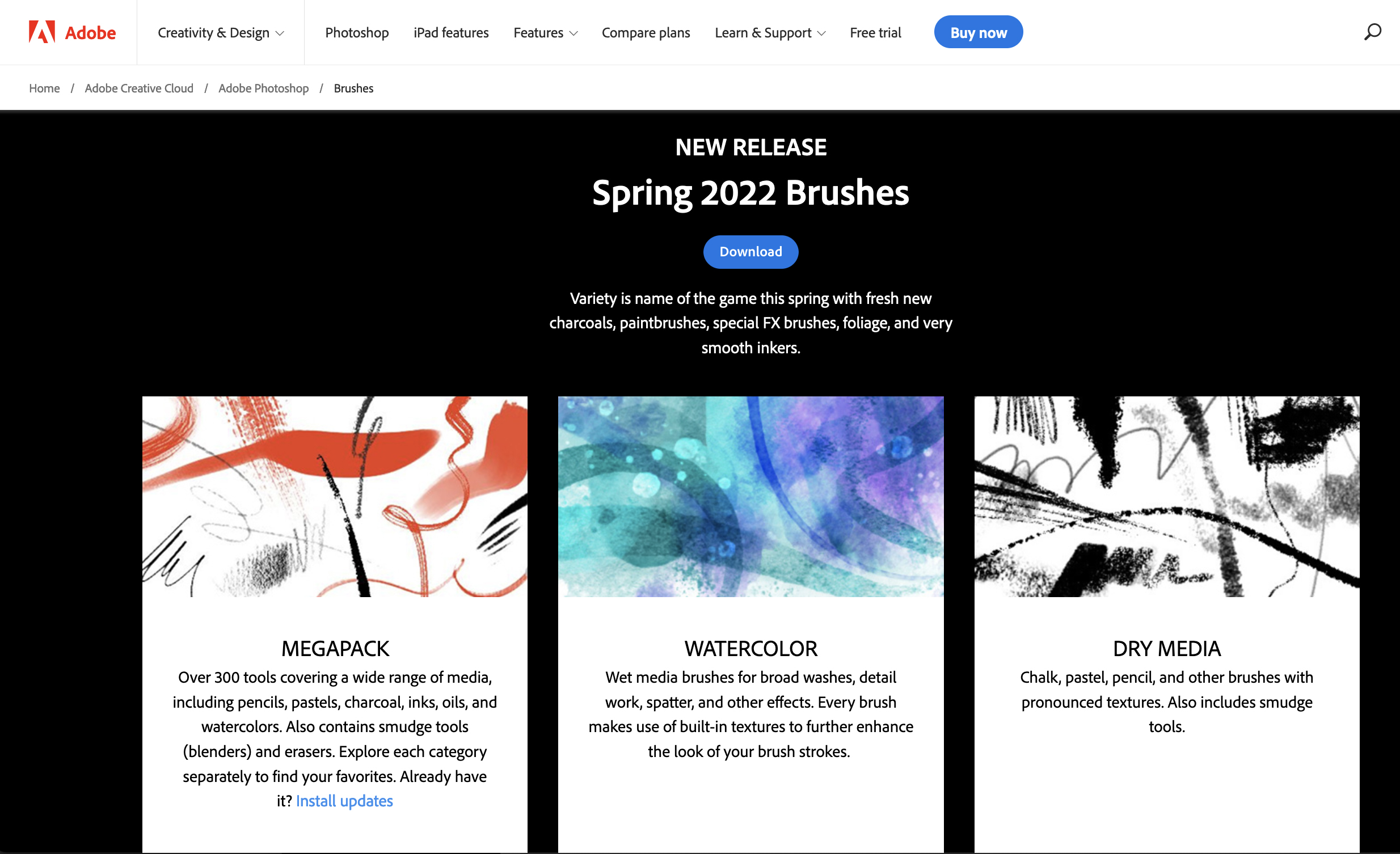
Since this tutorial is in part about painting, let’s grab some brushes for the task at hand. Specifically, we’ll want to make sure to download Kyle’s Megapack as well as his Spatter and Watercolor brushes, or any others that catch your fancy while you’re at it. If you haven’t been playing with Kyle’s brushes, you’ve definitely been missing out. Some of Kyle’s brushes are now a Photoshop default, but let’s take a look at how to download more of them.
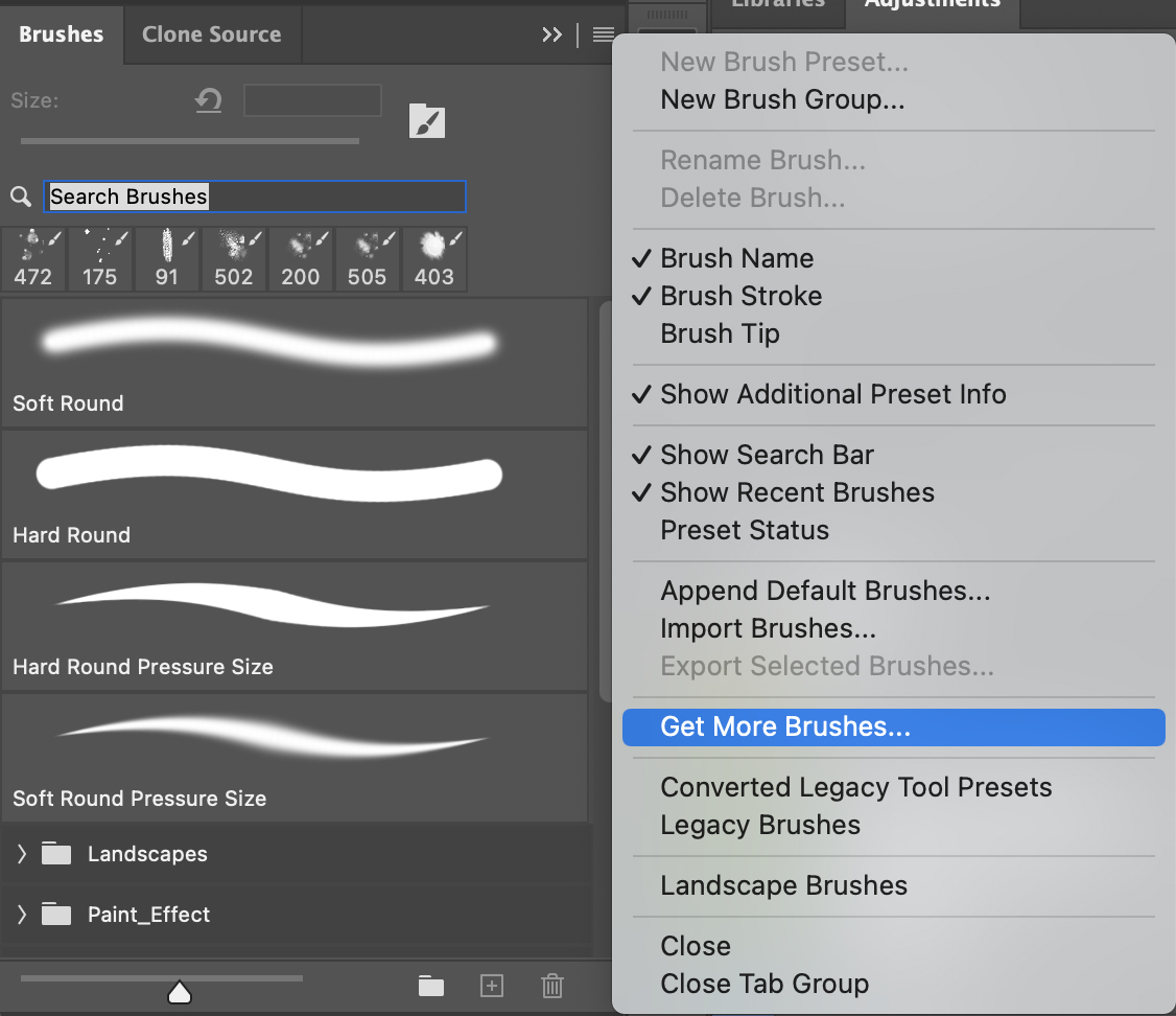
First, pull up your Brushes panel (Window>Brushes), then click the small hamburger menu at the upper-right corner. From there, select the Get More Brushes option, which will take you to the Adobe-hosted website with lots of Kyle’s brushes.
Sign in using your Creative Cloud log-in, browse the different packs of brushes, and click the Download button for any and all the packs you plan on using. Navigate to the downloaded .abr files, and double-click them to automatically install them in Photoshop. The sets will appear as folders at the bottom of the Brushes panel.
BRUSH WORK 101
So now you have lots of Kyle’s brushes. Great! Let’s see what these baddies can do now. A good place for experimentation is in a new document (Command-N, [PC: Ctrl-N]) so you can do some open sandbox play and really dig into how these brushes work. Keep in mind that some of the settings saved within a selected brush could change what tool you’ve selected, so keep an eye on your Toolbar as that can be a gotcha while painting. Some brushes are for smudging, some for painting, and some are a mixture of both effects using the Mixer Brush. In any case, these baked-in tool presets and brushes are indicated with a small tool icon next to the brushstroke preview in the Brushes panel. The example here shows the Brush tool, Mixer Brush, and Smudge tool, from top to bottom respectively.

If you have a pen stylus, take advantage of the wonderful pressure and tilt sensitivity, which you can adjust within the Brush Settings panel (Window>Brush Settings). Transfer is the property that will allow you to adjust pen pressure and opacity; however, the other sections can be helpful to play with as well, once you’re comfortable with the defaults that each brush includes.
And for those who don’t use a stylus pen, don’t worry! You’ll just need to play a bit more with Flow and brush Opacity (as well as other settings in the case of the Mixer Brush) up in the Options Bar to get the desired creative effect while painting. Speaking of which, begin painting on this blank document, trying various brushes to see how they work, making notes along the way.
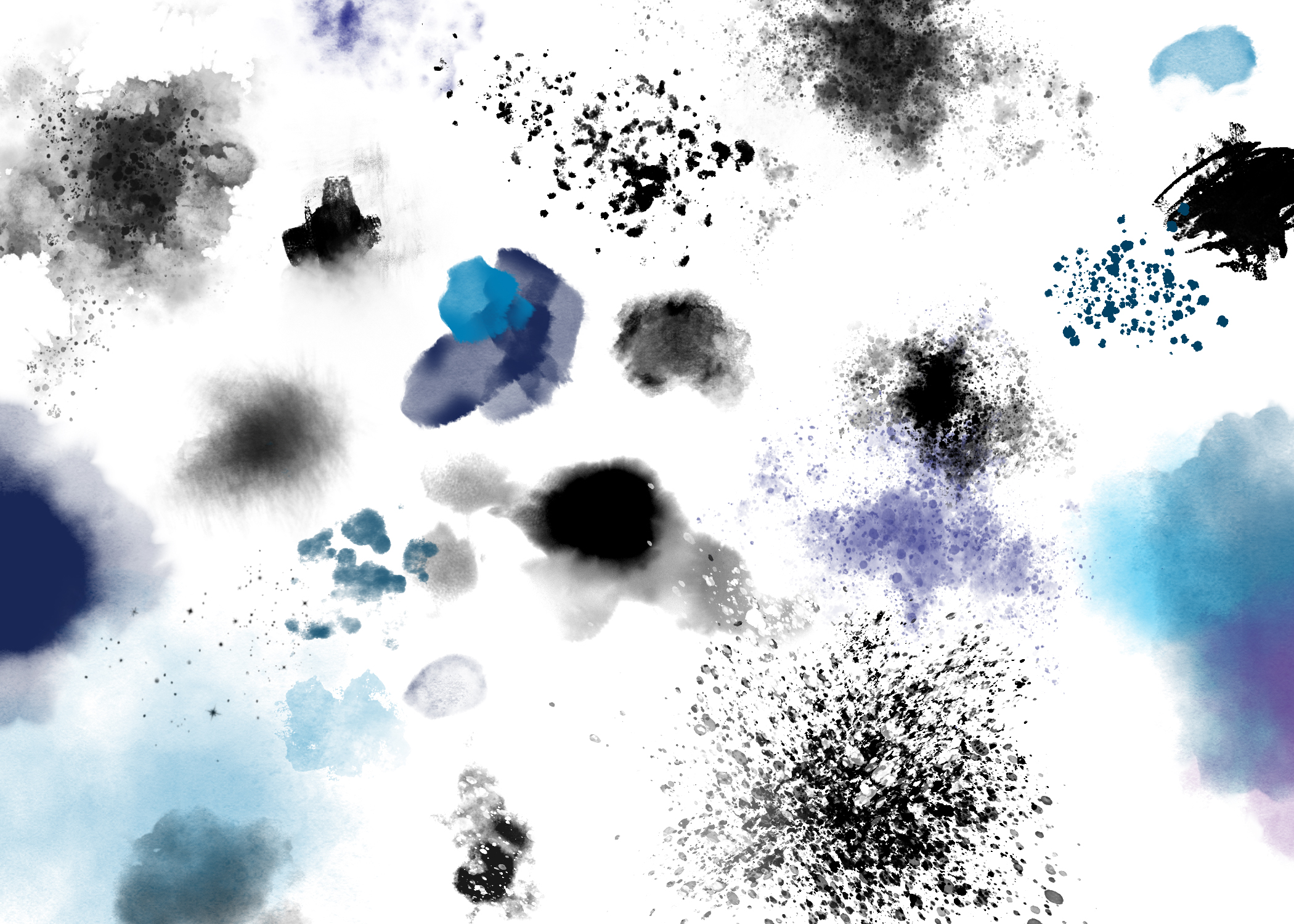
Tip: I recommend Kyle’s Spatter brushes in particular for abstract painting effects. For an especially Jackson Pollock effect for those with a stylus, try the brush called Supreme Spatter & Texture in the Paintbox folder in the Megapack folder (use the search field at the top of the Brushes panel to locate brushes quickly). By default, this brush will let you play with pen-tilt for elongating the spatter effect in the tilt direction of your pen, as if you threw paint at the canvas from an angle. This is great for adding energy and motion to an image, working with the visuals and composition. For the other brushes without this default, check out the options for Shape Dynamics in the Brush Settings panel.
Gear Recommendation: For those who are interested, I’m using Xencelabs latest pen stylus and it’s simply a joy to use it to create. The pens are well made like Wacom, only with some nice improvements and options, so I’d consider them if you’re in the market for a new tablet.
Tip: Once you find some brushes you especially like, it’s a good idea to make copies and place these copies in a new brush folder for organization and sanity’s sake. This helps tremendously with efficiency as your list of brushes becomes unwieldy with every additional pack installation. Just like with layers, it’s best to stay organized as you go. Start by selecting the brush you wish to copy, and then click the Create New Brush icon (the small plus symbol) at the bottom of the Brushes panel where you’ll find the Create a New Group icon (folder) as well. Give the “new” brush a name, and click OK. Then move the copied brush into the folder of your choice.
COMPOSE AND COMPOSITE
At this point you’ve hopefully played around abstractly with the brushes in a separate document, perhaps made some notes or collected brushes into a group folder, and have an initial sense for mood generated by these painterly effects. With these brushes at the ready, let’s first switch mediums and talk about compositing before we make a mess. For this part, we’re going to imagine and build the narrative elements, the various photo pieces needed to communicate an idea, feeling, or story.
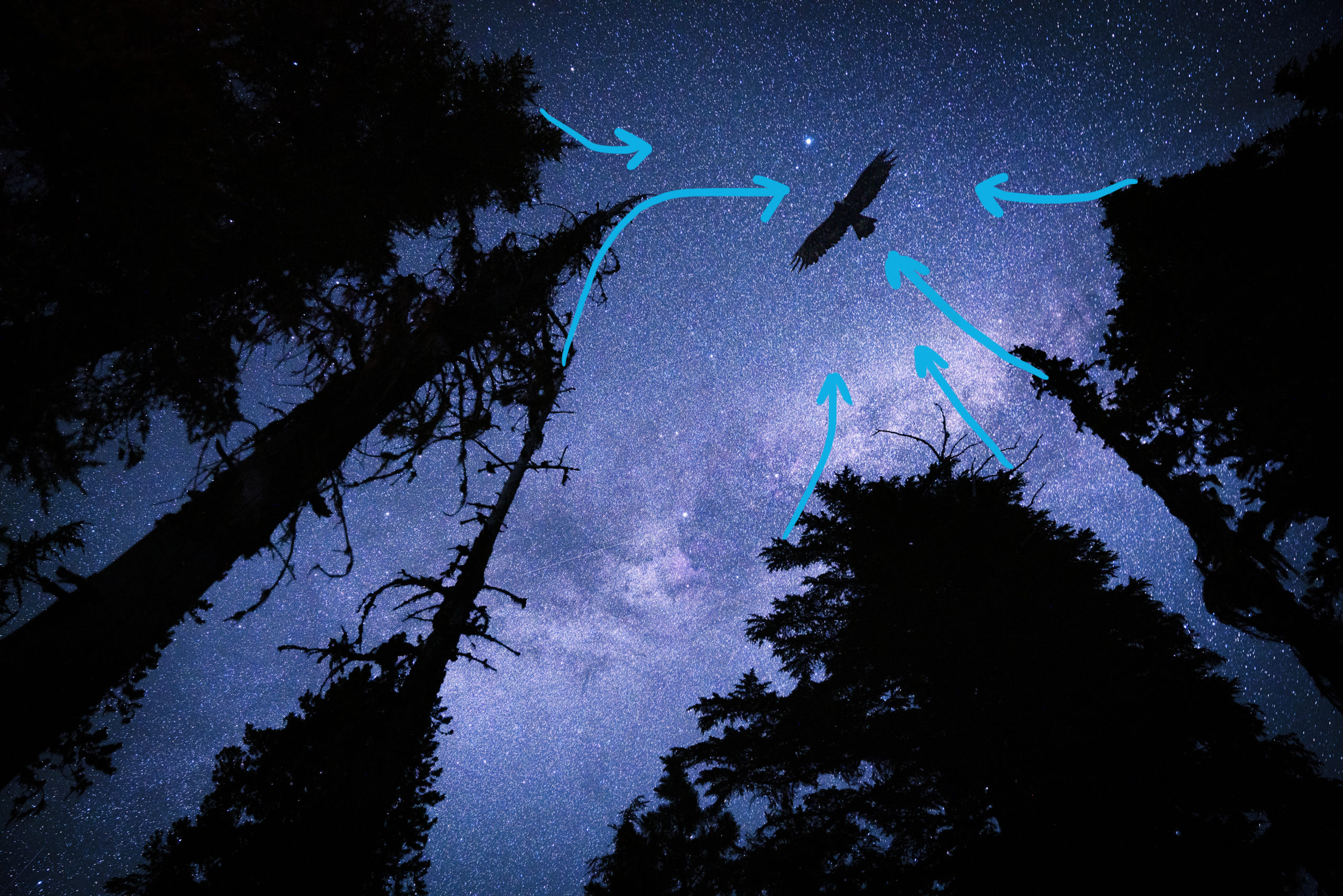
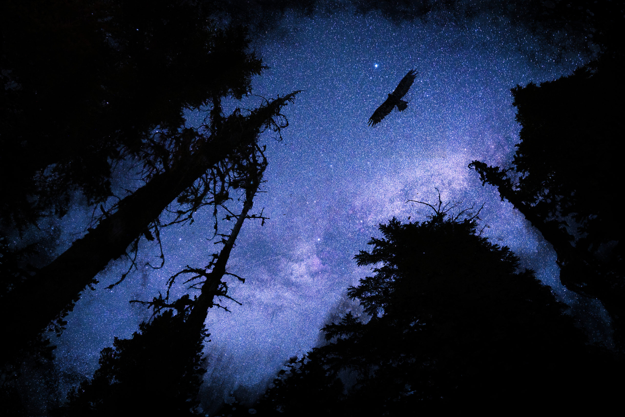
In the case of Dark Strike, the central idea was the feeling of being almost like prey out in the wilderness, and having the darkness be all-encompassing and mysterious—ominous even. While the Milky Way and the silhouetted trees were a great start, it needed to go further. No longer having to adhere to what would literally be possible to shoot at night (or not), compositing opens the door for much more artistic license and creativity. Years ago I took a picture of a golden eagle in the Swiss Alps, and while not a night predator like an owl, it had the right feeling of menace, wildness, and hunting for which I was going.
Working with the composition and implied lines from the trees, there was already a central place of compositional focus to place this predatory addition. For your own image, find the elements that help communicate the story and composite them in. Take a look at my KelbyOne courses on compositing for the process and techniques for selecting and masking, and how to work with imaginative narratives.
MASKING
Masking is the keystone that connects the painting and compositing for this effect. There are two ways of doing this: either by starting with a black layer mask, then painting back in your composite stroke by stroke with the desired brushes set to white, or starting with the default white mask and painting out elements of the composite using black. In either case, here are the steps for the masking and painting process.
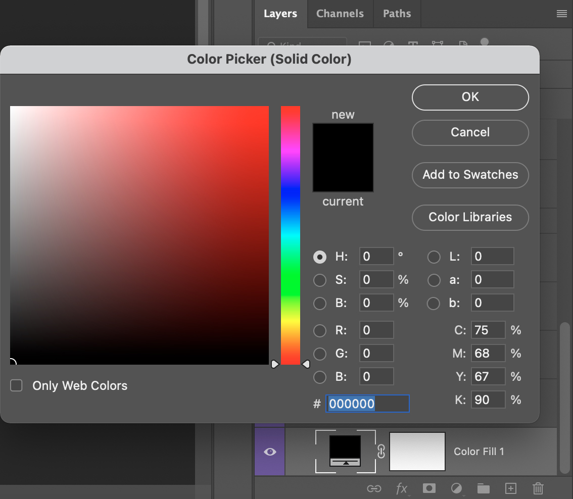
STEP ONE: Create a new Solid Color fill layer with your color of choice, and place this at the very bottom of the layer stack above the Background layer. You can create a new Solid Color fill layer by either going to Layer>New Fill Layer>Solid Color, or you can select Solid Color from the Create New Fill Layer icon (half-black/half-white circle) at the bottom of the Layers panel. Select your color in the Color Picker, and click OK.
Tip: As an alternative to a Solid Color fill layer, try grabbing a stock paper or canvas texture image, and place this as the bottommost layer. This can also work well with blending modes above a base layer, or even on top of everything altogether.
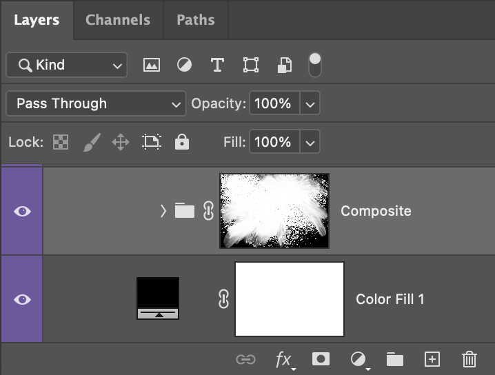
STEP TWO: Shift-click to select all the pieces of your composite in the Layers panel (don’t include the Color Fill layer we just added), and place these layers in a new group folder (Command-G [PC: Ctrl-G]). This will allow you to use one mask for blending your composite with the Color Fill layer; though this can be done for each element respectively.
STEP THREE: With the layer group active, click the Add Layer Mask icon (circle in a square) at the bottom of the Layers panel. For those looking to paint in their composite stroke by stroke, start with a completely black layer mask by Option-clicking (PC: Alt-clicking) the Add Layer Mask icon. This will initiate an inverted mask for the group (an all-black mask that nondestructively hides the entire composite).
STEP FOUR: At last, press B for the Brush tool and go find your desired brushes in the Brushes panel. Begin painting on the mask with black (to nondestructively erase) and white (to paint the composite back into existence) to blend your composite with the Color Fill layer below. Go wild and experiment! Try different variations of this mask until you find a combination that suits the image. Note: Some of Kyle’s brushes have a blend Mode other than Normal in the Options Bar so, depending on where you’re painting on the mask and what color you’re using, it may not affect the mask.
Tip: Pressing D on the keyboard will make your colors jump to pure white and solid black (always a good idea when masking), and using the shortcut X will allow you to seamlessly go back and forth between white and black, revealing and concealing respectively. You can also double mask by placing the composite group folder inside another group folder and then adding a mask to that group. This gives you two separate masks for a combined effect.
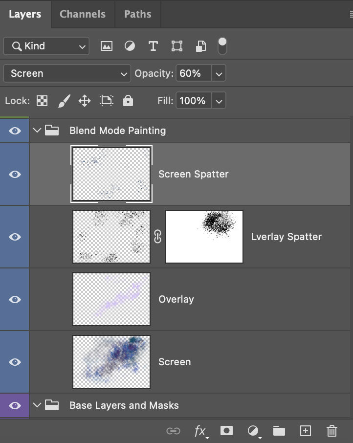
BLEND MODES
While painting on masks can have a great visual effect, the mixed media feel really comes from painting on new layers with different blending modes. For Dark Strike, the Milky Way shot is nice to have as a base image; however, a more dramatic painterly effect and lighter blue can really bring out the drama and dreaminess of the sky. This same effect can be done with all kinds of images, so here’s the trick to it, though you’ll have to experiment as you go.
STEP ONE: Create a new layer and place this above the composite folder.
STEP TWO: Choose a brush as an effect, and paint using a low Flow (or pen pressure turned on) in the Options Bar with either black, white, or something with an intentional color cast to it.
STEP THREE: Now experiment with blending modes! With the painting layer active, click on the word “Normal” near the top of the Layers panel to open the blend mode drop-down menu. Then hover your cursor over the various blend modes to get a preview of their effect on the image.
STEP FOUR: After finding one that works with the image and your concept, it may be too strong an effect, so play with the layer’s Opacity slider to taste. From there, repeat as needed, experimenting with the paint color, brush selection, and blending modes.
ADJUSTMENT LAYERS
Like blending modes, painting in various adjustments is another way to add more control and expression into the image. Specifically, adjustment layers such as Curves (see my KelbyOne class on Curves for the full demonstration of what can be done here), as well as Hue/Saturation, can help bring the image away from pictorial accuracy, and more toward the feeling of the image.
You can find adjustment layers by going to Layer>New Adjustment Layer, or clicking the Create New Adjustment Layer icon (half-black/half-white circle) at the bottom of the Layers panel. Whatever the adjustment, first make the desired alterations to the entire image in the Properties panel (Window>Properties), invert the white mask to black (press Command-I [PC: Ctrl-I]) to hide the entire effect, and then paint with white just where you’d like the effect to be applied.
There are many more things you can add to this creative process, but this is a great start for this effect! Just know that every image will be completely different from the next; some will work wondrously with a particular blending mode or paint splatter, and others may call for a contrasting approach. In any case, have digital courage and see what happy accidents await you!
About Photoshop User and KelbyOne
Photoshop User magazine comes out digitally 12 times a year and is part of KelbyOne, the leading educational resource for Photoshop, Lightroom, and photography. Pro members have access to more than 900 video courses and 100 back issues of Photoshop User. To learn more about KelbyOne, click here.