[This article originally appeared in the July 2022 issue of Photoshop User, the Magazine for Lightroom and Photoshop Users. To learn more about Photoshop User and to sign up to read the latest issue for free, click here.]
By Corey Barker
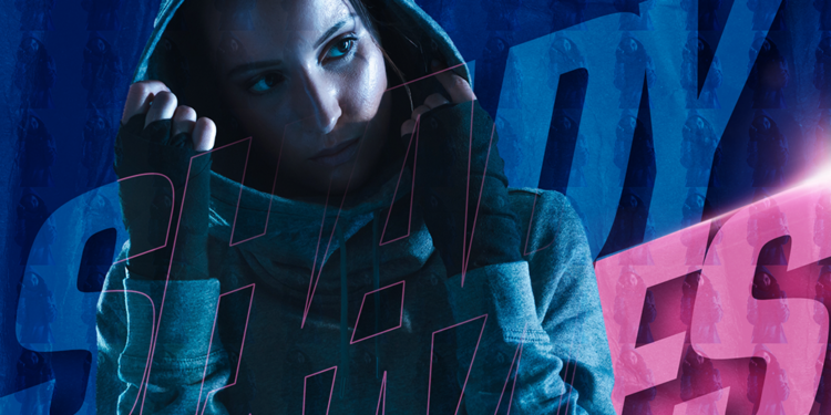
I was inspired by some sports images I saw recently and wanted to share some cool tricks for blending text and images in ways that enhance the design, while maintaining readability. You can use these tricks in a variety of ways, either combined, as we’re going to do here, or individually, to add a little something extra to any project. You can follow along by downloading the images, which (as of this writing) are totally free on Adobe Stock. I have also provided a free flare brush for you to download for the finishing part.
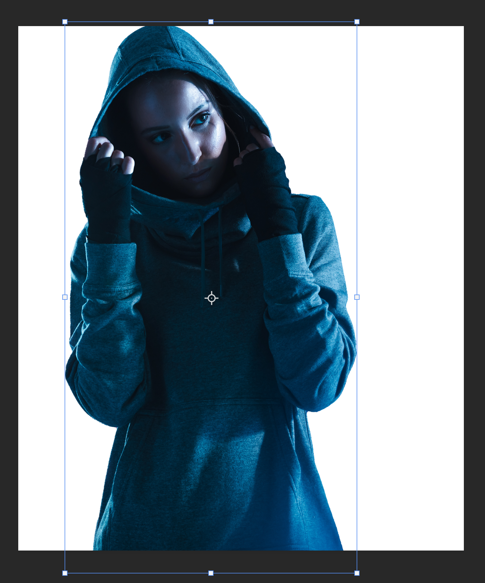
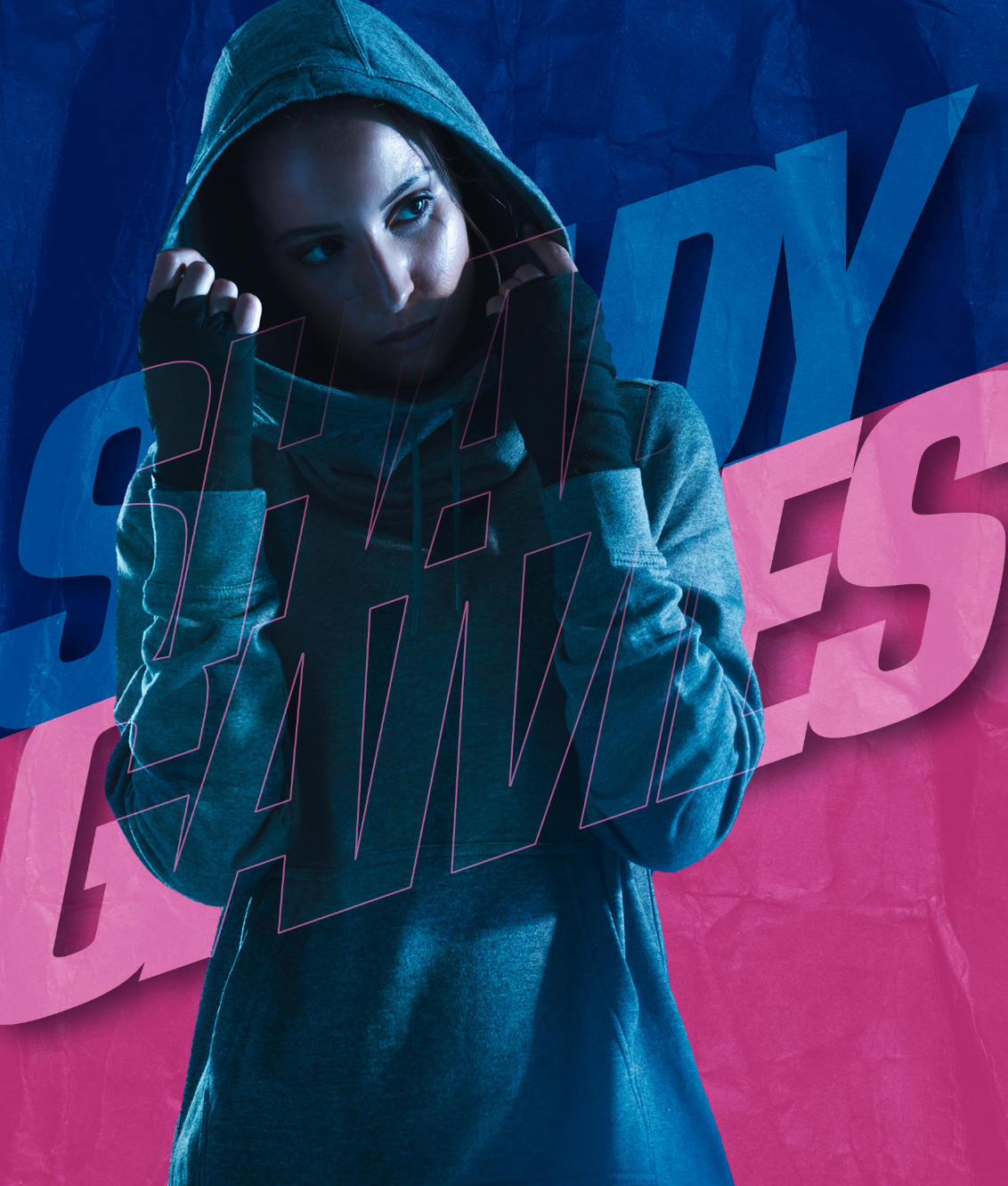
STEP ONE: Start with a subject you can easily extract from the background. As I mentioned, this one is free from Adobe Stock. They have quite a few free images that are worth checking out. I liked this one because of the mysterious subject and background colors, but we’ll use those colors in a different way.
If you’d like to download this image to follow along, click this link, log in with your Adobe ID, and click the License for Free button. This will download the image to your computer as well as add it to your Libraries panel (Window>Libraries). Double-click the image in the Libraries panel to open it in Photoshop.
Start by selecting the subject by going under the Select menu and choosing Subject.
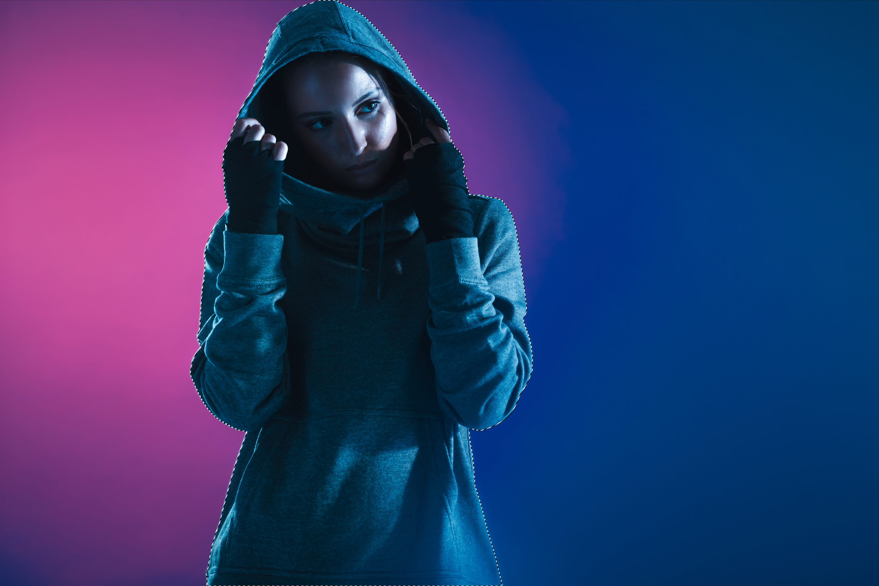
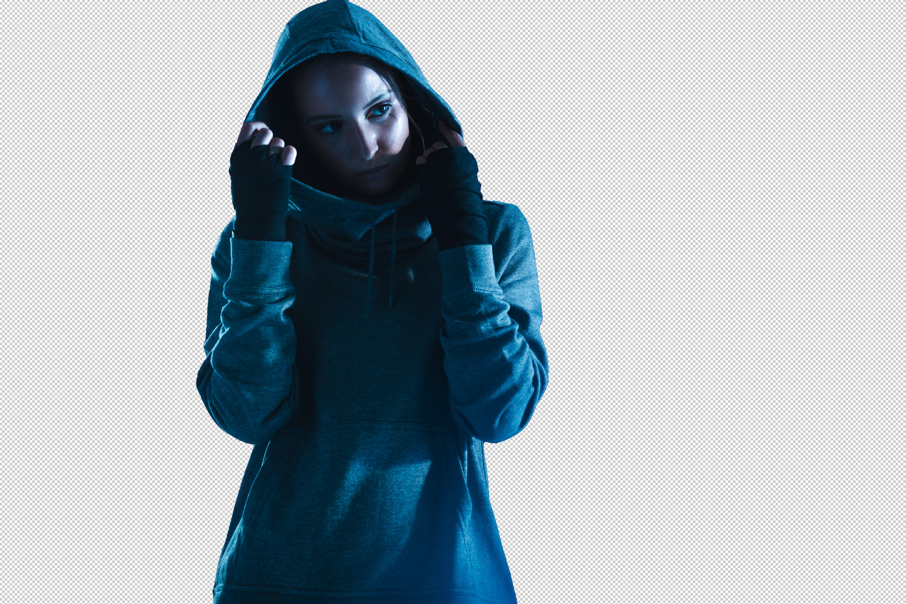
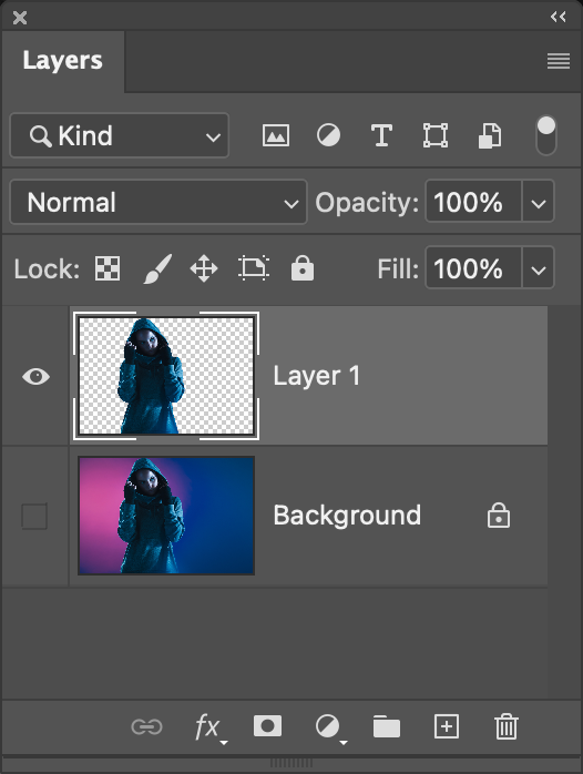
STEP TWO: Normally, this is where I would use Select and Mask but seeing as the subject has pretty defined edges, this isn’t necessary. You can always go into the Select and Mask workspace (Select>Select and Mask) to check the selection, and then just cancel if no adjusting is needed. Either way, once the selection is made, press Command-J (PC: Ctrl-J) to copy the subject to a new layer.
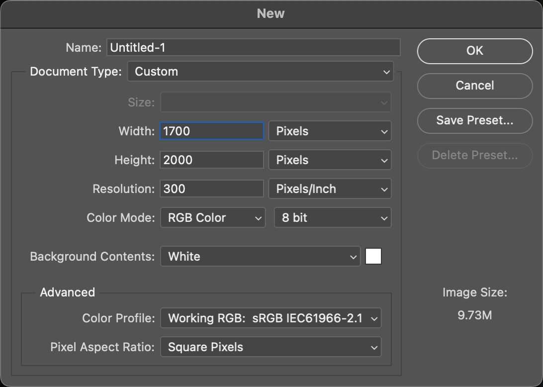
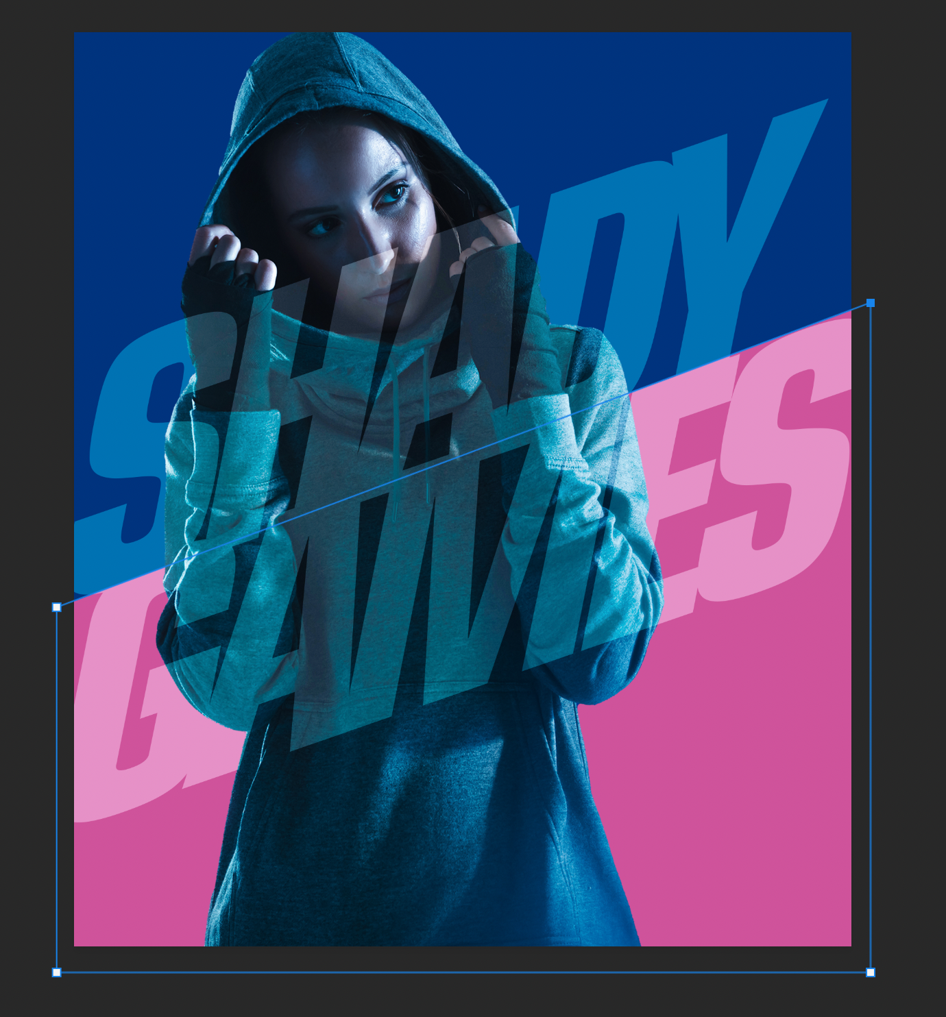
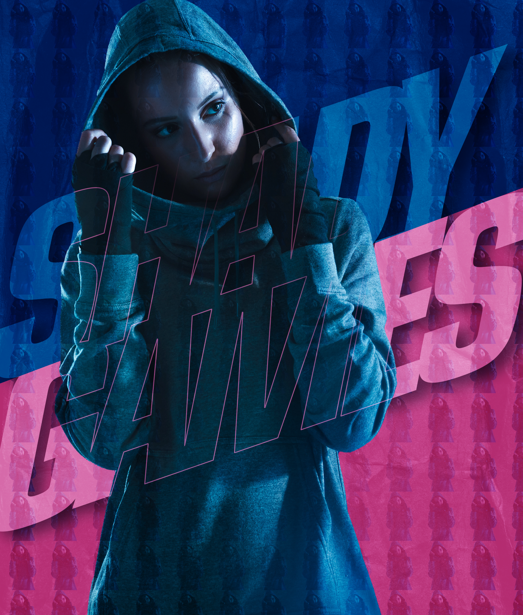
STEP THREE: Now go under the File menu and choose New to create a new canvas, where we’ll construct the design. Set this up a bit wider than poster format: Width 1700 pixels, Height 2000 pixels, and Resolution 300 ppi. Click OK or Create.
STEP FOUR: Go back to the extracted subject image and and use the Move tool (V) to drag the subject into the new canvas. Use Free Transform (Command-T [PC: Ctrl-T]) to scale the subject into the composition as shown here. (Tip: Press Command-0 [PC: Ctrl-0] to zoom out and reveal the Free Transform control handles.) Press Enter to commit the transformation.
Activate Free Transform again, unlink the Width and Height fields in the Options Bar, and reduce the subject’s width 10% by setting the Width field to 90%. This is a subtle way to show more of the background without greatly distorting the subject. Press Enter again.
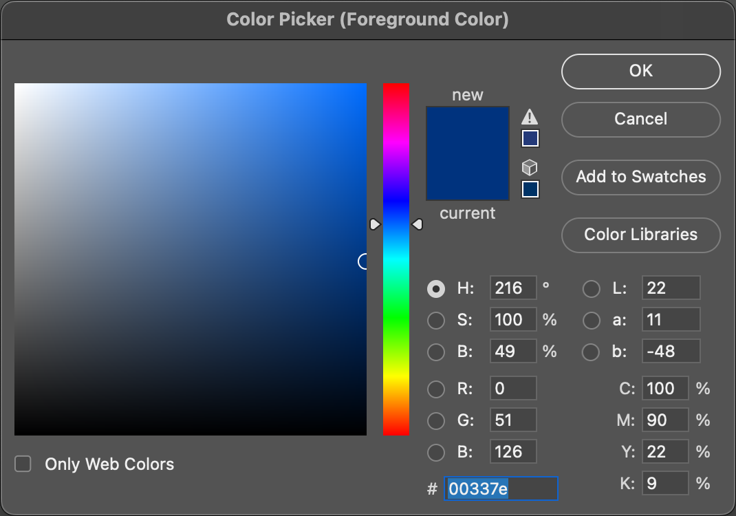
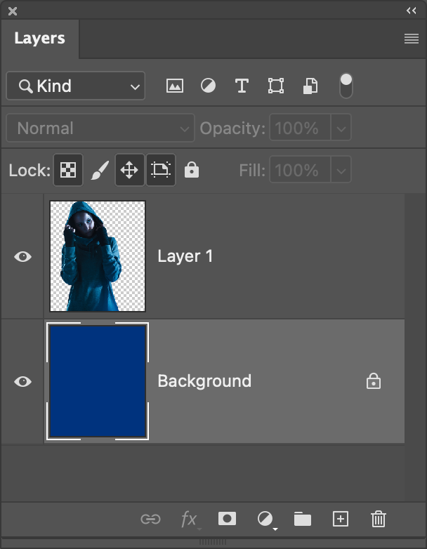
STEP FIVE: In the Layers panel, select the Background layer. Click on the Foreground color swatch near the bottom of the Toolbar to open the Color Picker, and select a blue color (#00337e) like we have here. Click OK, when done, and press Option-Delete (PC: Alt-Backspace) to fill the Background layer with blue.

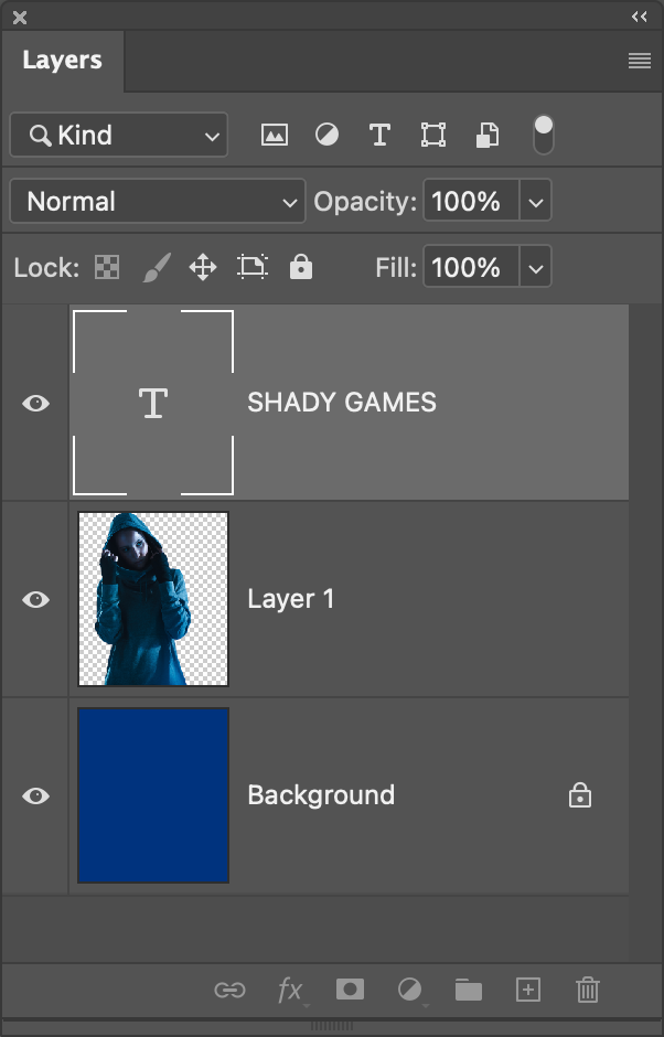
STEP SIX: With the basic backdrop and subject in place, now would be a good time to save your work. Then let’s start adding the text. Press D then X to set the Foreground color to white, and select the Type tool (T) in the Toolbar. Here we’re using a font from Adobe Fonts called Eurostile Condensed Heavy Italic. To activate an Adobe Font, go to Type>More from Adobe Fonts, log in with your Adobe ID, search for the font you want, and then click its Activate Font switch to sync it with Photoshop.
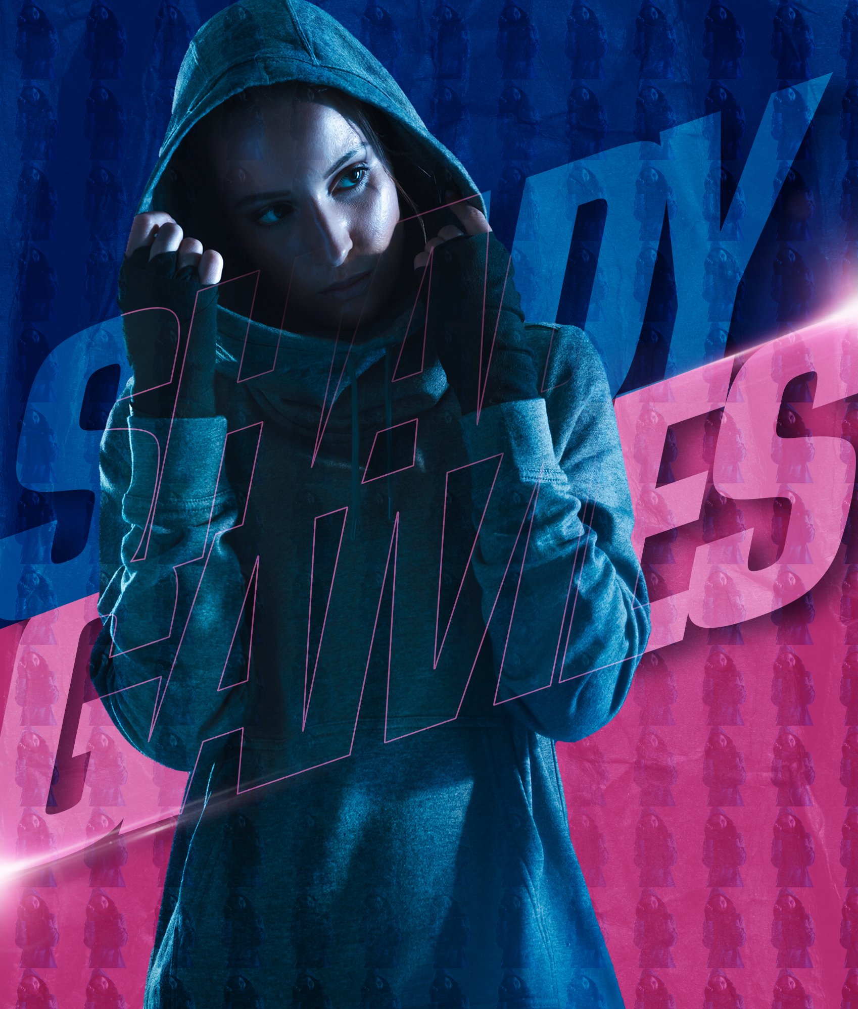
Back in Photoshop, click on the canvas to set a text object, which automatically creates a new text layer in the Layers panel, and then select your font up in the Options Bar. Type the title “SHADY GAMES” on two lines. We’ll scale the overall text in a moment, but for now make sure it’s big enough so you can see the text and edit it. Also, make sure the text layer is at the top of the layer stack in the Layers panel.

STEP SEVEN: We need to adjust the text formatting a little, so start by highlighting all the text. You can do this quickly by double-clicking the text layer’s thumbnail in the Layers panel. Once highlighted, hold down the Option (PC: Alt) key and tap the Left Arrow a few times to close the space between the letters (tracking), even letting them overlap a little.
Also tap the Up Arrow while holding down the Option (PC: Alt) key to close the gap (leading) between the two lines of text; let this overlap a little as well. Click the checkmark in the Options Bar to commit the type changes.

STEP EIGHT: Now let’s scale the text. Press Command-T (PC: Ctrl-T) to activate Free Transform once more. Right-click inside the bounding box and choose Skew. Once again, hold down the Option (PC: Alt) key, grab the middle control handle on the right side of the box, and drag it up as shown here. While the text was already italicized, this adds to that by making the overall angle much more dramatic. Don’t press Enter yet.
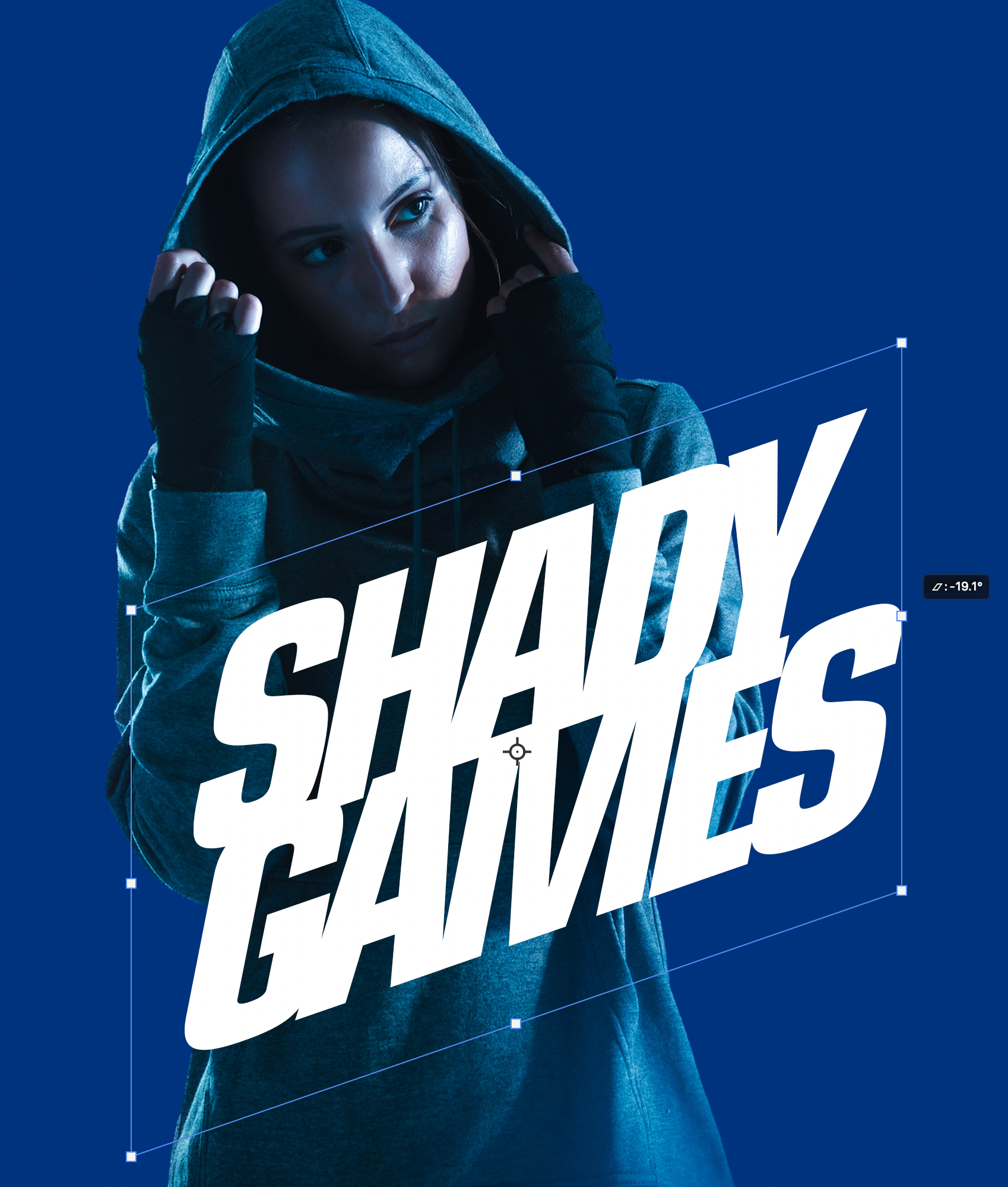
STEP NINE: Once the text is skewed, drag it to the center of the document. Right-click once more and choose Scale from the menu. Hold down Shift-Option (PC: Shift-Alt) and drag a corner point to scale the text object until it just starts to extend beyond the edges of the canvas. Now you can press Enter.
STEP 10: Change the text layer’s blend mode to Soft Light near the top left of the Layers panel.


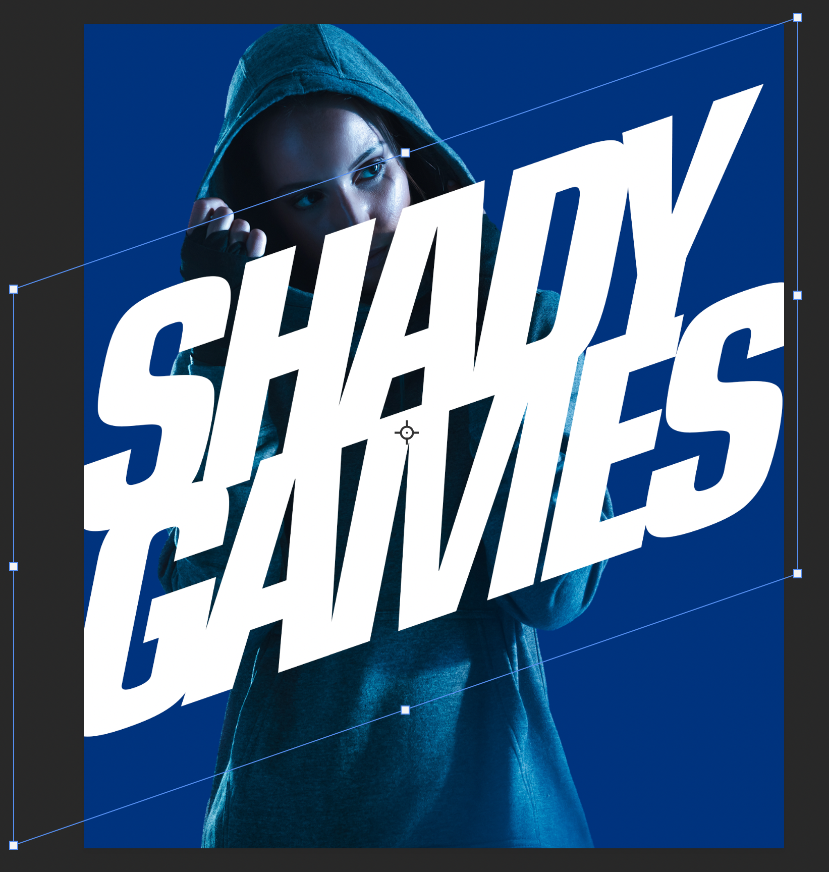
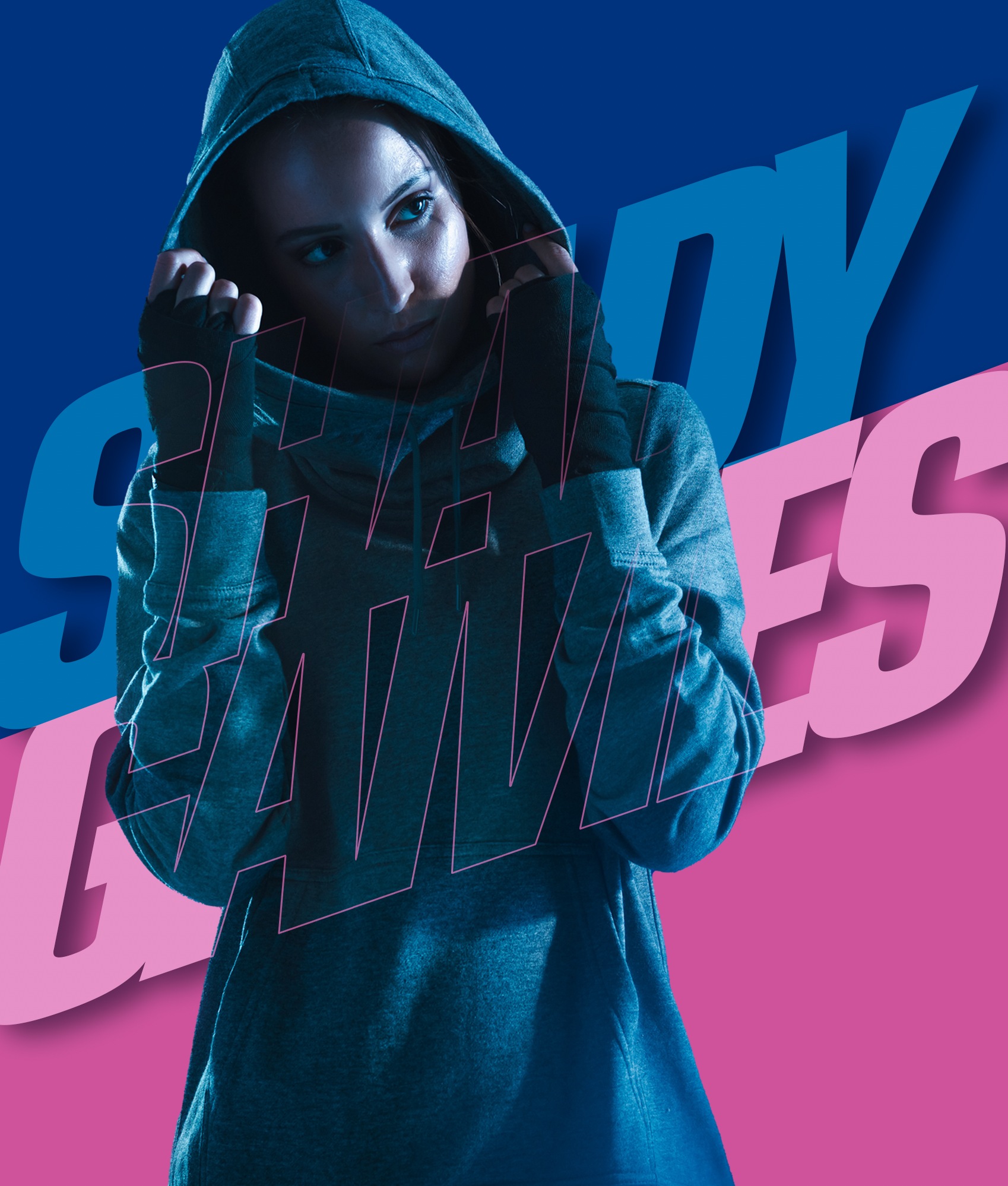
STEP 11: Click on the blue Background layer in the Layers panel to make it active, and then go to the Toolbar and choose the Rectangle tool (U). Make sure the Tool Mode is set to Shape in the Options Bar. Open the Color Picker by clicking the Foreground swatch in the Toolbar, and choose a pinkish color (#cf539b) close to the one in the original image. Draw a rectangle over the lower two thirds of the canvas.

STEP 12: Select the Direct Selection tool (the white arrow nested with the Path Selection tool [A] in the Toolbar) and use it to individually move the top control points so the top of the pink shape is at the same angle as the text to create a separation between the two words. When Photoshop warns you that it needs to turn the live shape into a path, click Yes.
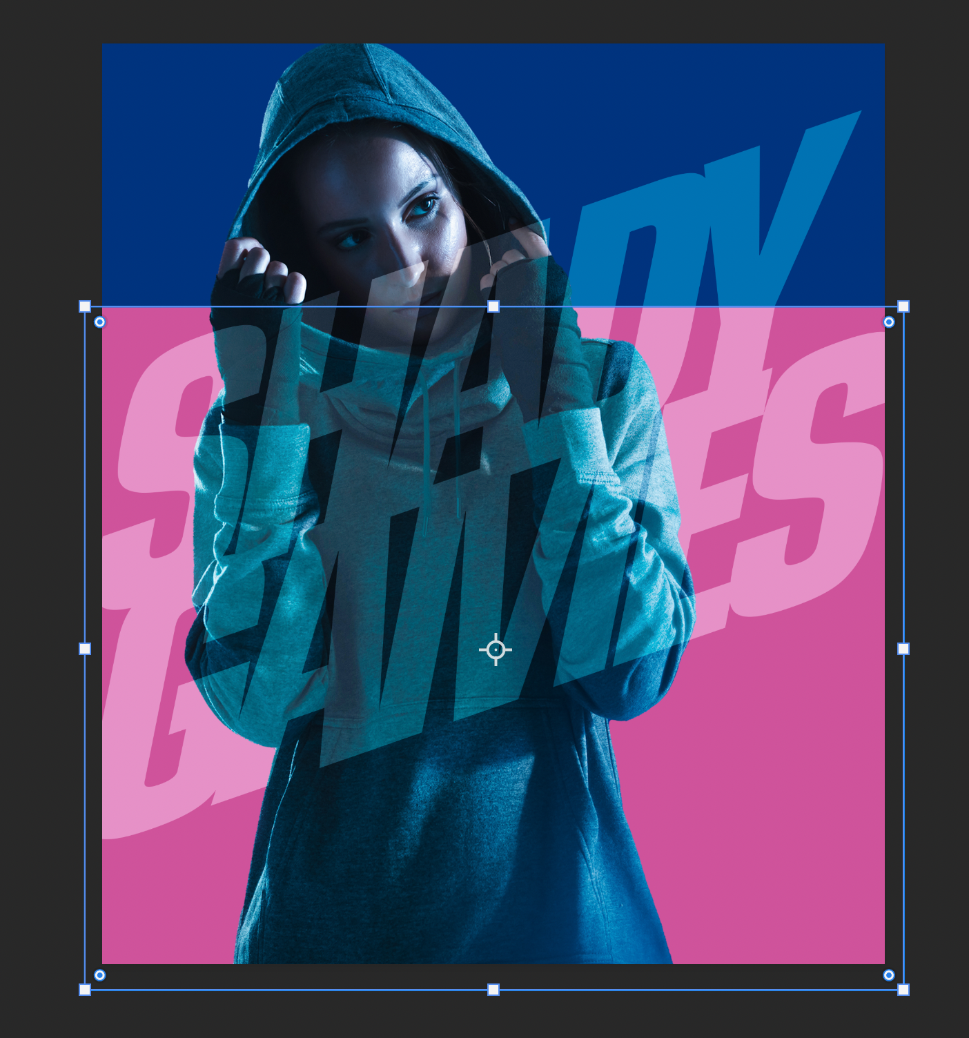
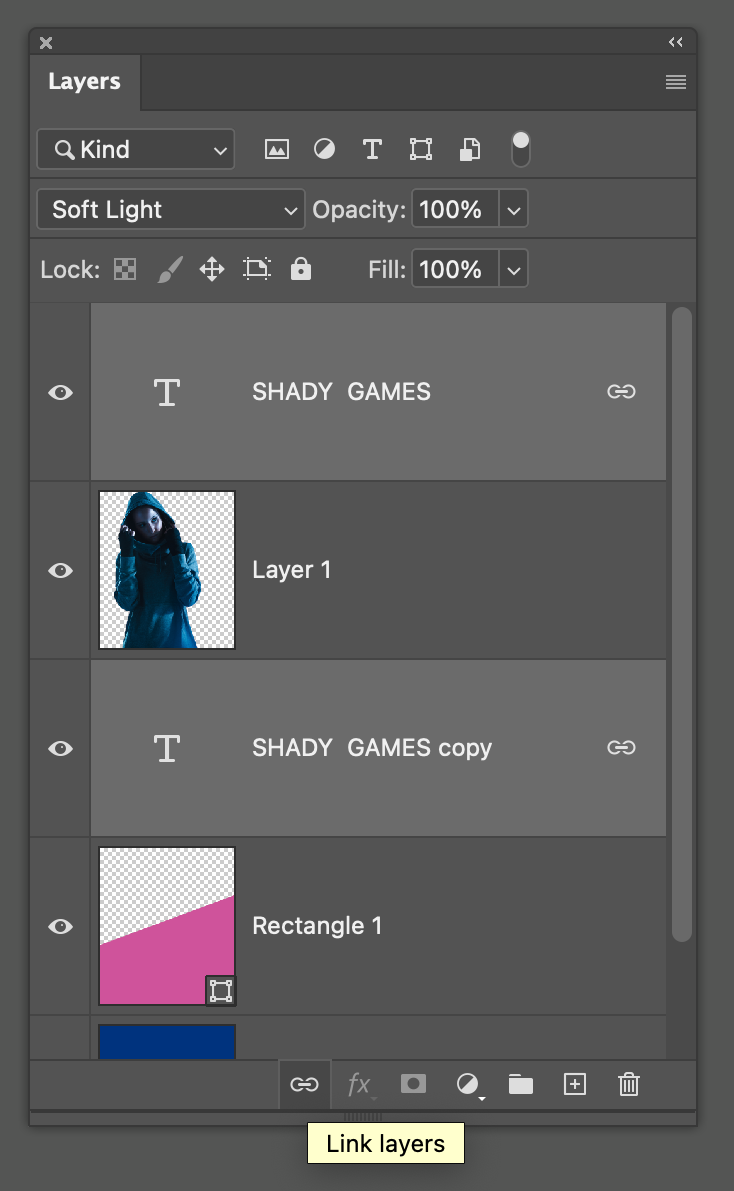
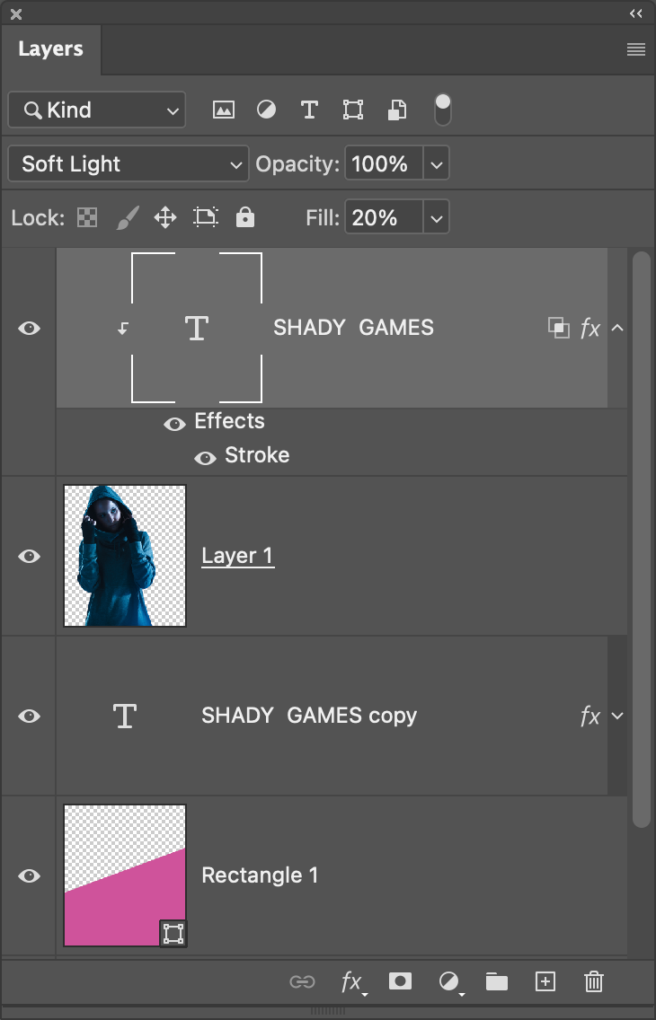
STEP 13: Click on the text layer at the top of the layer stack in the Layers panel and make a duplicate by pressing Command-J (PC: Ctrl-J). Then place the duplicate text layer below the subject layer in the layer stack. Command-click (PC: Ctrl-click) on the other text layer in the Layers panel so they’re both selected, and click the Link Layers icon (chain link) at the bottom of the Layers panel to link the two layers together. That way, if you move one layer, the other moves with it.
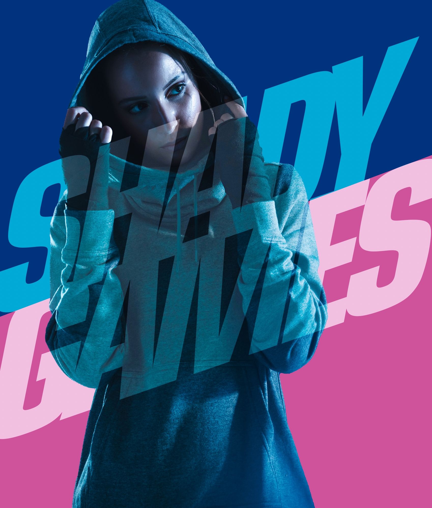
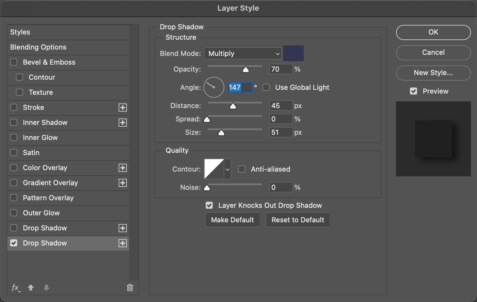
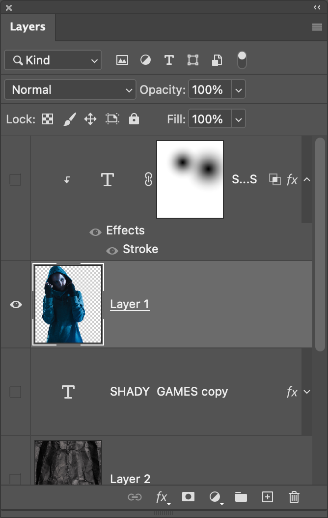
STEP 14: Click on the text layer below the subject layer in the Layers panel, click the Add a Layer Style icon (fx) at the bottom of the Layers panel, and choose Drop Shadow. Instead of the normal black shadow, change the color to a dark blue (#333553). Use the settings shown here to get a soft shadow effect to create some depth and separation between the text and background. Be sure to turn off Use Global Light. Click OK when done.

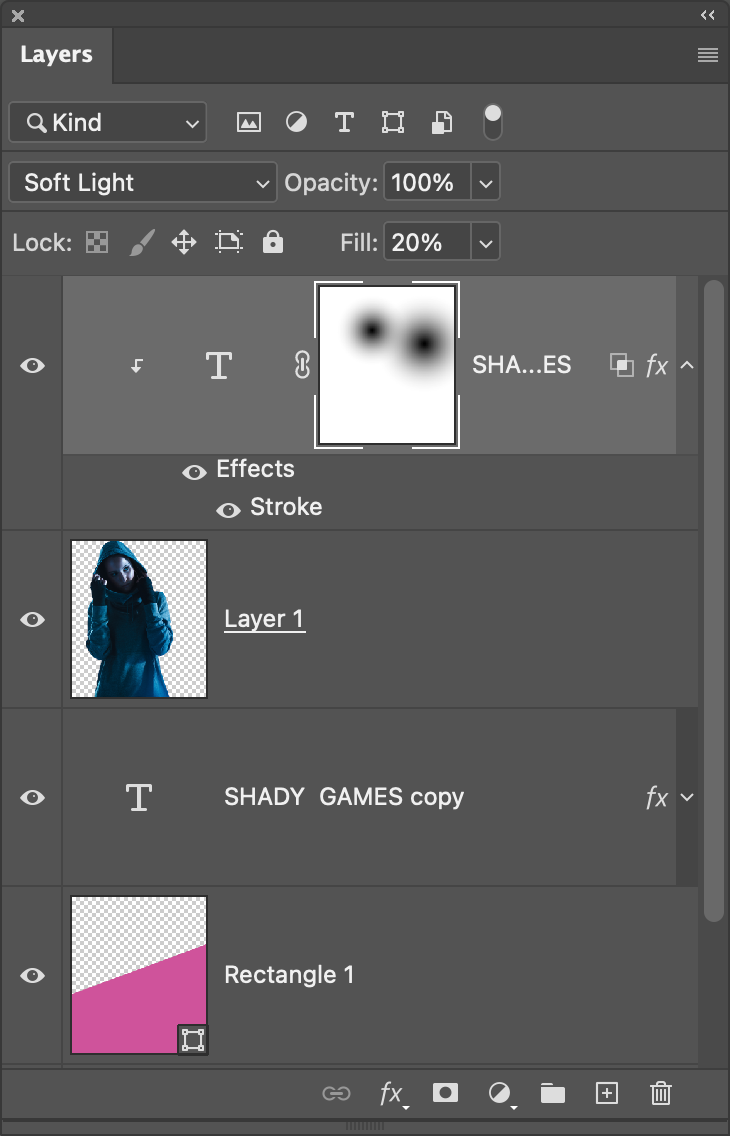
STEP 15: Select the top text layer, then click the Add a Layer Style icon again and choose Stroke this time. Set the Size to 3 px and the Position to Center. Click the Color swatch below and set it to the same pink color we used in Step 12. Finally, set the Blend Mode to Screen and lower the Opacity to 80%. Don’t click OK yet.

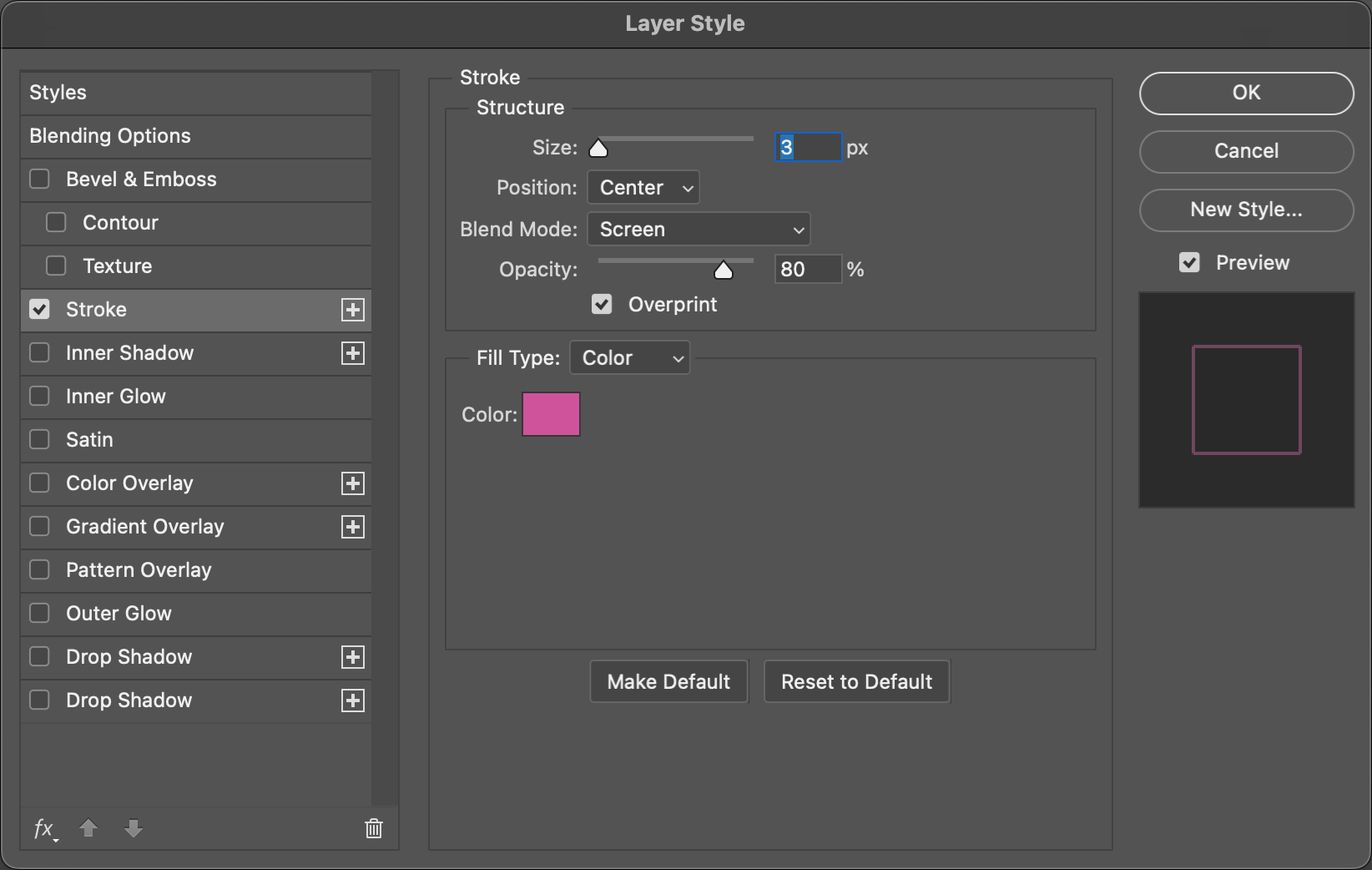
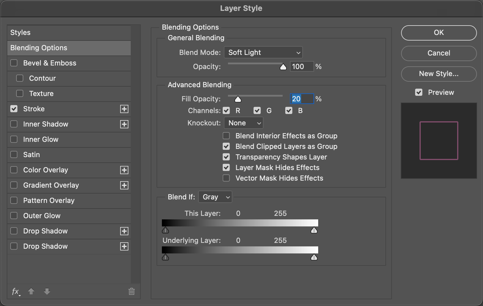
In the Layer Style dialog, go to the Blending Options section next. Set the Blend Mode here to Soft Light, and then under Advanced Blending, set the Fill Opacity to 20%. Also check on Layer Mask Hides Effects. Click OK when done.
STEP 16: To isolate the stroked text layer to just the area of the subject, simply press Option-Command-G (PC: Alt-Ctrl-G) to create a clipping group. This means the top text layer can only be seen in areas where there are pixels in the layer below, which is the subject. So if you were to move the text around, the stroke effect will always remain in the subject area.
STEP 17: Add a layer mask to the text layer by clicking the Add Layer Mask icon (circle in a square) at the bottom of the Layers panel. Grab the Gradient tool (G), click on the gradient strip in the Options Bar, and choose the Foreground to Transparent preset in the Basics set. Click OK to close the Gradient Editor. Select the Radial Gradient icon in the Options Bar.

Press D then X to set black as the Foreground color. With the layer mask thumbnail active in the Layers panel, draw a couple gradients around areas where you want to fade out the pink stroke, like the face and such. This is a nice blend of images and text and keeps it all readable.
STEP 18: Let’s add some texture to the background so it’s not just boring color fills. Here’s a nice crumpled paper texture that’s also in the Free section of Adobe Stock. You can click here to find and download it.
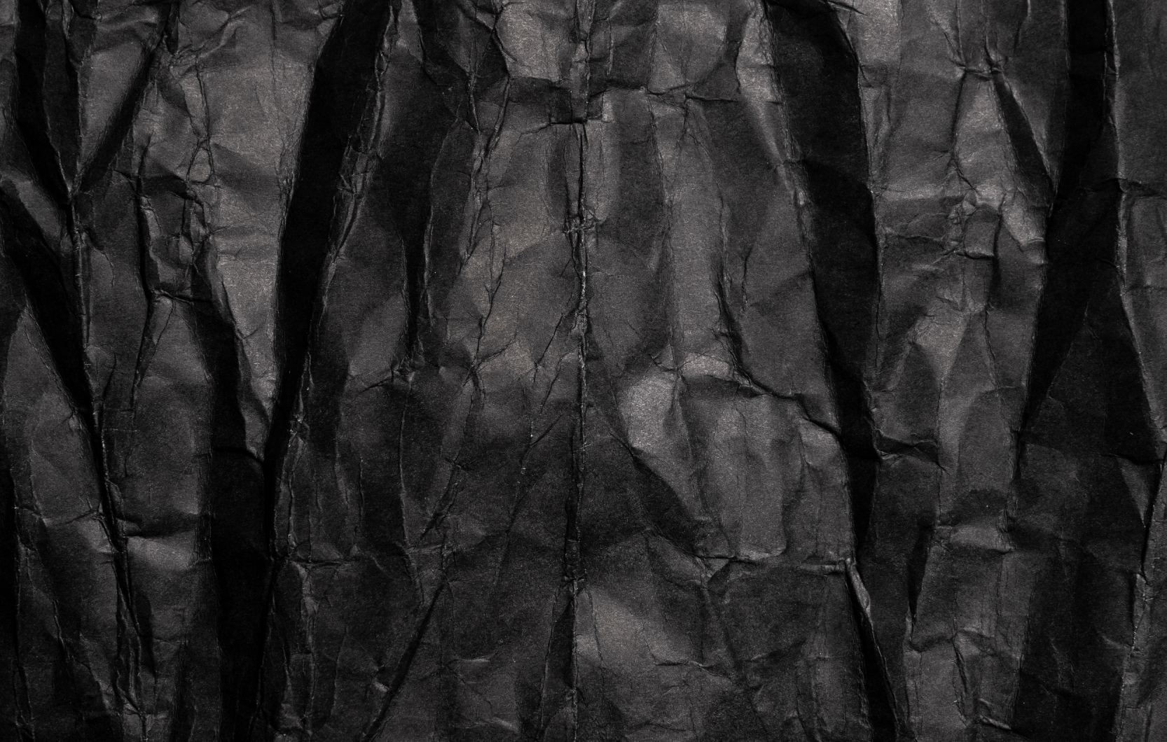
Go ahead and drag it from the Libraries panel into the main image, scale it to fit the composition as needed, and press Enter to commit the image. Drag this layer just above the background color layers, and then change its layer blend mode to Soft Light, and lower its Opacity to around 70%.
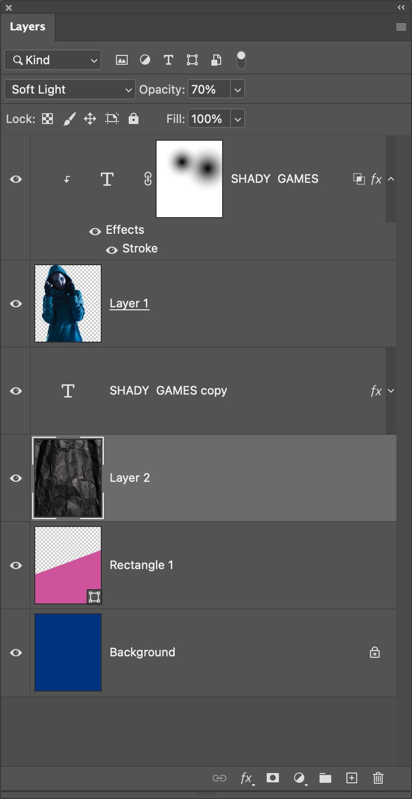
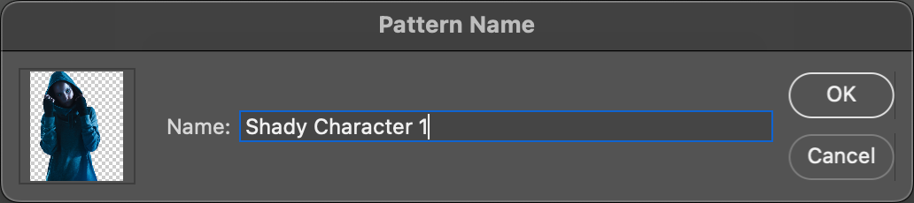
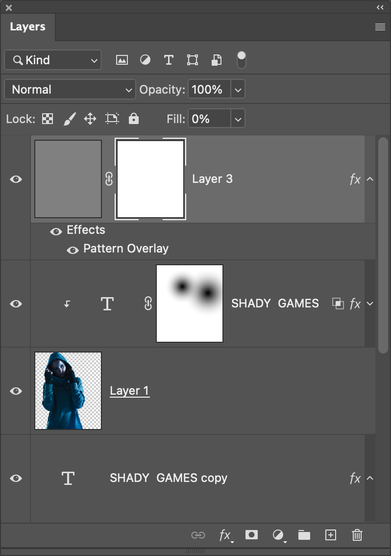
STEP 19: Here’s another cool trick for adding custom patterns with elements already in your composition. First, click on the main subject layer in the Layers panel to make it active. Hold down the Option (PC: Alt) key as you click the Eye icon to the left of the layer. This will turn off all the other layers except this one.
STEP 20: Go under the Edit menu and choose Define Pattern. Name the new pattern when prompted, and click OK. Option-click (PC: Alt-click) where the Eye icon used to be for the subject layer to reveal all the other layers again.
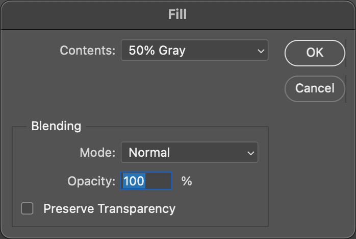
STEP 21: Create a new blank layer at the top of the layer stack, and then press Shift-Delete (PC: Shift-Backspace) to open the Fill dialog. Set the Contents to 50% Gray, leave the other settings as they are, and click OK.
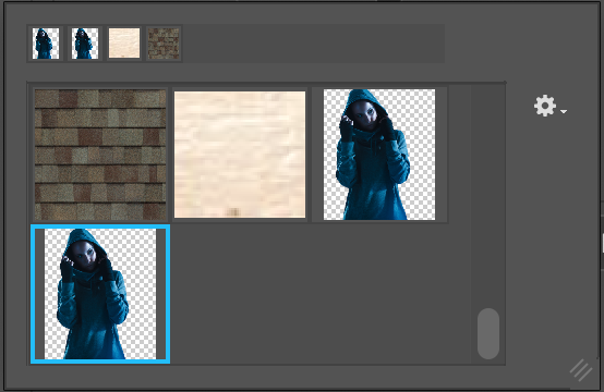
STEP 22: Click on the Add a Layer Style icon and choose Pattern Overlay. First, click on the Pattern thumbnail preview and choose your newly defined pattern, which will usually be at the bottom of the Pattern Picker.
Once selected, set the Scale to around 8%. Since it automatically tiles the image, you’ll see the repeated pattern. To blend it a bit better with the image, set the Blend Mode to Soft Light and lower the Opacity to 75%. If you want to reposition the pattern itself, just click on the canvas and move it around manually. Don’t click OK yet in the Layer Style dialog.

STEP 23: As we did earlier, go to the Blending Options section and just set the Fill Opacity to 0%. Click OK, when done.
STEP 24: You can see the pattern looks good over the background areas, and I do like it overflowing onto some of the subject and the text, as well, but let’s fade some of those areas as we did with the text, especially around the subject’s face.
Add a layer mask to this pattern layer. Even though we’re masking a layer style, we don’t need to activate the Layer Mask Hides Effects setting in the Blending Options this time because the layer mask wouldn’t alter this effect anyway. Mainly edge effects such as strokes or shadows are affected by that setting.

STEP 25: Using the same Foreground to Transparent gradient we used in Step 18, add a couple gradients to the layer mask to fade some of the pattern. Here we added our gradients over the subject because we mainly want the pattern on the background, but we do want some of that pattern spilling over into the subject as well. This pattern technique is a nifty little trick if you want to add a quick background element.

STEP 26: One final touch: I feel like this is screaming for a subtle flare. I’ve provided a few flare brushes that I created that you can download by clicking here. Once the .abr file is downloaded, just double-click the file to automatically load the brushes into Photoshop. Open the Brushes panel (Window>Brushes), and expand the PSU_Corey_Flare_Brushes set at the bottom. We’re going to use the one called Cinematic Flare 4.
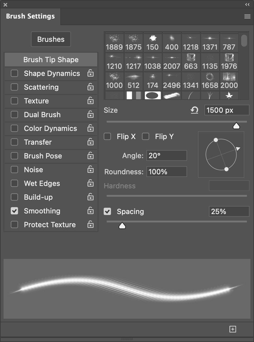
Open the Brush Settings panel (Window>Brush Settings). In the Brush Tip Shape section, set the brush Angle to 20% so it matches the angle of the text, and set the brush Size to 1500 pixels.
STEP 27: Press D then X to make the Foreground color white. Then create a new blank layer in the Layers panel at the very top of the layer stack. Now place the center of the cursor just outside the edge of the canvas next the top right of the “S” in “GAMES,” and click once to set flare. Then do the same on the other side in the lower part next to the “G.” When it comes to flares, don’t overdo it. These two should be fine.
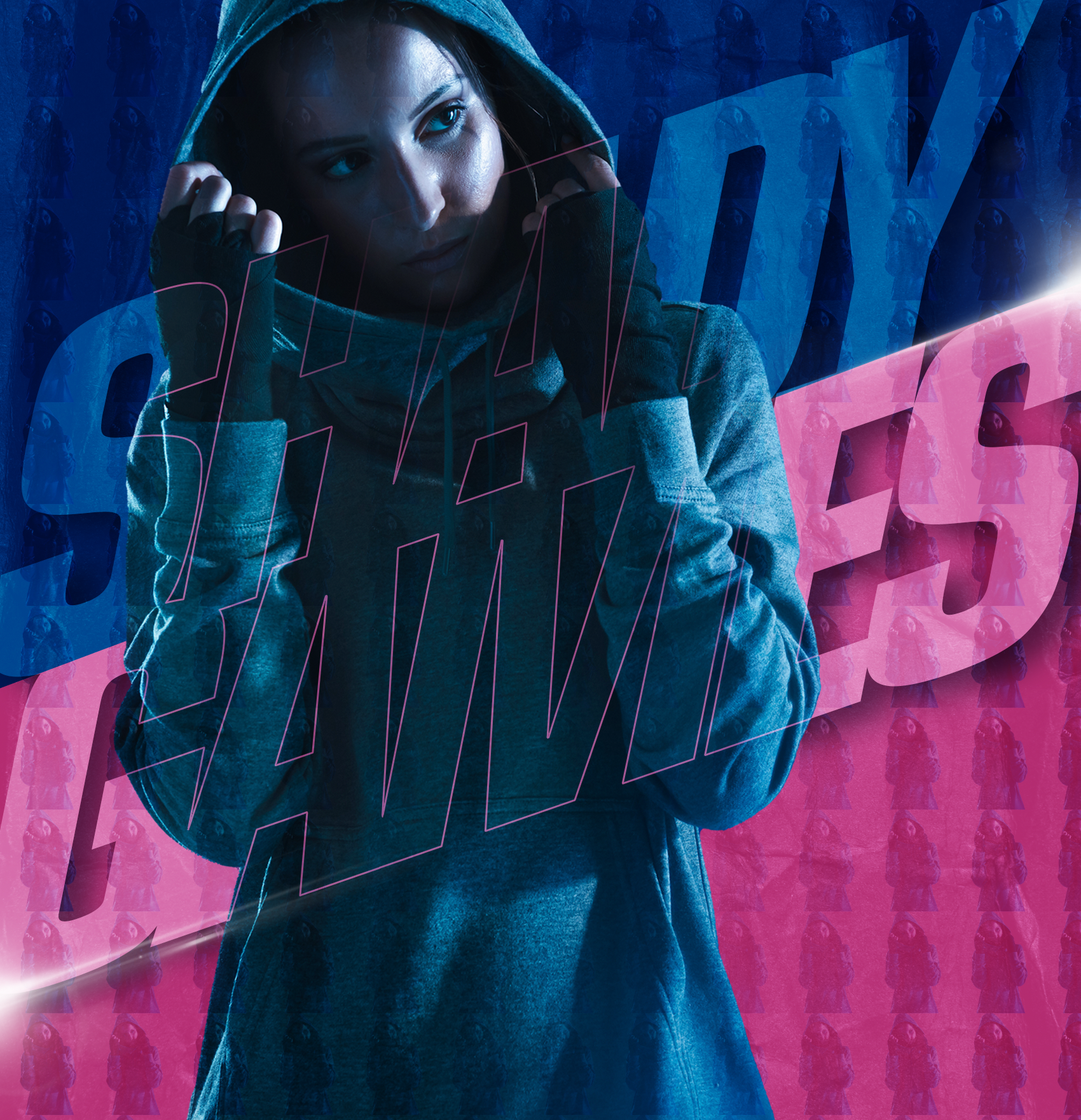
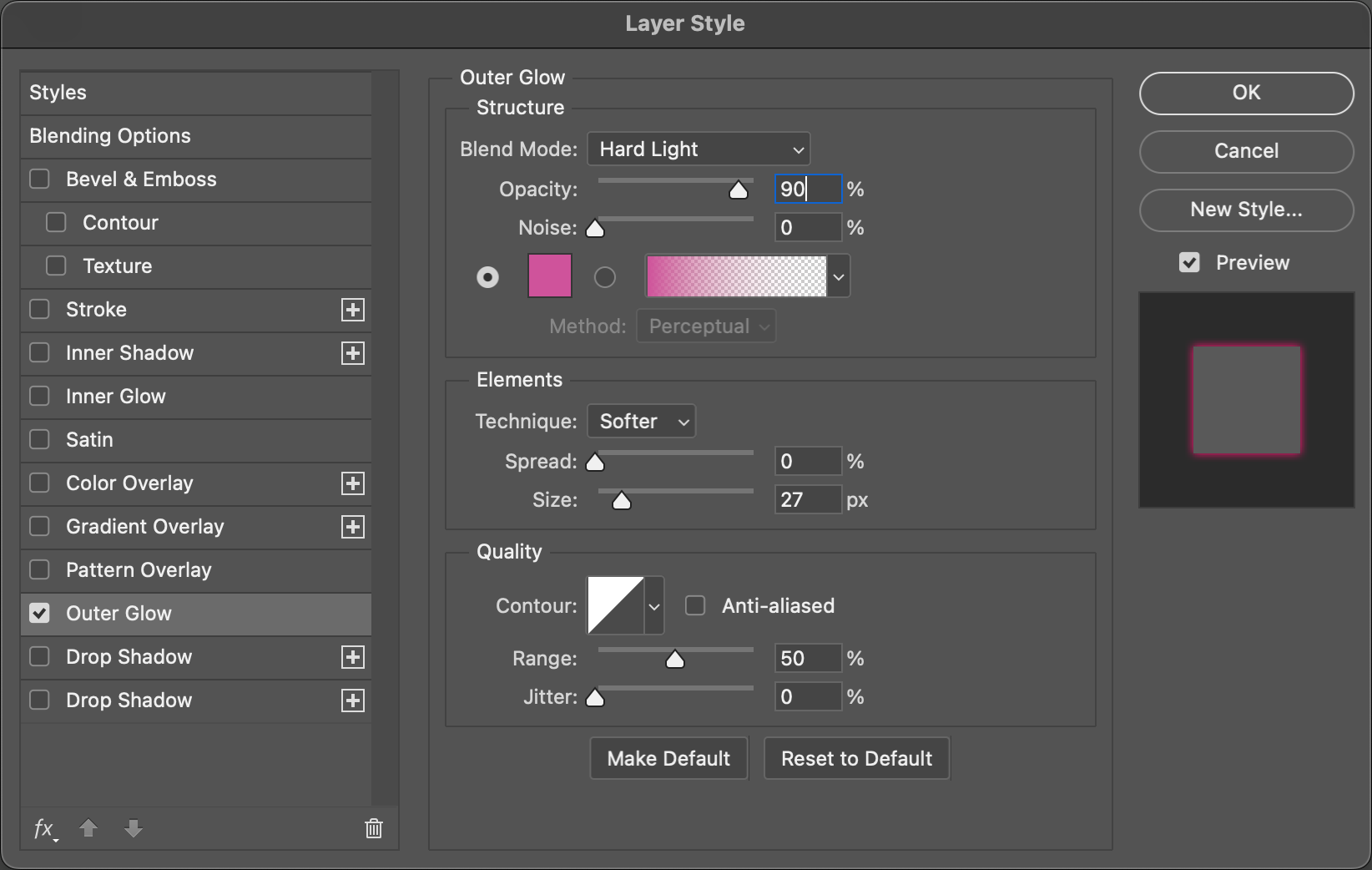
STEP 28: Finally, you can add an Outer Glow layer style to the flares and use the same pink color as the background to make it blend more within its surroundings. If you added flares in the blue area, you would just use the blue color on a separate layer.
That’s quite a handful of useful tricks, whether used as a whole or used as separate effects, you can have a lot of fun experimenting with these design effects.
About Photoshop User and KelbyOne
Photoshop User magazine comes out digitally 12 times a year and is part of KelbyOne, the leading educational resource for Photoshop, Lightroom, and photography. Pro members have access to more than 900 video courses and 100 back issues of Photoshop User. To learn more about KelbyOne, click here.