
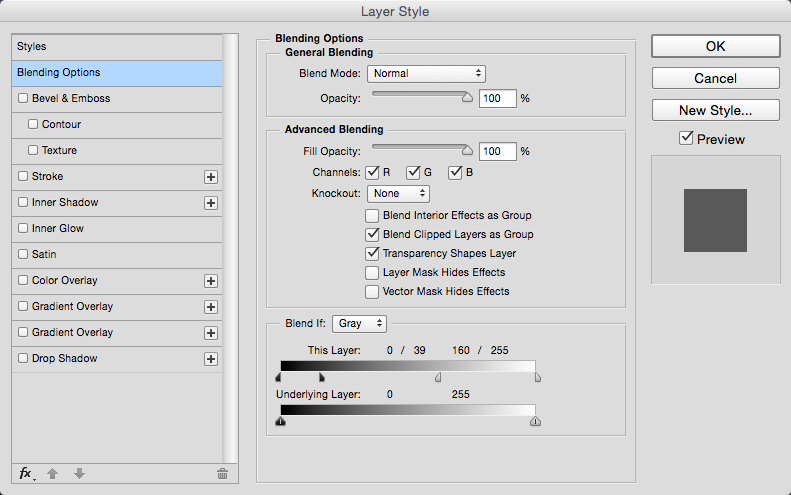
In the Layers Styles panel at the bottom of the first tab “Blending Options” is one of the unsung heroes of Photoshop that gets overlooked so often, and I think it is because it seems a little weird or scary… so today i am going to try to eliminate some of the confusion and hopefully give you a reason to take the Blend if sliders for a spin… er… a slide.
“Blend if” works on the amount of tonality the element or its background has according to the sliders. Most of the time you will use it set on gray, but the same principles apply if you change to a different color. The key is how much white, black or shades of gray the element or the background has in it, that will then determine what is blended. (Think of blending as allowing parts of one layer to show through parts of the other.)
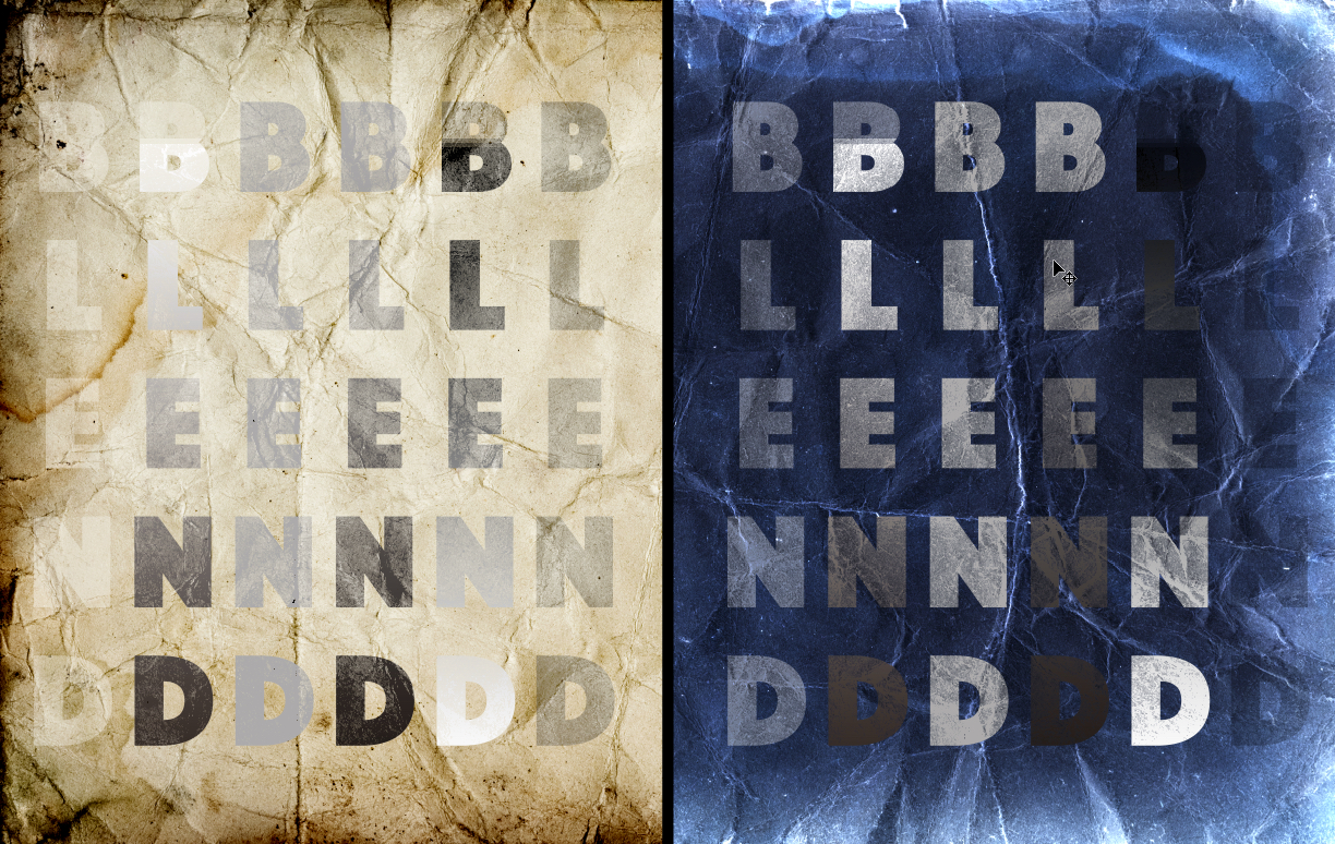
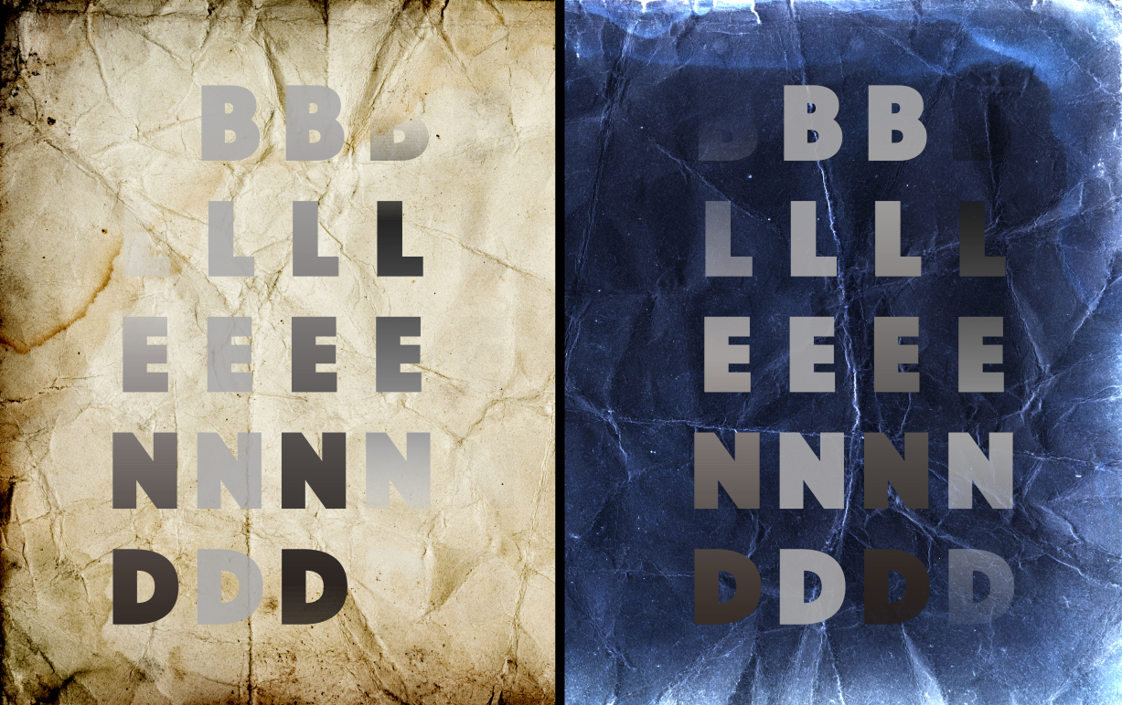
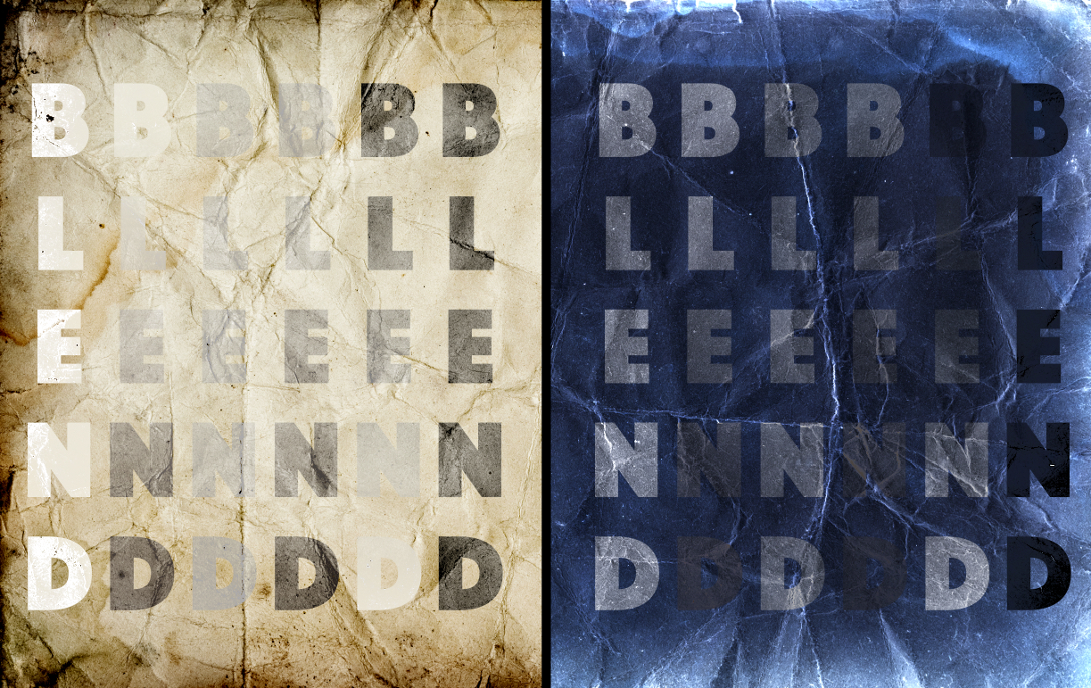
It will be easier to show you… so I have created a layer that has the word Blend on it in different shadings and gradients to show how they will react to the next layer which is a light and dark (inverted) version of a piece of paper. So we are only dealing with two layers… the Blend layer and the background light/dark layer.
Different shadings of the word blend on both light and dark backgrounds.
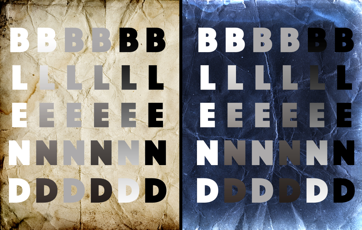
Now you will want to make sure that you have the top layer selected… otherwise the bottom layer would try to blend with what is below itself which won’t do anything. Double click on the layer to bring up the Layer Styles panel. On the first tab called Blending Options at the bottom of the tab is the “Blend if” section. Grab the top slider on the right (white) and drag it to the left.

Blend if set to gray and sliding the top right slider to the left
When you do this, you will notice that parts of your Blend layer disappear. Notice that it is the light/white areas that become transparent. This is pretty cool, but it is pretty clunky… as you can see where it cuts off part of the letters and isn’t very subtle.
Blend if with the top right slider moved to the left
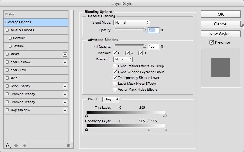
There is a more precise way to use this slider… simply hold Opt/Alt while clicking and dragging any of the sliders and it will split into two halves. Now you can leave the right half alone and just drag the left half… this gives a more subtle blending. What it is doing is instead of just blending one specific tone, it is blending everything within that range of tones, and the end result looks more natural.

Splitting the right slider in two gives you more control
The blending is more precise and you see the letters fading instead of being chopped off.

Notice the letters that were chopped off before are now faded and more subtle
The right side slider affects the look of the layer based on the range of white to gray elements on that layer… so pure white is transparent and you see semi-transparency as you move through the light areas of the gradients.
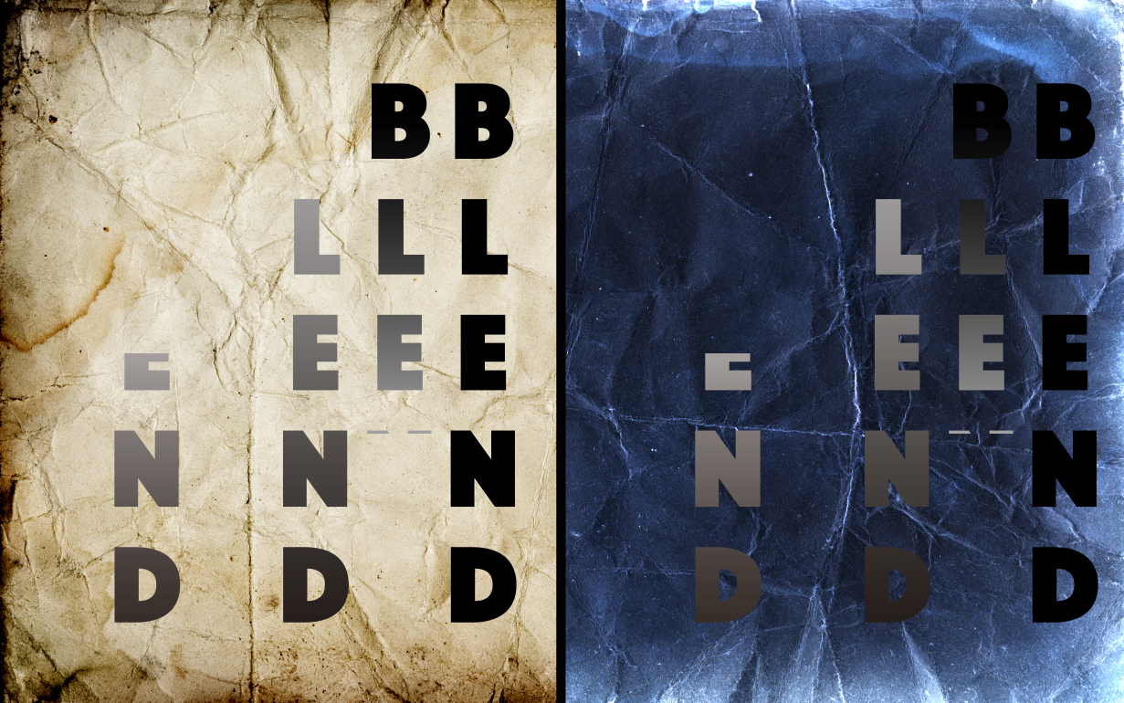
You can also see the same thing happen with the top left slider (black).

moving the entire left (black) slider starts to affect the darkest areas...

Notice how some of the letters are chopped off... because we haven't split the slider
Just as before, splitting the slider is going to give you more control and a better final look. (I think the sliders should be split as a default but that is just me. :D)
Splitting is better
Now the letters are no longer chopped, but faded
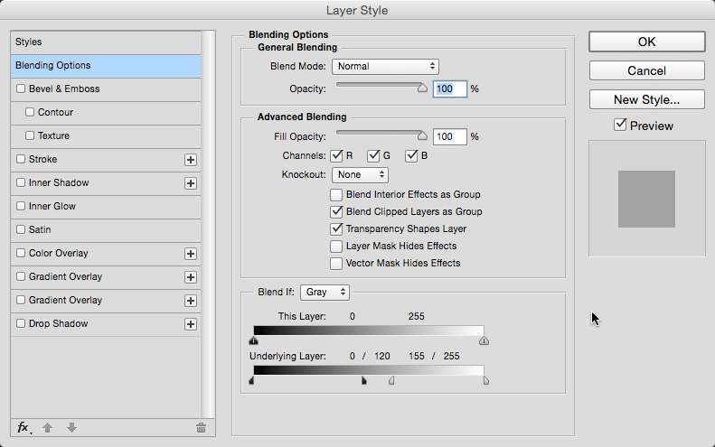
But this is just half of the equation… depending on how you want things to look, you may want to use the background as the blending control… if so, you will want to use the second slider called the Underlying layer. Now the blending will be determined by the amount of white to black (light to dark) tones in the background. This is why you will get different looks on the two different sides of the images coming up. One half of the background is light and will respond in a certain way, while the dark (inverted) right side will respond differently. Let me show you.
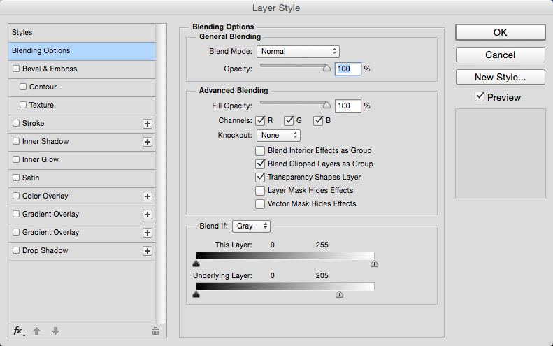
If you slide the right bottom slider you will see different results than the top slider

As you can see the letters are faded according to the lightness of the background while the darker background barely changes.
Once again splitting the slider gives more control
Now you have a nicer fading so that the letters look like they are interacting with the background.
What is happening is that you are telling Photoshop to hide/fade anywhere that the background is between the ranges of the slider, so the right slider (white) has more of an impact on the left side because of its lightness, while the right side is more affected by the left slider. (black)
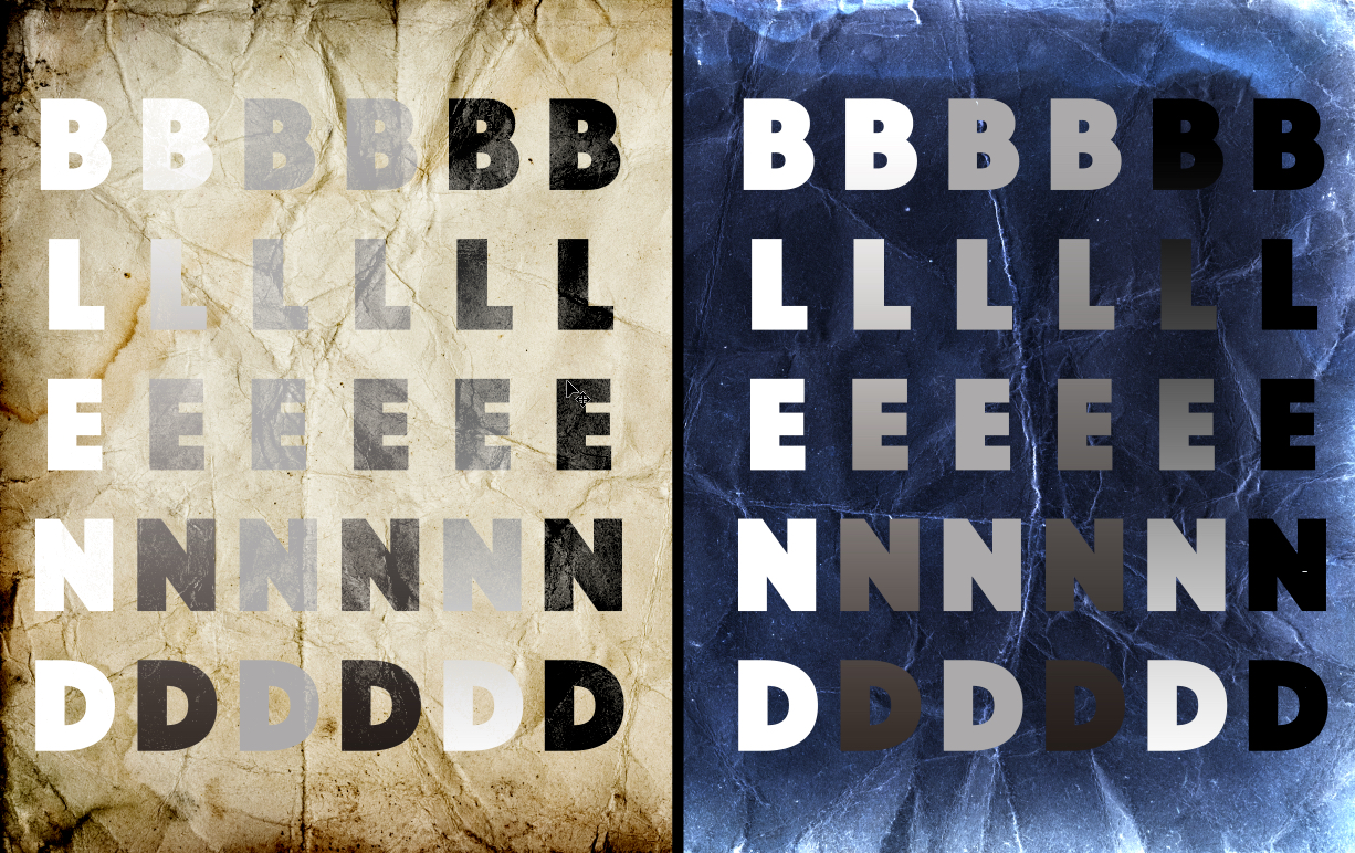
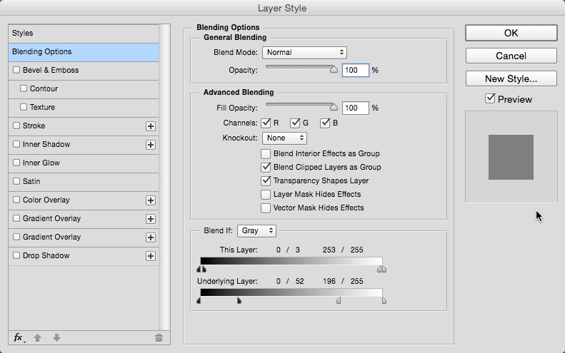
Both sliders are split and adjusted for best results
With both sliders split and adjusted the letters look like they are part of the background instead of floating on top
Once you have an understanding of how each slider affects the look, then you can simply try moving the different sliders to get the look you want. The great thing is that if you mess up or change your mind later, you can just double click back into that layer and readjust the sliders.
Final adjustments include barely moving the top sliders along with dialing in the right amount of the lower sliders.

The text looks aged and blended with the paper as if it has been part of that page for years.
So hopefully the “blend if” sliders will become a go to technique that you use over and over again since it can give you subtle looking blending with just a couple of quick slides. Enjoy!
Great beat ! I wish to apprentice even as you amend
your website, how could i subscribe for a weblog site?
The account aided me a appropriate deal. I have
been a little bit familiar of this your
broadcast offered bright clear concept
Thanks for another fantastic post. The place else may just anyone get that
type of information in such a perfect manner of writing?
I’ve a presentation next week, and I’m on the look for such info.