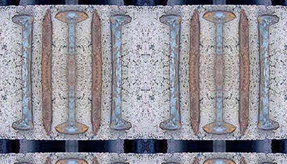
Ever wonder where all those seamless backgrounds come from? How does the creator get them to blend so…well, seamlessly?If you’ve tried to create your own, I’m sure you’ve perused at least a dozen tutorials on the subject. Some may have garnered excellent results, and some not so much. I’m not going to grade the quality of anyone else’s tutorials here. I know from personal experience that a single error to a technique or misplaced step will award the writer a small avalanche of email. Been there, but I’m not complaining. You folks keep me sharp, and I like it that way!
This week I’m going to give a personal twist to the ol’ seamless background creation niche. I’ve warmed up the digital cam (my trusty Mavica… forgive me Jim Patterson, but I love that camera) and snapped a few shots. Let’s see if we can’t create something interesting.
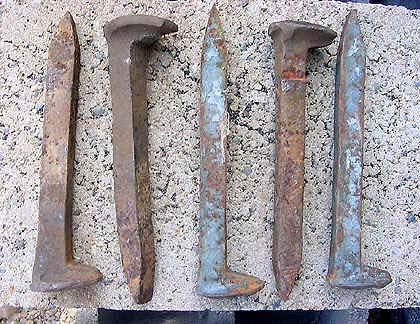
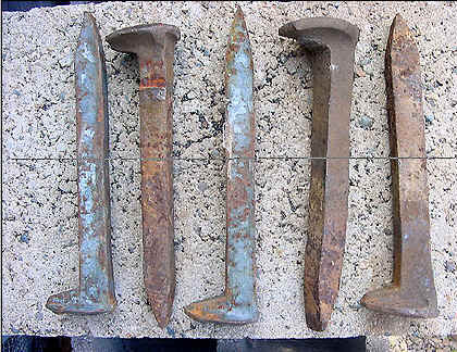
I call this one ‘Spikes On Cinderblock’… my attempt at industrial photography.
1. First off, duplicate the background layer by dragging it to the new layer icon on the bottom of the layers palette.
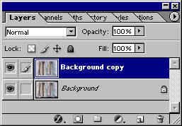
2. Select the copied layer. Go to Edit>Transform>Flip Horizontal.
3. Click the ‘Add a Mask’ icon on the bottom of the layers palette.

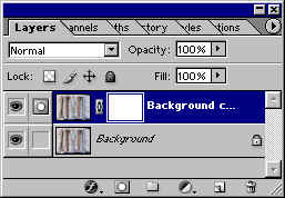
3. If you are unfamiliar with masks, you will notice that the foreground/background colors are white/black respectively. We are about to apply a gradient to the layer mask, which will render half the layer visible (that covered with white) and have will reveal the layer beneath (the black portion of the gradient).

4. With the Mask selected, click the gradient tool. Click inside the gradient in the options bar to bring up the gradient editor.
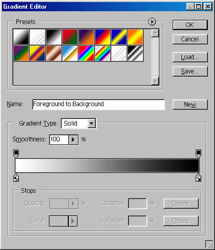
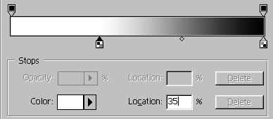
5. Click the white color stop and manually enter ‘35%’ for the location. Select the black color stop and manually enter ‘65%’ for the location.
6. Click the Mask field for the copied layer in the Layers Palette. As strait as you can, draw the gradient from left to right across the layer.
7. Take a look at your image. You should see something like this.
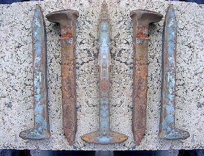
8. With the top layer still selected, hit Command/CTRL+E to merge the layers together.
9. Duplicate the background again. We are going to follow the same procedures as above, only this time we will flip the new layer vertically instead of horizontally. Also, this time apply the gradient to the mask from top to bottom rather than left to right. When completed, it should look like this:
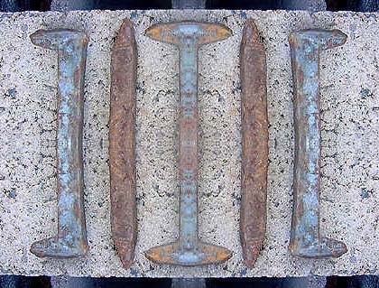
10. Merge the layers again.
11. Go to Image>Adjust>Image Size. Deselect ‘Constrain Proportions’ and enter identical measurements for the width and height.
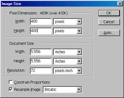
Here’s the image:
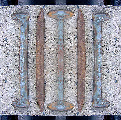
So is it seamless? Well here’s a quick test. First. I’ll reduce the size again. Next, I’ll go to Edit>Define Pattern. Third, I’ll create a new document. I’ll then test my background by filling the new document with the new pattern.
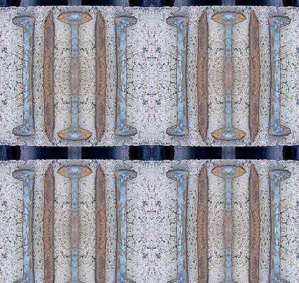
Try saving the above tutorial as an action. Here are a couple additional examples:
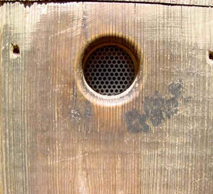
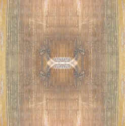
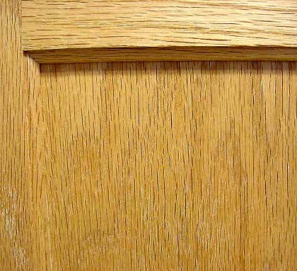
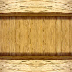
I hope you have fun with this one. Take care, and I’ll see you next time!


Thank you for the tutorial. I have tried several different ones but yours is easy to follow through. 🙂
Great tutorial, very informative.
You might want to spell check step 6 (strait should be straight) :oP
Fabulous tut greatly appreciated and very easy to follow. I created an action as you suggested and it works brilliantly. Thank you!
I have done this over and over and it never works? No sure what I’m doing wrong.