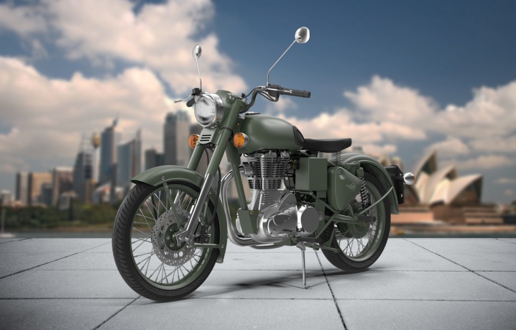
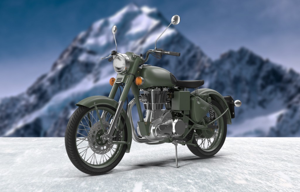
Quick Production Backdrop
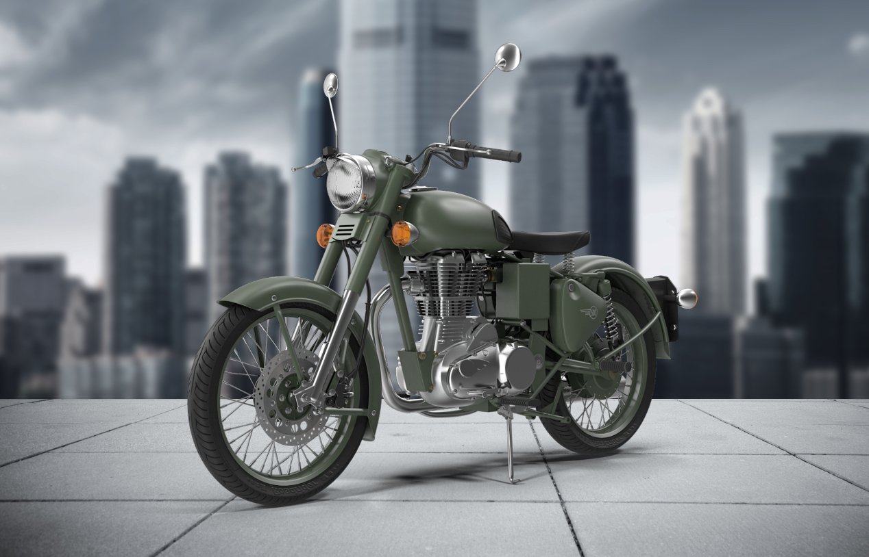
One challenge that designers have is how to showcase their companies product in a simple but effective way. This is a great way to quickly create a dynamic stage for your products to be showcased.
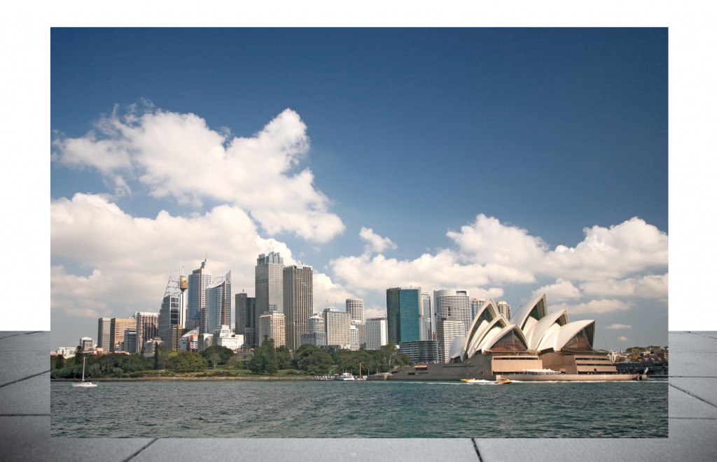
Start with a good looking section of ground… it can be whatever you want from concrete to grass to dirt… it is up to you and what you want to show.
Now simply cut out the ground from the rest of the image and leave it on its own layer.
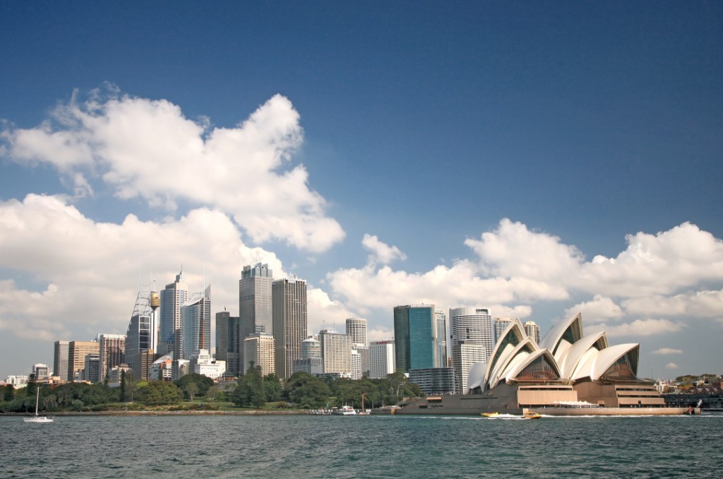
Find a suitable background image to be the setting for the product… Iconic skylines from around the world is a great way to give your product an international flavor.
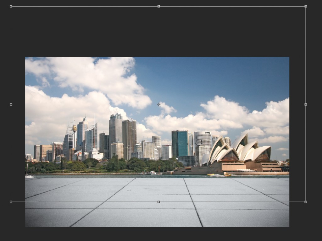
Drop the background into the document. Don’t worry if it is a little smaller than the ground image… as you will see in a minute the background doesn’t have to be tack sharp.
Resize the background to fit the image… be more focused on how the elements look rather than sharpness
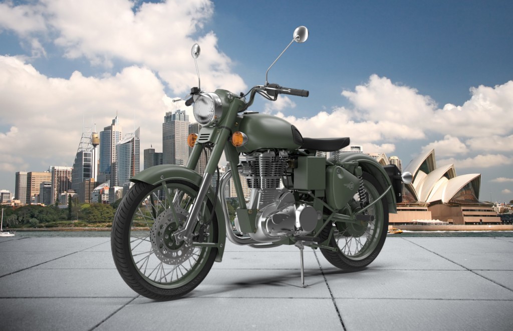
Once you have the background in place, and you drop in your product image… the depth of field of the overall image can be a bit distracting. The eye doesn’t know whether to focus on the product or the skyline. Not what you want.
Adding a Gaussian blur to the background will help focus the eye on the product while still giving the flavor of the background. Play with the amount of blur to find the visual sweet spot.
Along with sharpness… having the background too bright will grab the eye as well, so darken the background with an adjustment layer or Photo filter.
And there you go, in a couple of quick steps, you have an effective stage setting for your product.
It is now very easy to swap out both the background image and the ground image to change the flavor of the scene.

