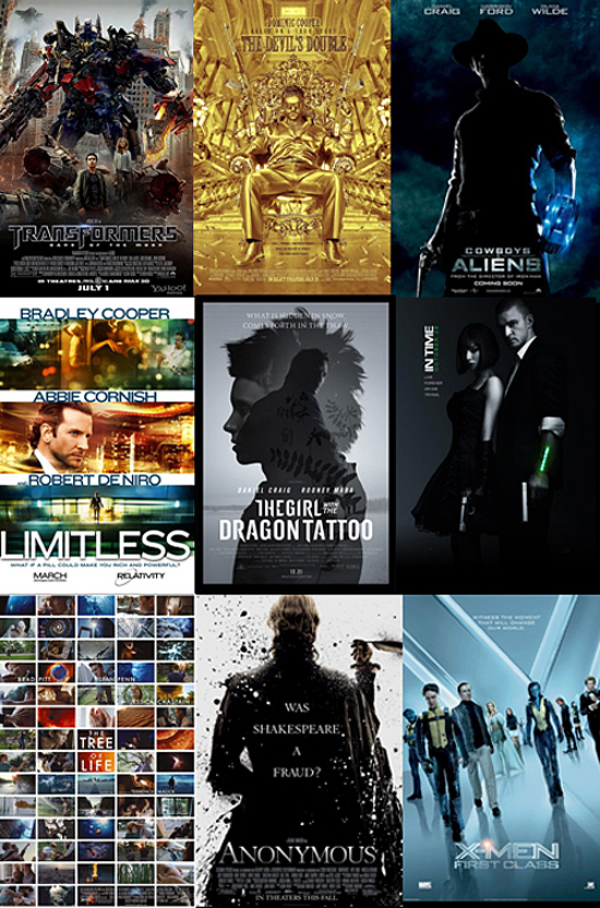
Notable Movie Posters of 2011
So it has been an interesting year in movies. There have certainly been a lot of good ones and even some severe disappointments. More so than usual it seems. However, even bad movies can have some impressive poster designs. So to wrap up the year I have put together a collection of some of the most interesting poster designs of 2011. They are in no particular order, I like them all for different reasons. So here we go:
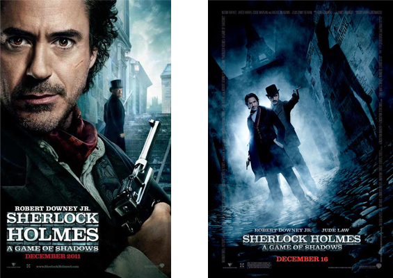
SHERLOCK HOLMES: A GAME OF SHADOWS
This is the follow-up to the 2009 original starring Robert Downey Jr. and directed by Guy Ritchie. I loved the first film but I loved the poster designs more. Love the lighting and composition in both examples.
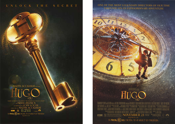
HUGO
This is the new fantasy film from famed director, Martin Scorsese. Have not seen the film yet but love seeing Scorsese exploring different genres other than those of the gangster flavor, even though I love those films. Posters for the film are beautiful!
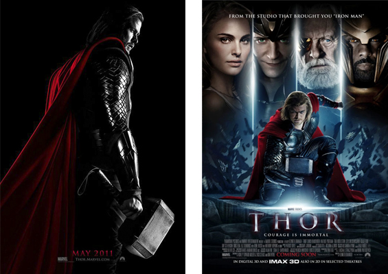
THOR
Of all the comic book movies this year I would have to say I enjoyed Thor the most. Thought it was a great origin story to a promising franchise. Despite the difficulty they have in finding a new director for the sequel. Great photography in these posters combined with some great compositing work.
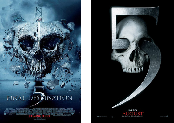
FINAL DESTINATION 5
I’ll admit it; I am not a fan of these films. Another horror franchise that has overstayed it’s welcome is how I see it. However, this most recent installment had some pretty cool poster concepts. While not great films, there’s some really clever design work demonstrated here.
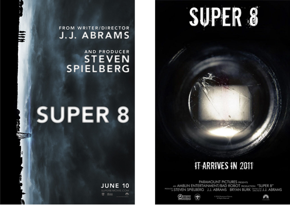
SUPER 8
This was one of the films I most anticipated this past year, and for good reason. It was produced by Steven Spielberg and directed by JJ Abrams. I am fan of both of these guys. So the two of them working together was bound to be fun to watch…and it was. I rather enjoyed this film. Had a real nostalgic feel to the old Spielberg classics of the 80’s. Oh, and the posters are really cool too!
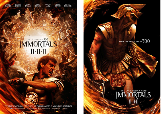
IMMORTALS
I was really intrigued when I saw the trailer for this film. I was even further intrigued by the style of the posters. They actually had a campaign of posters depicting main characters from the film. Ultimately the film was just Ok, but the posters are still awesome!
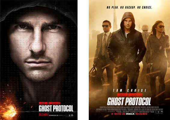
MiSSION IMPOSSIBLE: GHOST PROTOCOL
I was only mildly interested in seeing the fourth installment of this series. That was before I found out that Tom Cruise actually hired Brad Bird to direct. Some of you may know, Brad Bird is most well known as an animator. In fact, he has written and directed two Pixar films: The Incredibles and Ratatouille. So for him to take on a big budget live-action film was an interesting move. Based on what I have seen in the trailers and the posters, my interest is peaked!
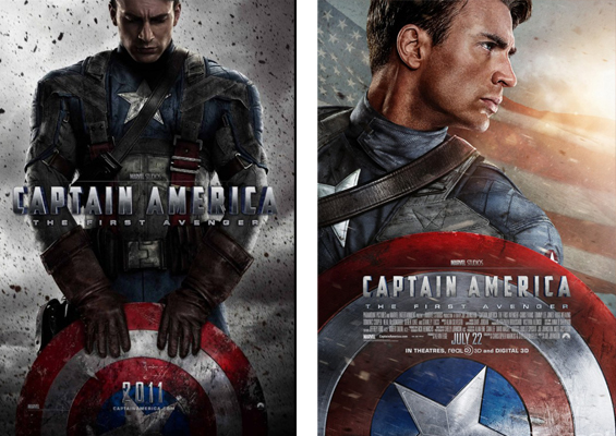
CAPTAIN AMERICA: THE FIRST AVENGER
Here is another comic book movie I really enjoyed this year. Had no real expectations when I first saw it but was pretty impressed with it. This movie was another great origin story to add to the Marvel movie universe, as well as some great poster art. Really liked the one on the left with the composition and the particle effects.
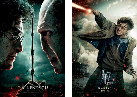
HARRY POTTER and the DEATHLY HALLOWS PART 1 & 2
Whoever designed the one sheets for this film just went crazy. I don’t think I have ever seen a movie campaign with this many variations of posters. Almost every character has a one sheet. Here are just a couple examples but the concept is pretty consistent throughout all of them.
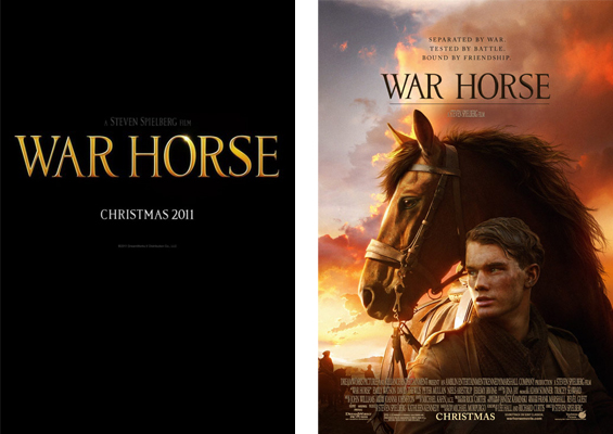
WAR HORSE
I am intrigued to see this film just because of the fact that it’s Steven Spielberg. When it comes to his films all you need is his name and the title of the film like in the example on the left and I am sold.
So those are some of the more notable poster designs from the past year. I have here also a small collection of honorable mentions that I thought were quite interesting as well. It is often fun to really examine a poster and try to understand what the designer intentions might have been. Is how you are reacting to it the right reaction? Does the design work? Does it flow right? Does it raise good questions about the story? Is it selling the movie correctly? These are the same questions you could ask yourself about your own work. Think about it!
Oh and if there is a poster from 2011 that I have not mentioned here that you find remarkable then leave a comment and tell us what your favorite is!
