
This tutorial explains how to create a rusty text effect, using Photoshop filters and a texture image. Then, it explains how to use Photoshop brushes and layer styles to add some glow to the final effect.
Tutorial Assets
1- Watford font.
2- Colored Vintage Paper Texture 09 (Grey) from the Colored Vintage Paper: Texture Pack by Ciara Panacchia.
3- Rust texture 6 by wojtar-stock.
4- Sparklies Photoshop Brushes pack by redheadstock.
Step 1
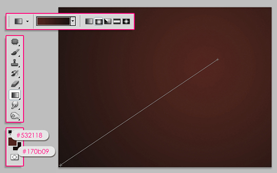
Create a new 1024 x 768 px document. Set the Foreground color to #532118 and the Background color to #170b09. Pick the Gradient Tool (G), choose the Foreground to Background gradient and click the Radial Gradient icon in the Options bar, then click and drag as shown below to create the gradient.
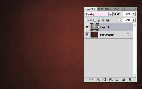
Open the Colored Vintage Paper Texture 09 (Grey), and place it on top of your Background. Resize it to fit in the document, then change its Blend Mode to Overlay.
Step 2
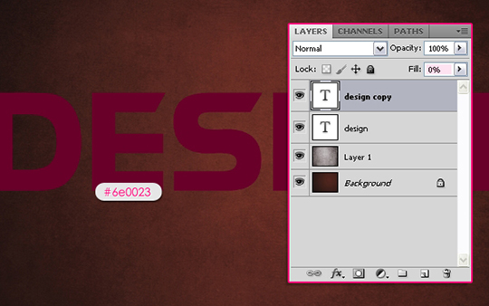
Type in your text using the Horizontal Type Tool (T). The text color is #6e0023, the font used is Watford, and the size is 250 px. Duplicate the text layer (Ctrl/Cmd + J), and change the copy’s Fill value to 0%.
Double click the original text layer to apply the following Layer Styles:
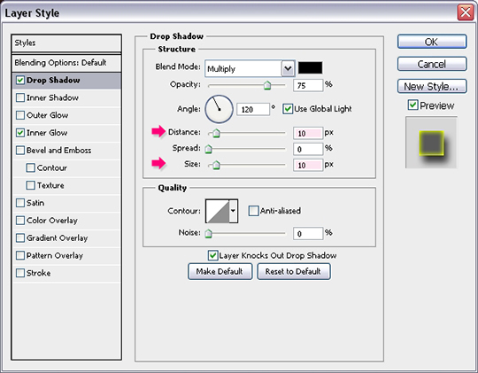
Drop Shadow: Change the Distance and the Size values to 10.
Inner Glow: Change the Blend Mode to Normal, the Opacity to 100%, the color to #ffff00, the Size to 8, and the Range to 75%.
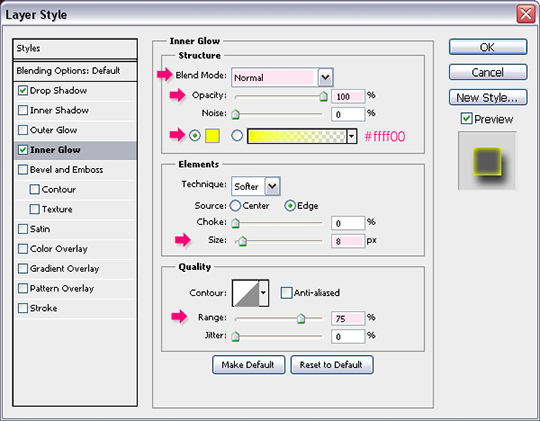
This is what the text should look like.
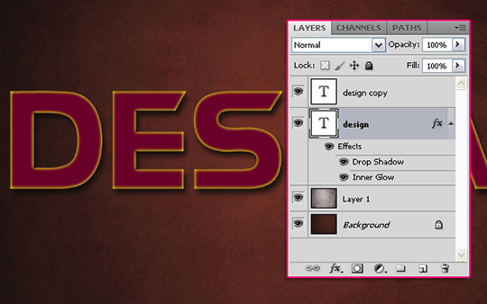
Step 3
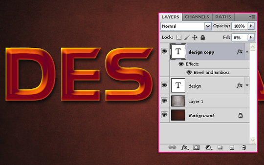
Double click the copy text layer to apply the following Layer Styles:
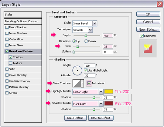
Bevel and Emboss: Change the Depth to 450, the Size to 21, check the Anti-aliased box, change the Highlight Mode to Linear Light and its color to #ffd200, and change the Shadow Mode to Hard Light and its color to #9c2323.
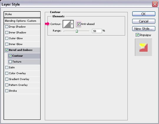
Contour: Just check the Anti-aliased box.
This is what the text should look like after layer styles are applied to both text layers.
Step 4
Create a new layer on top of all layers and call it “texture”. Press the Ctrl/Cmd key, and click a text layers’ thumbnail (icon) to create a selection.
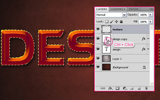
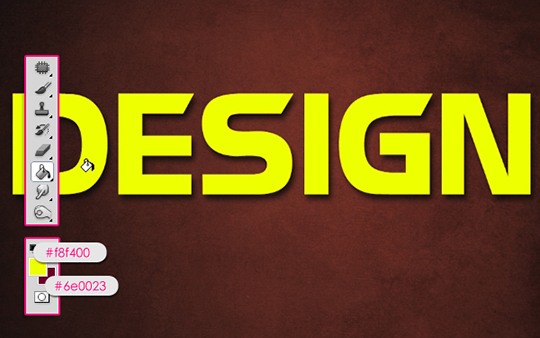
Set the Foreground color to #f8f400 and the Background color to #6e0023. Fill the selection with the Foreground color, then go to Select -> Deselect (Ctrl/Cmd + D) to get rid of the selection.
Step 5
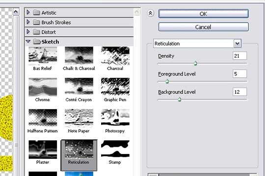
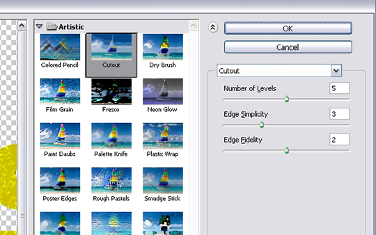
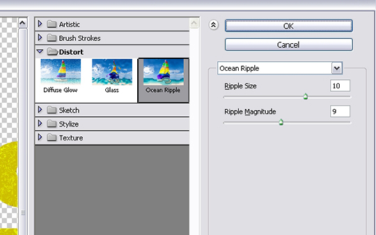
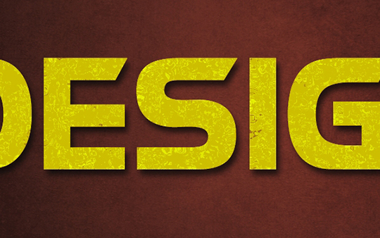
We are going to apply a couple of filters to create a simple texture. This texture will be a base for the texture image we are going to use later on. Change the values for each filter as shown in the images below:
Filter -> Sketch -> Reticulation.
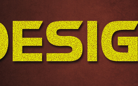
Filter -> Artistic -> Cutout.
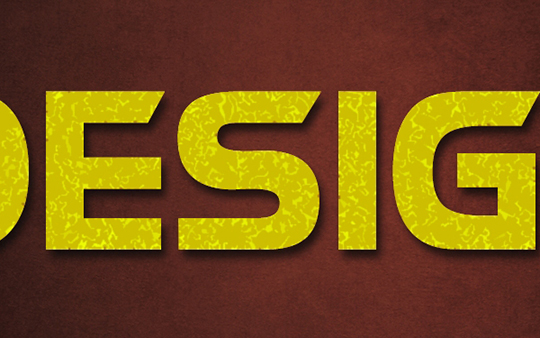
Filter -> Distort -> Ocean Ripple.
Step 6
Change the “texture” layer’s Blend Mode to Soft Light.
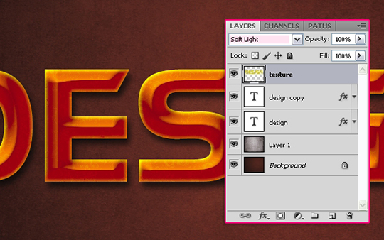
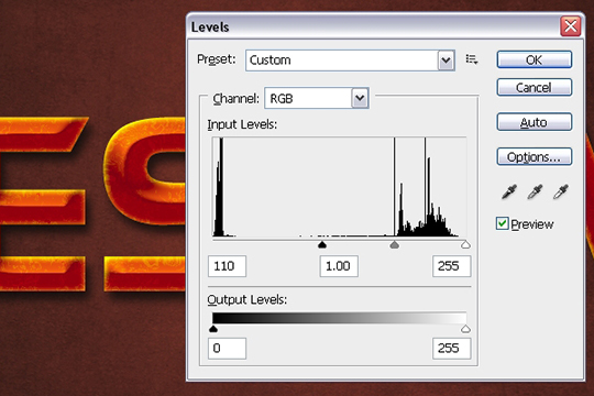
Go to Image -> Adjustments -> Levels (Ctrl/Cmd + L), and change the Shadows (black arrow) value to 110.
Step 7
The next step is modifying the texture image to create the main rusty effect.
Open the Rust texture 6 image, and place it on top of all layers. You can resize the image if you want the details to be smaller. And if the image does not cover all of the text, you can simply duplicate it and move it around until all of the text is covered. Just make sure to keep the images’ edges outside the letters.
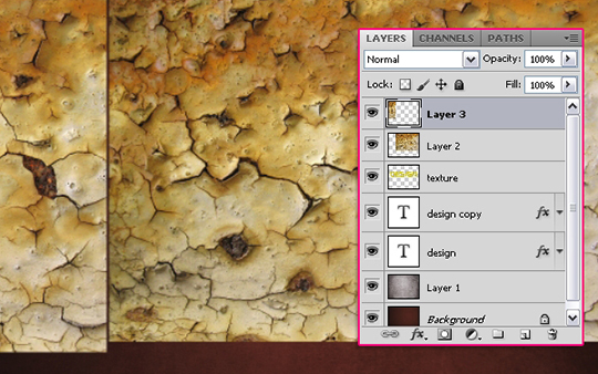
Merge all of the texture image layers (Ctrl/Cmd + click all of the texture layers, then go to Layer -> Merge layers, or press Ctrl/Cmd + E). Then, change the merged layer’s Blend Mode to Multiply.
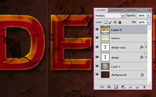
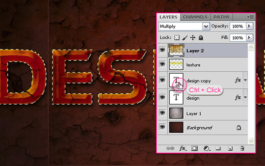
The Press the Ctrl/Cmd key and click a text layer’s thumbnail to create a selection.
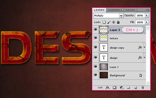
Make sure that the texture image layer is still active (selected), then press Ctrl/Cmd + J. This will duplicate the selection in a new layer (Layer 3). You can go ahead and delete the original layer (Layer 2) if you like, or make it invisible (click the eye icon next to it) as we don’t need it anymore.
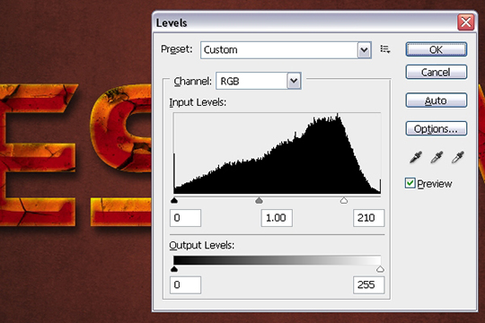
Press Ctrl/Cmd + L to open the Levels box, and change the Highlights (white arrow) value to 210 to brighten up the texture a little bit.
Step 8
The texture might look too dark in some areas. We are going to fix this in two simple ways, but you can go ahead and modify it using other tools if you like.
The first way is using the Eraser Tool (E). With a soft round brush, erase some of the very dark or over-textured spots, for example, the dark spot on the tip of the “G” letter. A soft brush helps create a smooth transition leaving no harsh lines, but do not erase very big areas, keep them small and distant.
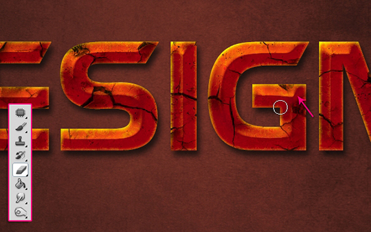
The second way is using the Dodge Tool (O). Instead of erasing the whole area, you can make it a bit brighter using the Dodge Tool, as in the letter “E”. You might as well need to change some of the settings in the Options bar at the top, Like the Range or Exposure. Way too much exposure might create very bright areas, so make sure to choose values around 50%.
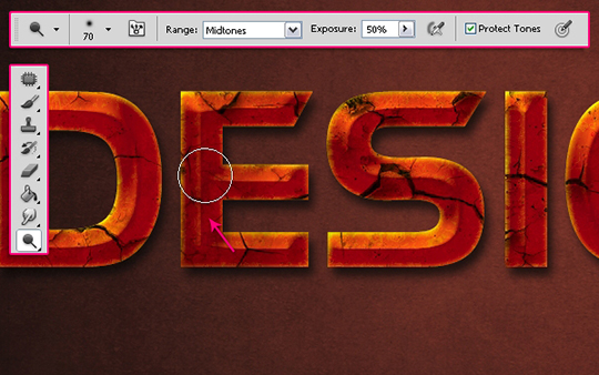
Finish whatever modifications you want to make before moving on to the next step.
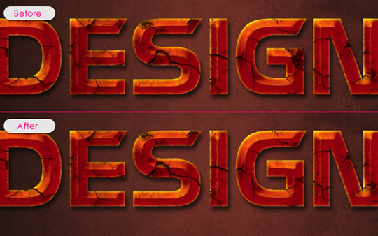
Step 9
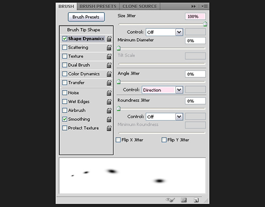
Open the Brush panel (Window -> Brush), and choose a soft round brush. Change its size to something around 30 px, the Roundness to 40%, and the Spacing to 1000%.
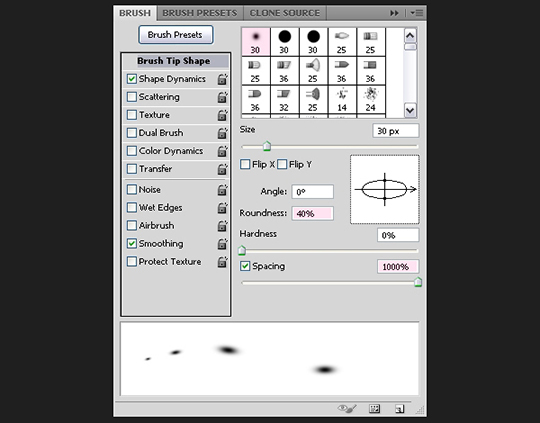
Under Shape Dynamics, change the Size Jitter to 100%, and choose Direction from the Angle Jitter drop down menu, this will make the brush angle follow the text path.
Step 10
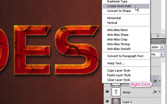
Right click one of the text layers and choose Create Work Path.
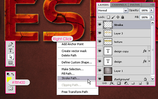
Set the Foreground color to #f8f400, pick the Direct Selection Tool, create a new layer on top of all layers and call it “Stroke”. Right click the work path and choose Stroke Path.
Choose Brush from the Tool drop down menu.
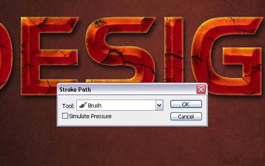
This will stroke the path with the modified brush. Hit Enter to get rid of the path.
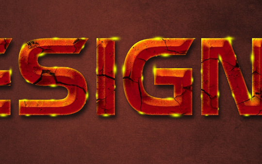
Step 11
Double click the “Stroke” layer to apply the following styles:
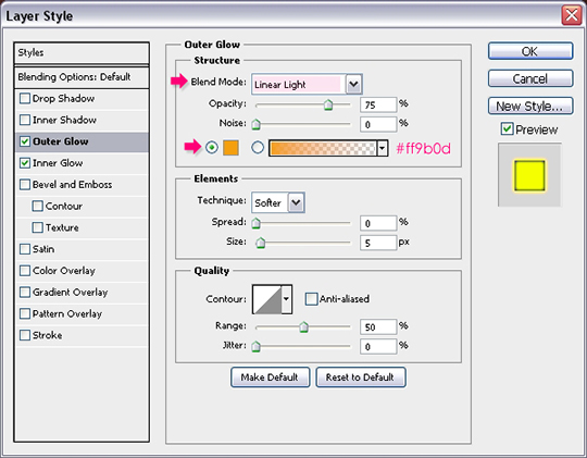
Outer Glow: Change the Blend Mode to Linear Light and the color to #ff9b0d.
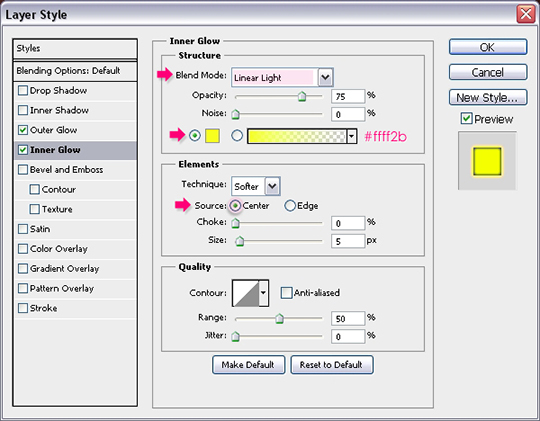
Inner Glow: Change the Blend Mode to Linear Light, the color to #ffff2b, and the Source to Center so that the glow is illuminating from the center not the edges.
This should add a vivid glow to the stroke.
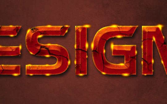
You can use a soft round brush to erase some of the dots at the corners of the letters, where the brush seems to not follow the path.
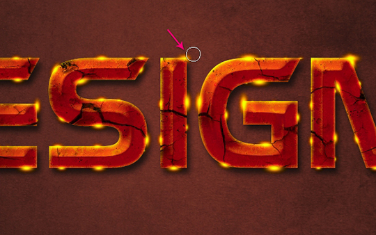
Step 12
Open the Brush panel once again (Window -> Brush), this time, choose the Star 14 pixels brush, and change the Spacing to 250%.
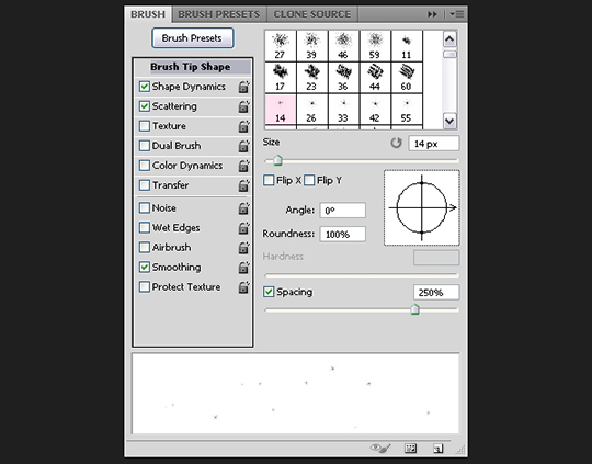
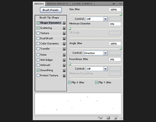
Change the values under Shape Dynamics to whatever you like. We are modifying the settings to randomize the sparkles’ Size and Angle values.
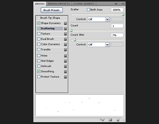
Modify the Scattering values as well. You can play around with the values and see the different effects you get.
Step 13
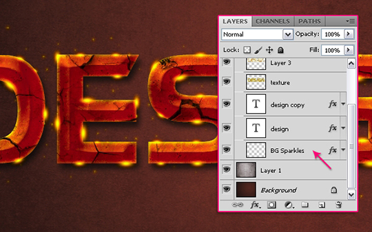
Create a Work Path just like you did in Step 10, create a new layer right below the original text layer and call it “BG Sparkles”, and stroke the path with the sparkles brush. Then, right click the “Stroke” layer, choose Copy Layer Style, right click the “BG Sparkles” layer, and choose Paste Layer Style. This will apply the same layer style for the Background sparkles.
Step 14
Download the Sparklies Photoshop Brushes pack, and choose whatever sparkles you like. You can change the Shape Dynamics for the brush you choose so that each time you click to add a sparkle, the size and rotation angle will be different.
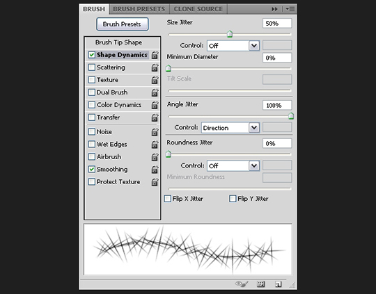
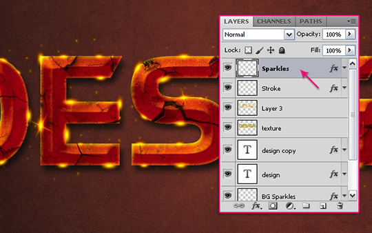
Create a new layer on top of all layers and call it “Sparkles”, paste the “Stroke” layer style once again to apply it to this layer as well, and start adding some sparkles over the glowing stroke.
Try not to add way too many sparkles.
Conclusion
This is the final result. If your text has a different font size, you might need to adjust the Bevel and Emboss values to suit the new size. Hope you enjoyed this tutorial and found it helpful.



video’s way better
Thank you for this tutorial it’s well done. I bought your book and it’s Awesome, the best reference book I ever had and I bought many, none can compare to yours. Outstanding!
In my opinion a video is much better. ( both wouldnt hurt :P)
I had a go because I love your fonts tutorials but I still prefer to hear your voice
I caught a virus when I downloaded the font used in this tutorial … was gonna email you instead of sending you this on here … but … no email option …
Please, video’s!
Cool tutorial!
WTF*** I GOT STUCK AT THE PART OF STPE 10!!! I SAY VIDEO IS A WAY MORE COOLER
Hi, Good tutorial…so far. I’m stuck on step 10. I can’t seem to create work path, I have right clicked but there is no option for work path.
Good Good Good Good Good !!!!!!! THANKS