Tutorial Assets
1- Wood Pattern Background patterns.
2- Janda Manatee font.
3- Patterns 21 by Ransie3.
4- Floral Fabric Patterns by sofi01.
5- Diagonal Noise pattern by Christopher Burton.
6- gradient-shapes for Photoshop by ilnanny.
Step 1
Create a new 1152 x 864 px document, then duplicate the Background layer.
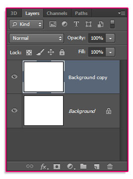
Double click the Background copy layer to apply the following Layer Style:
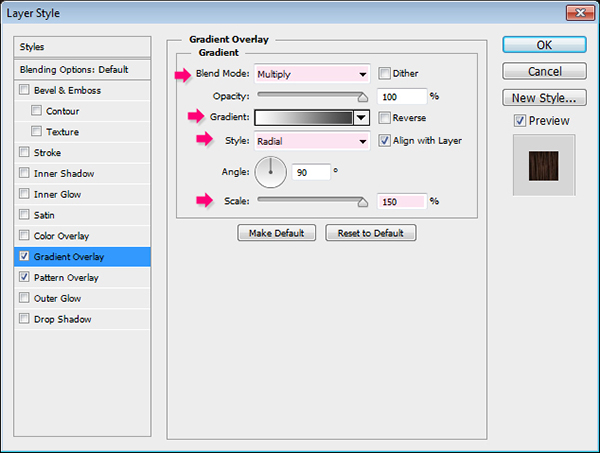
Gradient Overlay: Change the Blend Mode to Multiply, the Style to Radial, the Scale to 150%, and click the gradient box to create it.
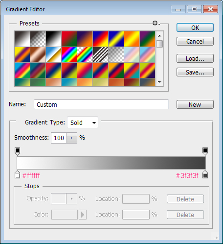
The gradient uses two colors: #ffffff to the left, and #3f3f3f to the right.
Pattern Overlay: Choose the “Melamine-wood-002” pattern from the “Wood Pattern Background” pack.
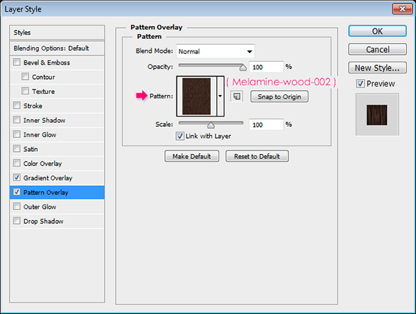
This will create a simple dark wooden background.

Step 2
Create the text in All Caps using the font “Janda Manatee”. The color is White, the font size is 250 pt, and the Tracking value is set to 25 to avoid any overlapping.
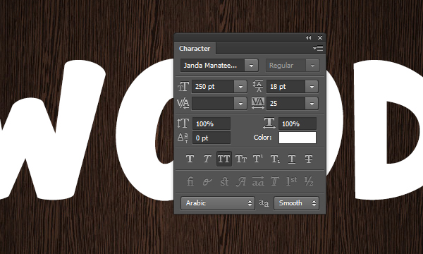
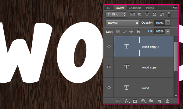
Duplicate the text layer twice so that you have two copies.
Step 3
Open the ” VF_r03.jpg” image from the ” Patterns 21″ pack, then go to Image -> Adjustments -> Levels, and change the Gamma value to 0.75.
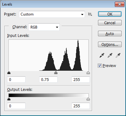
This will darken the pattern a bit. You can use bigger values if you want it to be lighter, and smaller values to darken it even more.
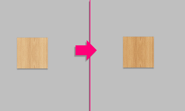
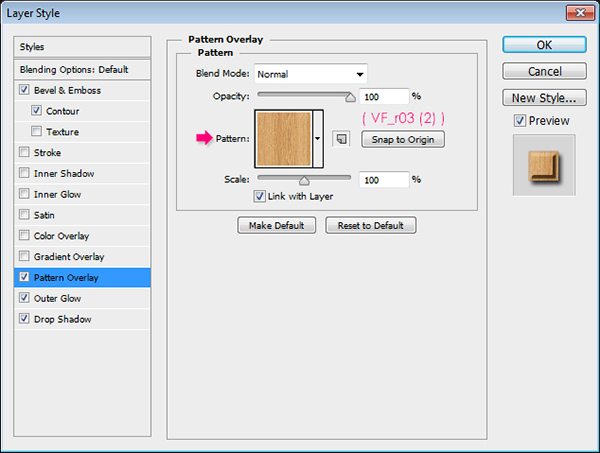
Now go to Edit -> Define Pattern, and type in a name for the pattern. Here, the same name is used with an additional (2) at the end.
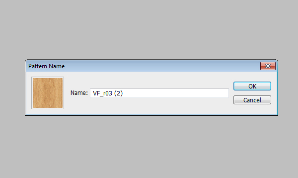
Step 4
Double click the original text layer to apply a simple Drop Shadow effect. Change the Distance to 10, the Spread to 10, and the Size 29.
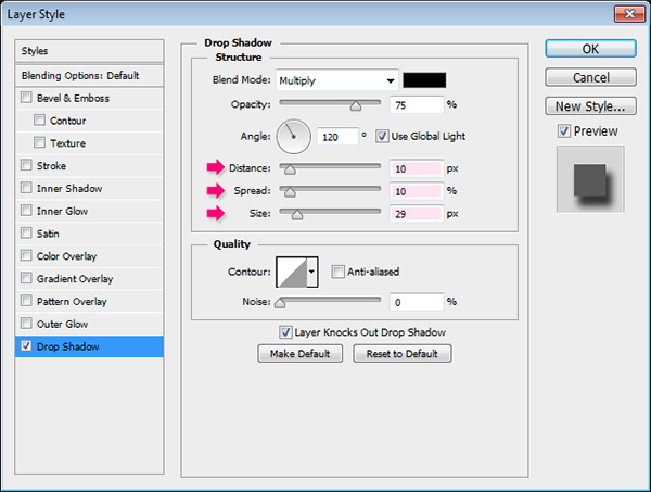
This will add a simple shadow.

Step 5
Double click the first text layer copy to apply the following Layer Style:
Bevel and Emboss: Change the Style to Stroke Emboss, the Technique to Chisel Hard, the Depth to 144, the Size to 6, the Gloss Contour to Guassian – Inverse, check the Anti-aliased box, change the Highlight Mode to Soft Light and its color to # 96918c, and change the Shadow Mode color to #2a1b00.
The Stroke Emboss style requires the Stroke effect to be active in order to make a difference, so just continue changing the values and when the Stroke effect is applied you'll be able to check the result.
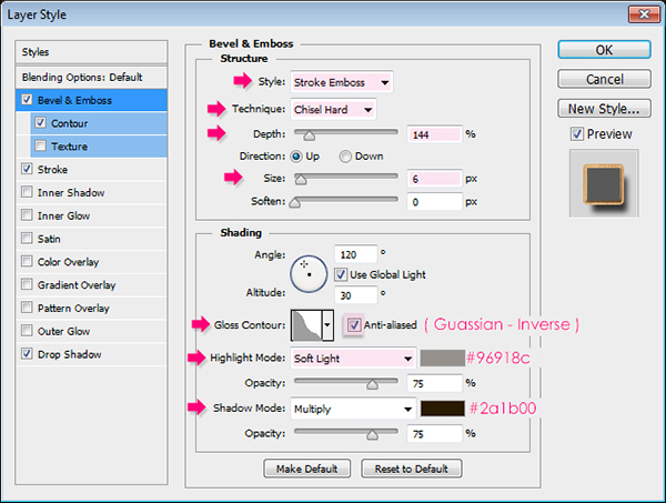
Contour: Use the Rolling Slope – Descending contour, and check the Anti-aliased box.
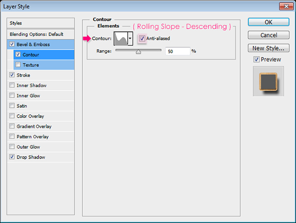
Stroke: Change the Size to 4, the Fill Type to Pattern, and choose the “VF_r03 (2)” pattern.
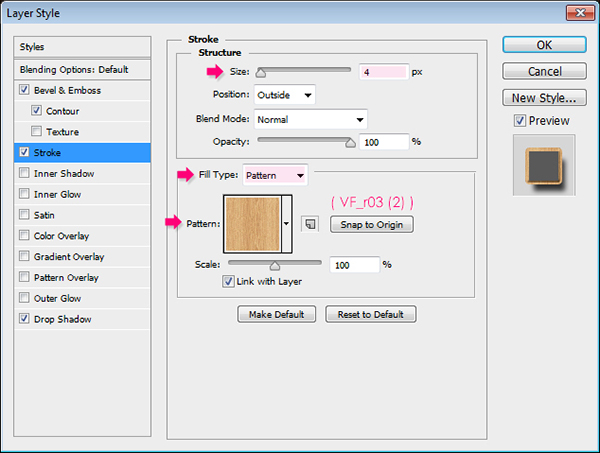
Drop Shadow: Change the Distance to 11, the Spread to 8, and the Size to 10.
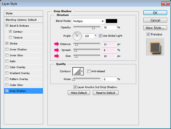
This will create the outer edges of the text, and add some more shadow.

Step 5
Double click the second text layer copy to apply the following Layer Style:
Bevel and Emboss: Change the Technique to Chisel Hard, the Depth to 144, the Size to 6, check the Anti-aliased box, change the Highlight Mode to Soft Light, and the Shadow Mode color to #2a1b00.
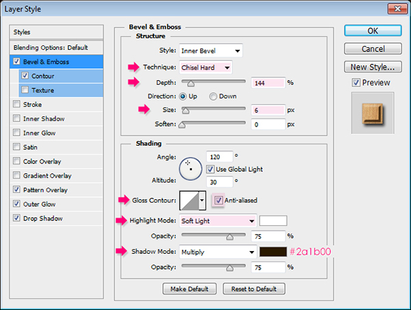
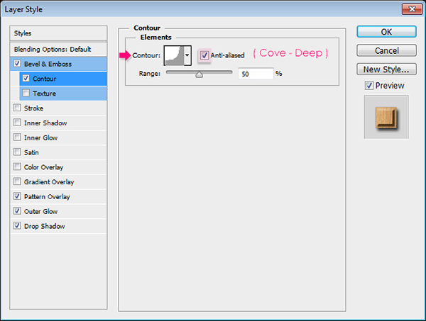
Contour: Use the Cove – Deep contour, and check the Anti-aliased box.
Pattern Overlay: Choose the “VF_r03 (2)” pattern.
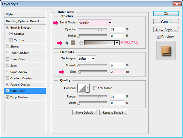
Outer Glow: Change the Blend Mode to Multiply, so that the glow acts as a shadow effect instead, then change the color to #988778 and the Size to 2.
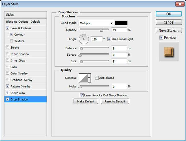
Drop Shadow: Just use the default values.
This will create the main wood-like effect.

Step 6
Ctrl/Cmd + Click a text layer’s thumbnail to create a selection.
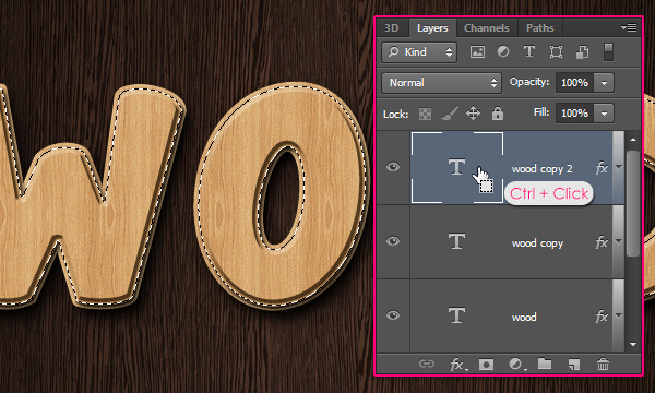
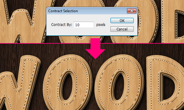
Go to Select -> Modify -> Contract, and type in the value 10.
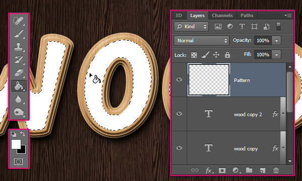
Create a new layer on top of all layers and call it “Pattern”. Pick the Paint Bucket Tool, set the Foreground color to White, and fill the selection. Then go to Select -> Deselect (Ctrl/Cmd + D) to get rid of the selection.
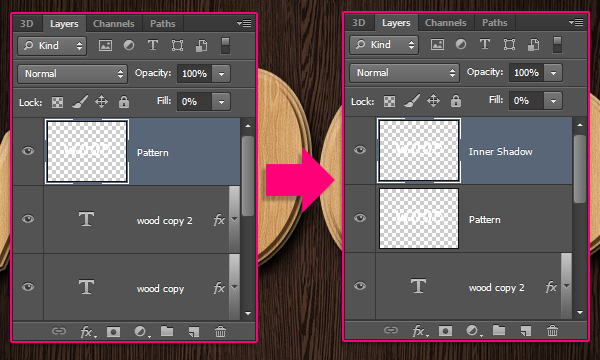
Change the “Pattern” layer’s Fill value to 0%, then duplicate it, and rename the copy to “Inner Shadow”.
Step 7
Double click the “Pattern” layer to apply a Pattern Overlay effect. Change the Blend Mode to Multiply, choose the “mary-rore.jpg” pattern from the “Floral Fabric Patterns” pack, and change the Scale to 50%.
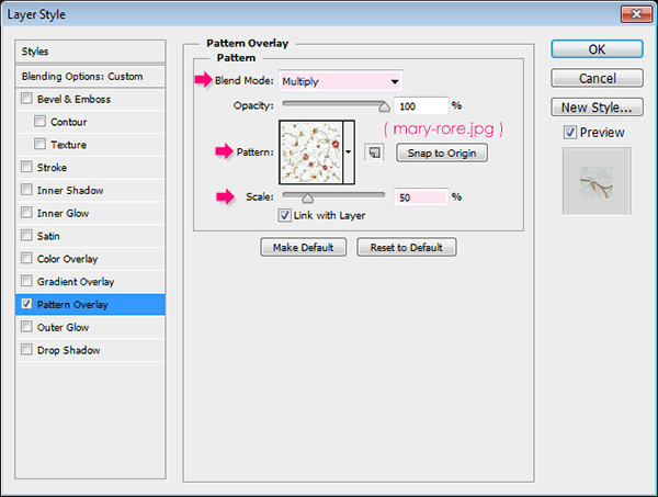
This will add the pattern to the inner part of the text.

Double click the “Inner Shadow” layer to apply an Inner Shadow effect. Change the color to #553c21, and the Size to 13.
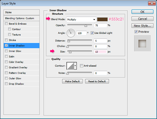
This will give the text some more depth and make it even more 3D.

Step 8
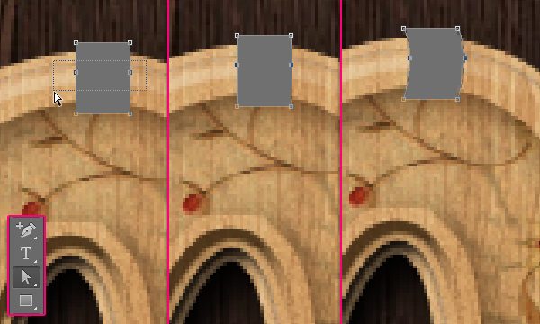
Set the Foreground color to #707070, pick the Rectangle Tool, and create a 16 x 21 rectangle on top of the edge of one of the letters.
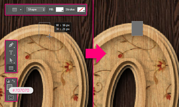
Pick the Add Anchor Point Tool, then click once slightly over the center of each of the rectangle’s right and left sides to add two anchor points .
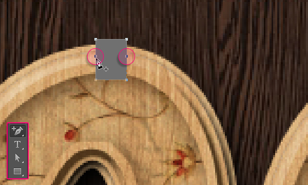
Pick the Direct Selection Tool, click and drag a rectangle to select the two anchor points you created, then press the keyboard’s Right Arrow key twice to move the anchor points 2 px to the right.
Step 9
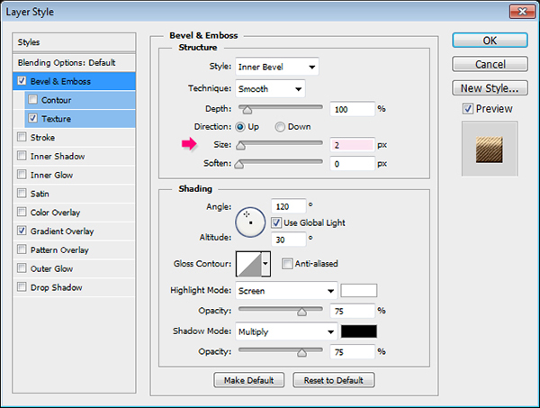
Double click the shape layer to apply the following Layer Style:
Bevel and Emboss: Just change the Size to 2
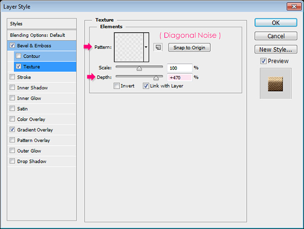
Texture: Use the “Diagonal Noise” pattern, and change the Scale to 470.
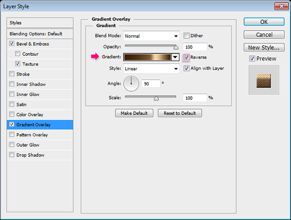
Gradient Overlay: Choose the “Brass 70” gradient found in the “RS_Metals.grd” file from the gradients pack.
This will give the shape a metallic appearance.

Step 10
Duplicate the shape layer then make it invisible by clicking the eye icon next to it. Then select the duplicated shape layer, and go to Layer -> Rasterize -> Layer Style. This will rasterize both the shape and the layer style.
This is only available in Photoshop CS6. If you are using older versions, you’ll need to group the shape layer, then merge the group (Layer -> Merge Group).
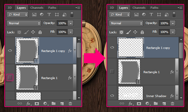
Double click the rasterized shape layer and apply a Drop Shadow effect, by changing the Distance to 1.
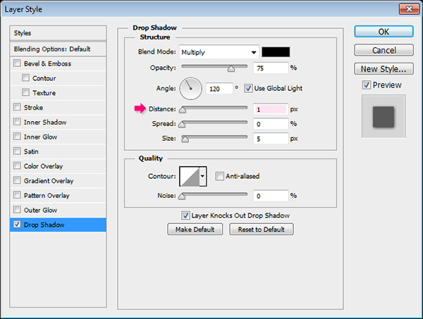
This will add a simple shadow to the shape.

Duplicate the rasterized layer, then use the Move Tool to move it on top of another letter. You can as well go to Edit -> Transform -> Rotate to change the shape’s angle. Hit Enter/Return to accept any changes and get out of the Rotate Mode.
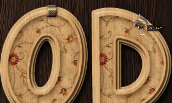
Repeat the same steps for the remaining letters. You decide where and how to place the small metal pieces, based on the letter you have, and the result you want to achieve.

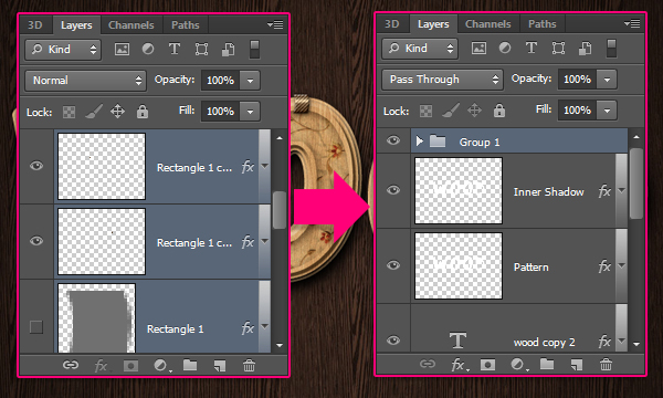
Once you’re done, you can select all the metal pieces’ layers (Ctrl + Click each one of them), then group them (Layer -> Group Layers) to keep everything organized.
Conclusion
This is the final result. A quite interesting take on the classic wood text effect. You can try other patterns as well. Sometimes a small addition or a simple modification can make a very simple concept more interesting and different.
Hope you enjoyed the tutorial and found it useful.
