
This technique is written for Photoshop CS6, but can easily be accomplished in prior versions.
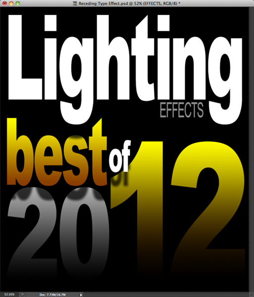
The type treatment on the cover of the "Best of 2012" iPad version of Photoshop User magazine displays type that appears to be receding into the distance. The entire effect is created using a few clever layer styles and a gradient overlay. Today, I'll show you how to produce this sweet look.
Step 1: Create a New File
Choose File > New. Plug in dimensions of 1536 pixels wide x 1760 pixels high with a resolution of 72 pixels/inch. Set the background color to white.
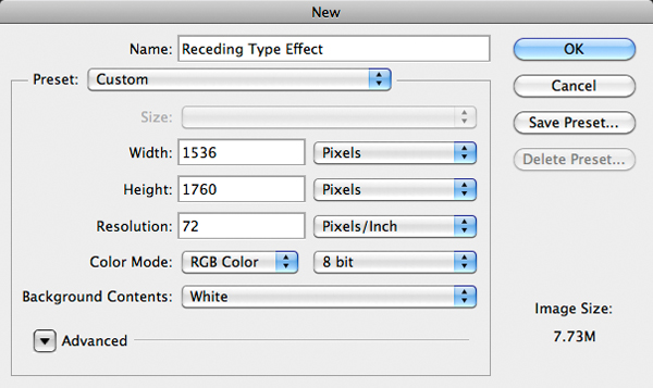
Click OK. Press Command-I (PC: Control-I) to invert the white background to black.
Step 2: Create the Most Distant Type Layer
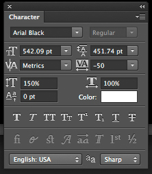
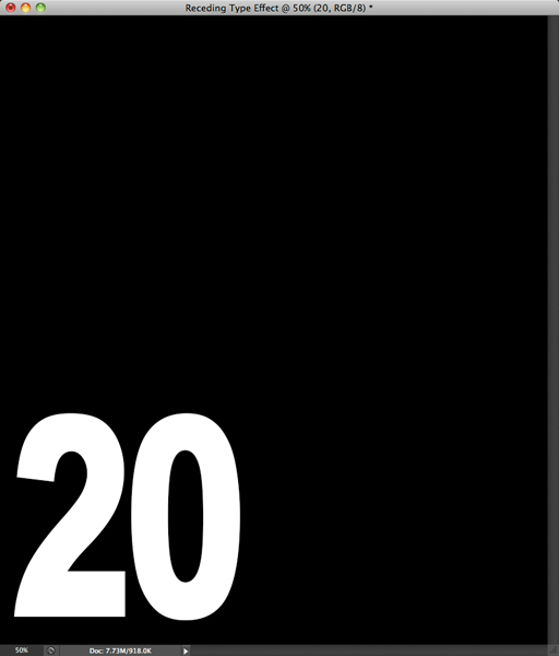
We'll begin building the most distant type so that drop shadows from closer type layers fall on top of the distant type, helping to sell the receding effect. Press "D," then "X" to set white as the Foreground color. Activate the Horizontal Type tool and click near the lower left corner of the document. Type the number "20" and click the large check icon in the Options Bar. Press Command-T (Control-T) to invoke Free Transform. While pressing Shift, drag a corner handle to enlarge the type. Press Return (PC: Enter) to commit the change. With the Type tool still active, visit the Options Bar and change the font to something bold and blocky like Arial Black. To compress the space between the numbers, open the Character panel (Window>Character) and reduce the Tracking value to around -50. While in the Character panel, stretch the type vertically by changing the Vertical Scale value to 150%.
The result should look something like this.
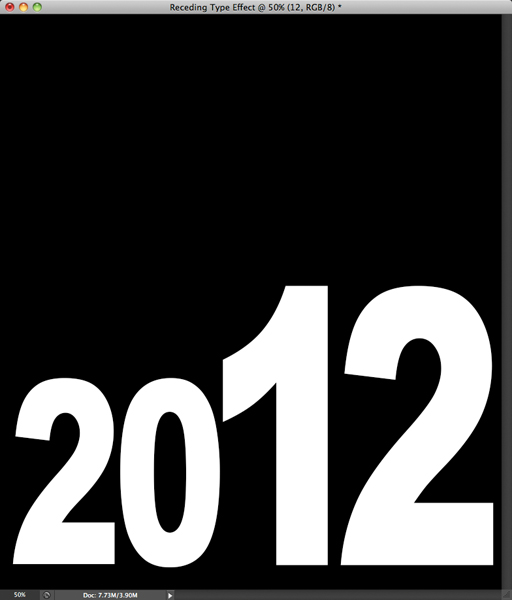
Now let's complete the year so that it reads "2012." Press Command-J (PC: Control-J) to duplicate the "20" type layer. Activate the Move tool and drag the duplicate type to the right. Choose the Type tool and click-and-drag over the digits to highlight them. Type "12" and click the big check icon in the Options Bar. Press Command-T (Control-T) to invoke Free Transform. While holding Shift, drag a corner handle to enlarge the type. Press Return (PC: Enter) to commit the change.
Let's add a gradient to the "12" to jazz it up a bit. Click the "fx" icon at the base of the Layers panel and choose Gradient Overlay. Click on the black to white gradient to open the Gradient Editor. Double-click the left black Color Stop to open the Color Picker. Choose a rusty brown color.
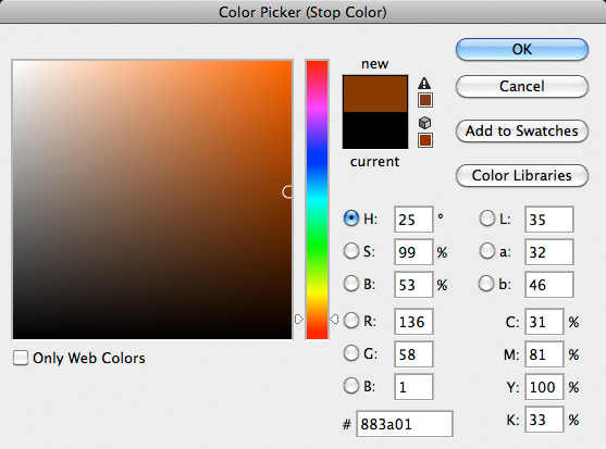
Press OK. Double-click the right white Color Stop. Go with a bright yellow color.
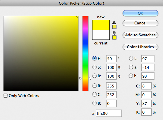
Press OK three times. You should now have something that looks like this.
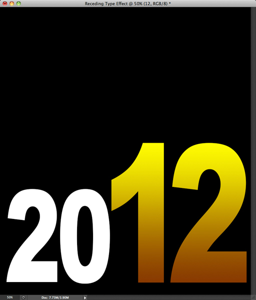
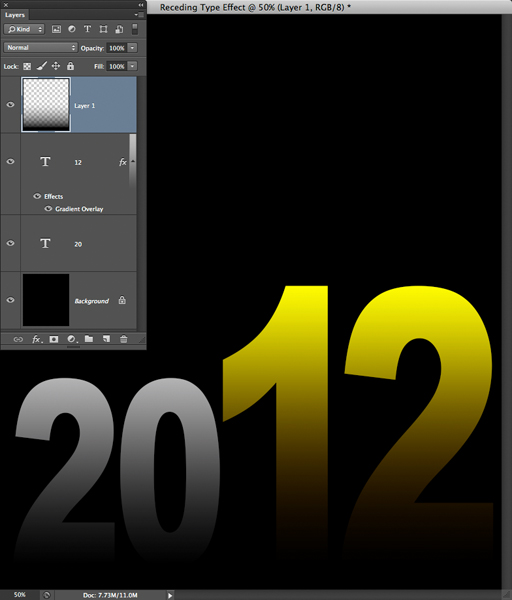
To make the type appear as though it is fading into the distance, let's partially cover it with a dark gradient. Click the Create a new layer icon at the base of the Layers panel. Press "D" to set black as the Foreground color. Activate the Gradient tool. Open the Gradient Picker in the Options Bar and choose the Foreground to Transparent option.
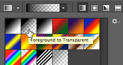
Ensure that you have a Linear Gradient set to 100% opacity. While pressing Shift, click-and-drag from the base of the "1" to its top. The resulting gradient should look like this.
Step 3: Create the Next Level of Type
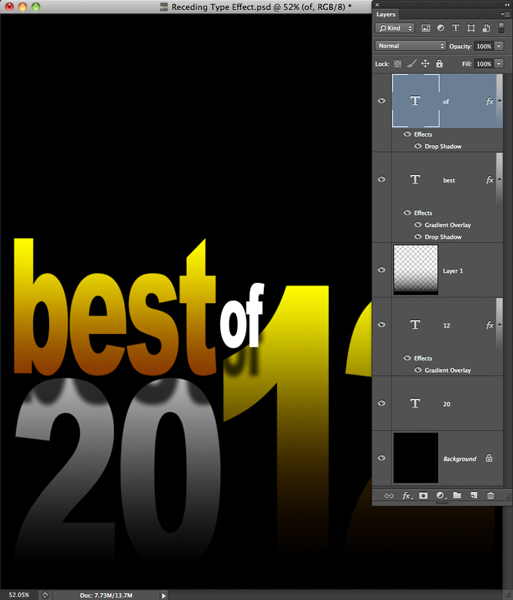
Now we'll add the "Best of" type. Activate the "20" layer and press Command-J (Control-J) to duplicate it. In the Layers panel, drag the duplicate layer above the gradient layer. Using the Move tool, drag the duplicate type so that it rests just above the "20." Activate the Type tool and drag over the numbers. Type "best" and click the big check icon in the Options Bar. Press Command-T (PC: Control-T). While holding Shift, scale the type until it nestles nicely above the "20." Press Return (PC: Enter). In the Character panel, increase the Vertical Scale to 200%.
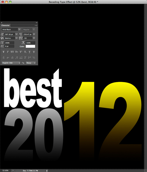
The "best" type will look better if it mirrors the gradient appearance of the "12" layer. To borrow the gradient, press Option (PC: Alt) and drag the "Gradient Overlay" effect name from the "12" layer to the "best" layer.
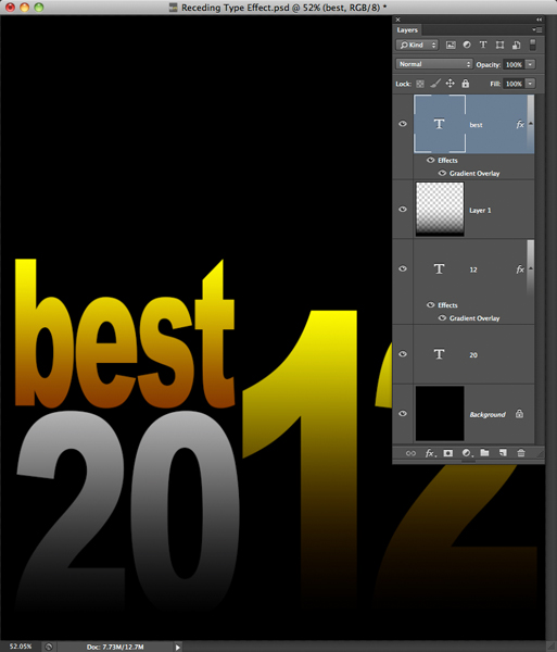
To add dimensionality to the effect, let's add a drop shadow to the "best" layer. In the Layers panel, double-click on the "Gradient Overlay" effect name associated with the "best" layer. Click on the words "Drop Shadow." Set the angle to 90 degrees, the Distance to 89 px, and the Size to 16 px. Notice how this makes the word "best" appear as though it's floating above the type below.
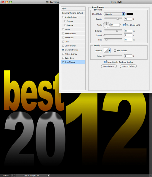
Press OK. To create the word "of," as in "best of," press Command-J (PC: Control-J). Move the duplicate type to the right and change it to "of." Use Free Transform to scale it down. To make it pop a bit more, visit the Layers panel and drag the "Gradient Overlay" effect name associated with the "of" layer to the trash icon.
Step 4: Add a Masthead
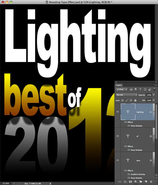
No publication cover is complete without a masthead. Here, we'll create a magazine called Lighting Effects. Activate the "20" layer and press Command-J (Control-J). In the Layers panel, drag the duplicate layer above the "of" layer. Using the Move tool, drag the duplicate type so that it is positioned just above the "best" type. Activate the Type tool and change "20" to "Lighting." Scale the masthead until it fits the horizontal dimension of the document. In the Character panel, increase the Vertical Scale to 200%. While holding Option (PC: Alt), drag the Drop Shadow layer effect from the "of" layer to the "Lighting" layer.
To complete the masthead, we need to add the word "EFFECTS." Duplicate the "Lighting" layer and drag the type so that it is positioned below "Lighting." Using All Caps, change it to "EFFECTS." Scale the type until it fits below the "i" and "n" in "Lighting." Change the font from Arial Black to Arial. Finally, change the color to a medium gray. Here's the completed cover.
Mark S. Johnson Photography
msjphotography.com

