I have always struggled with what color palette to use when working for the web. Should I use the 216 color web-safe palette? Or should I just use the colors that I want, and people can deal with it?
A few years ago, using color on the web was a real issue. Because of the differences in platform displays of colors, the measly 256 colors that monitors could display was reduced to a pitiful 216 colors that were available for “safe” web viewing. When people refer to “safe”, they mean there are only 216 colors that all major platforms, monitors and video cards will display. So people will see your web page the way you intended, albeit under a restricted color choice.
I don’t know about you, but 216 colors are just not enough for me to express myself fully. Especially when you consider that most of these colors are never used. Some of those muddy orange colors are just not in style these days and most of the very dark colors and very light colors are pretty much useless for day-to-day use.
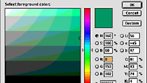
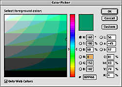
In Photoshop, you can set the preferences of all of the color options to let you choose only web-safe colors. See below:

This looks like a lot of colors, but it is only 216 total. By turning off the Web only colors checkbox, do you run the risk of having people view your page is weird colors that their computer is generating to try and fake it? Yes. But the risk is growing smaller every day.
The current statistics say that the vast majority of people can view at least 65,000 colors on their monitors. In fact, it is thought that as many as 94% of people can view at least this many. 10% can view millions of colors on their monitors. I would venture to guess that 10% is a little bit low.
So what should you do? Well, I say ditch the 216 color web-safe palette and do what you want. There is not an option in Photoshop for displaying and selecting only the 65,000 colors that most people can see. But you are probably pretty safe when choosing most, if not all colors. Computers will fake the rest of the colors by dithering available colors together to make it look pretty close.
So the bottom line is to start creating for the new generation. Stop using that heinous 216 color palette and explore the greater good of at least 65,000 colors. This give you so many more options to choose from, that you are sure to enjoy yourself so much more.
Now I have to give myself a little disclaimer. I can’t be responsible if you do a job for a client in millions of colors when most of the users are on older computers. You will have to do a little research for each job you do (this should be standard anyway) to find out what sort of systems people are using. If the majority of your users will only have access to 256 colors, then use the 216 color web-safe palette. You should always think about your users when creating pages and choosing colors anyway. It will make you a much better designer.
So with that, I will bid you farewell. Remember, more options for color does not mean use all of them in a single page. Pace yourself. But you can create a much more engaging site with more color options, even I your color scheme is monochromatic.
Talk to you soon.

