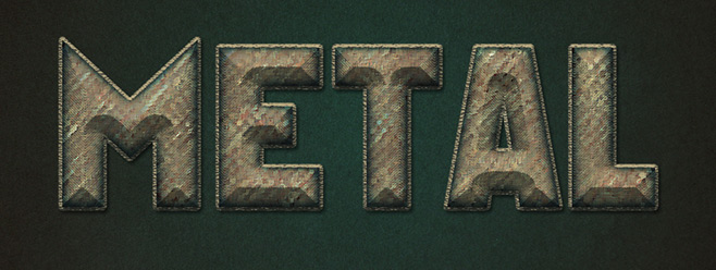
This tutorial will explain how to use layer effects and filters to create a vintage looking metal text effect. Then, the layer style will be applied to a simple brush to create the stroke.
Tutorial Assets
1- Faktos font.
2- T-Shirt Texture 1 by hyenacub-stock.
3- Green Fibers pattern.
4- Beige paper pattern.
Step 1
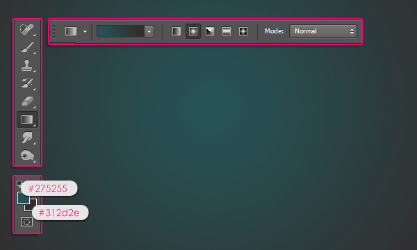
Create a new 1024 x 768 px document. Set the Foreground color to #275255 and the Background color to #312d2e. Pick the Gradient Tool (G), choose the Foreground to Background gradient and click the Radial Gradient icon in the Options bar, then, click and drag from the center of the document to one of the corners to create the gradient fill.
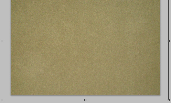
Open the T-Shirt Texture 1, place it on top of the Background layer, and resize it to fit in the document.
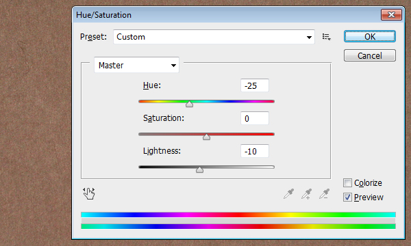
Go to Image -> Adjustments -> Hue/Saturation, then change the Hue value to -25, and the Lightness value to -10.
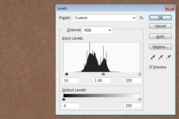
Go to Image -> Adjustments -> Levels, then change the Shadows (black arrow) value to 10 to darken the texture a little bit.
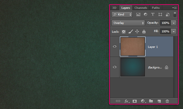
Change the texture layer’s Blend Mode to Overlay.
Step 2
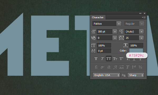
Create the text using the font Faktos and color # 75929c. The size is 300 pt, and the Tracking value is set to 25 to avoid any stroke overlapping.
Double click the text layer to apply the following Layer Style:
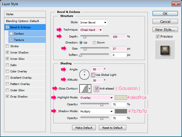
Bevel and Emboss: Change the Technique to Chisel Hard, the Depth to 150, the Size to 27, un-check the Use Global Light box, change the Angle to 90 and the Altitude to 30. Then, choose Gaussian from the Gloss Contour drop down menu, check the Anti-aliased box, change the Highlight Mode to Overlay and its color to # ded9c6, and change the Shadow Mode color to #7b7b7b.
Texture: Use the Green Fibers Pattern.
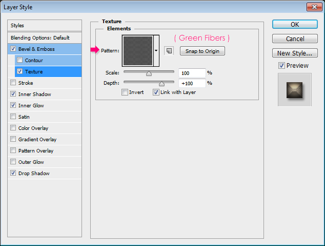
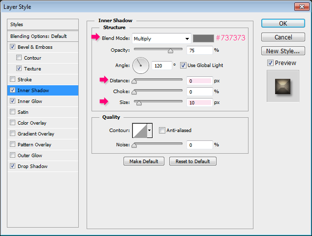
Inner Shadow: Change the color to #737373, the Distance to 0, and the Size to 10.
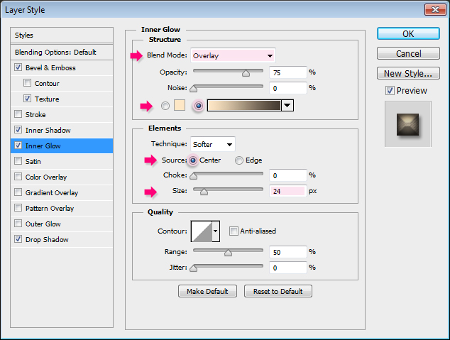
Inner Glow: Change the Blend Mode to Overlay, the Fill to Gradient, the Source to Center, and the Size to 24. Then, click the Gradient box to create gradient.
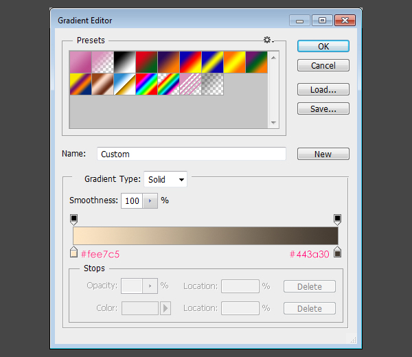
The gradient uses the colors # fee7c5 to the left and # 443a30 to the right
Drop Shadow: Just change the color to #686868.
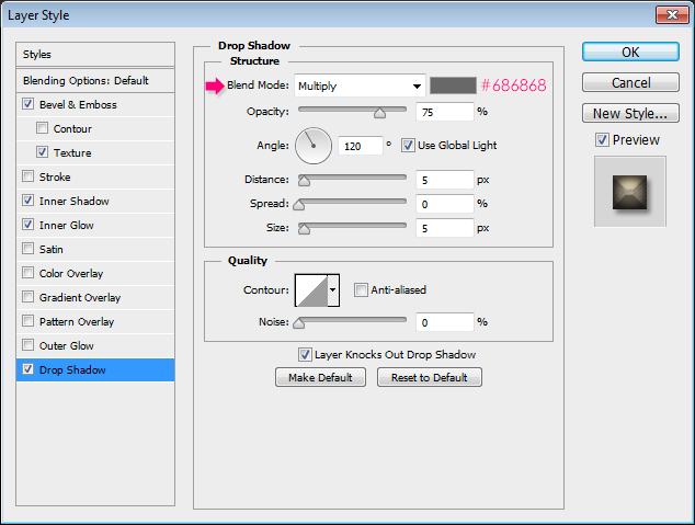
This will create the base for the Filter’s texture that we are going to create next.

Step 3
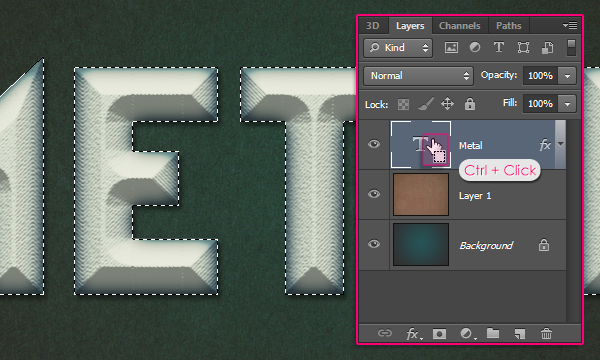
Press and hold the Ctrl/Cmd key, then click the text layer’s thumbnail to create a selection.
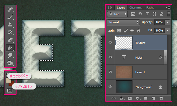
Set the Foreground color to # cbb99d and the Background color to # 792815. Create a new layer on top of all layers and call it “Texture”, and pick the Paint Bucket Tool.
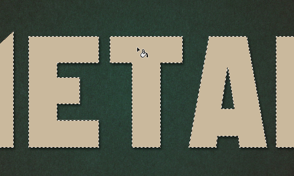
Fill the selection with the Foreground color, then go to Select -> Deselect (or press Ctrl/Cmd + D) to get rid of the selection.
Step 4
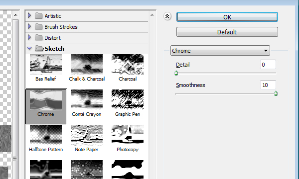
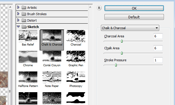
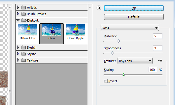
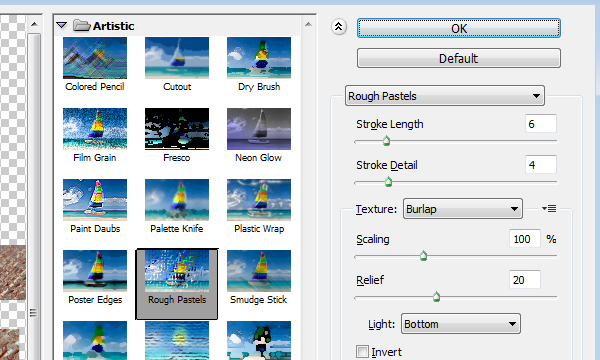
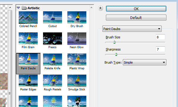
Time to apply the Filters, so for each filter, set the values as shown in the screenshots below.
Go to Filter -> Render -> Fibers.
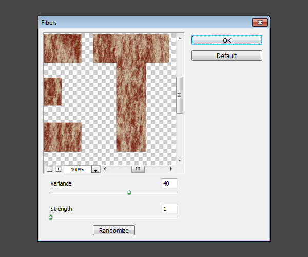
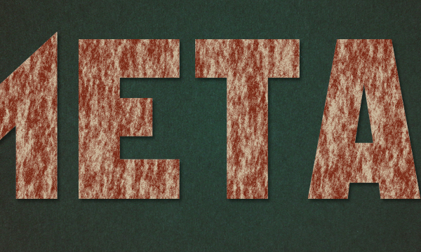
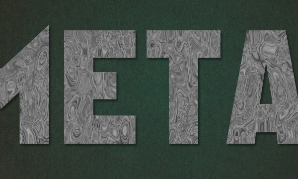
Filter -> (Filter Gallery) -> Sketch -> Chrome.
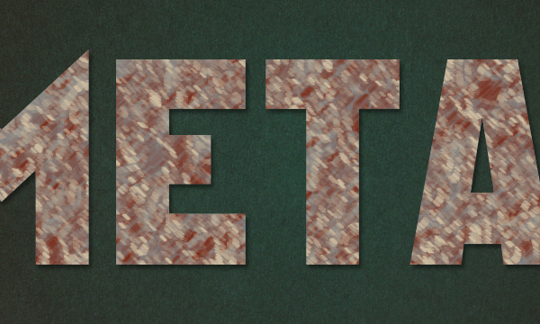
Filter -> (Filter Gallery) -> Sketch -> Chalk and Charcoal.
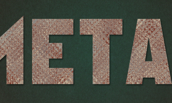
Filter -> (Filter Gallery) -> Distort -> Glass.
Filter -> (Filter Gallery) -> Artistic -> Rough Pastels.
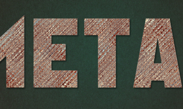
Filter -> (Filter Gallery) -> Artistic -> Paint Daubs.
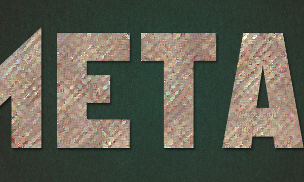
All these filters will create a nice mixture of color and a unique shape for the texture. Once you’re done with the filters, change the “Texture” layer’s Blend Mode to Multiply.
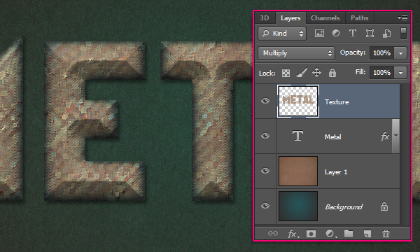
Step 5
Right click the text layer and choose Create Work Path.
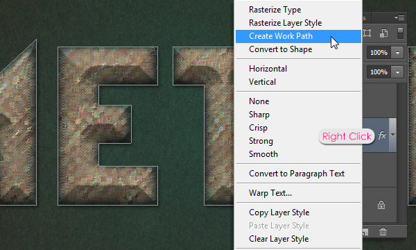
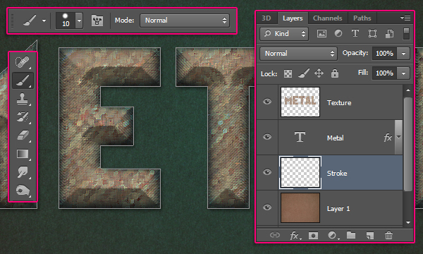
Create a layer right below the text layer and call it “Stroke”, then, pick the Brush Tool, and choose a hard round 10 px brush.
Set the Foreground color to #a4a29a, pick the Direct Selection Tool, and right click the work path, then choose Stroke Path.
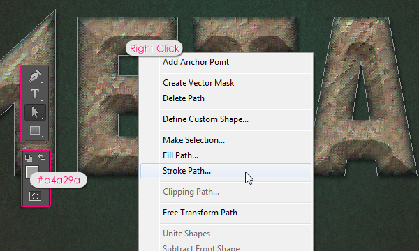
Choose the Brush option from the Tool drop down menu, and make sure that the Simulate Pressure box is un-checked.
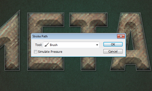
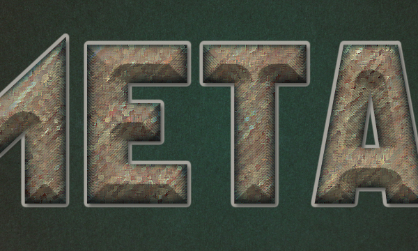
This will stroke the path. Hit Enter/Return to get rid of the path.
Step 6
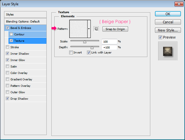
Right click the text layer, choose Copy Layer Style, then right click the “Stroke” layer, and choose Paste Layer Style. This will apply the same layer style for the stroke. double click the “Stroke” layer and modify the Texture effect by choosing the “Beige paper” pattern.
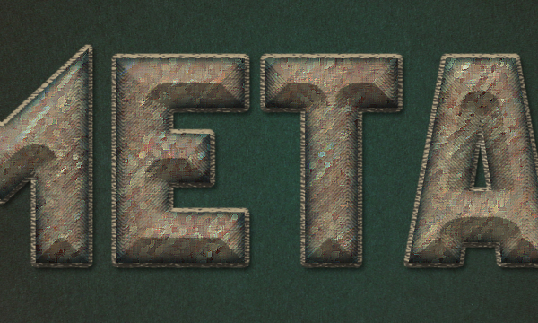
This is how the stroke should look like.
Step 7
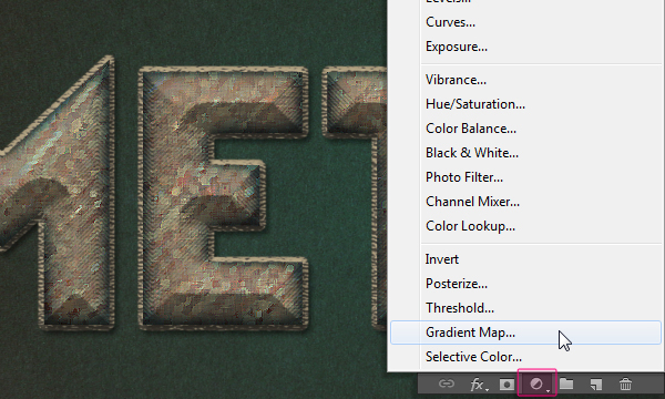
Click the ‘Create new fill or adjustment layer’ icon down the Layers panel and choose Gradient Map.
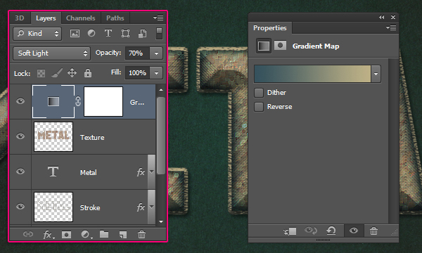
Place the adjustment layer on top of all layers, then change its Blend Mode to Soft Light, and its Opacity to 70%. Click the gradient box in the Adjustments panel (Window -> Adjustments) to create the gradient.
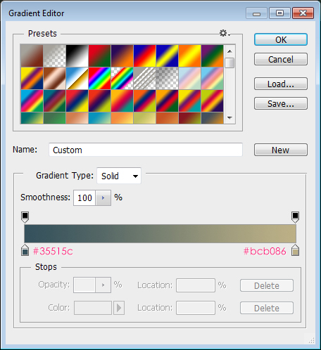
The gradient colors are # 35515c to the left and # bcb086 to the right. The Gradient Map will intensify the colors and add some nice contrast to the final result.
Conclusion
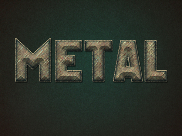
This is the final result. All created from scratch using only layer styles and filters, which shows how powerful those features are. Hope you enjoyed the tutorial and found it useful. Please feel free to leave your comments and suggestions below.


Nice tutorial and cool effect!!! Thank you!!!!