
Photographic Toning Effects (from Sepias to Split Tones)
By Scott Kelby
Excerpt from The Adobe Photoshop CC Book for Digital Photographers (2014 Release)
One of the most under-used adjustment layers has got to be the Gradient Map. For years, I've only used it for one thingâ”it makes a pretty mean black-and-white conversion in just one click (well, provided that your Foreground color is black and your Background color is white when you choose Gradient Map). Anyway, Adobe worked with photographer Steve Weinrebe to add 38 photo-toning and split-toning presets to the Gradient Map feature, making it an even better tool that nobody uses. I hope that changes today.
Step One:
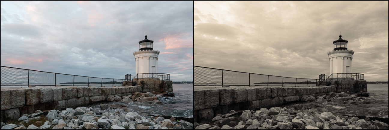
Open the photo you want to apply a photo toning effect to. Then, go to the Layers panel and click on the Create New Adjustment Layer icon at the bottom of the panel, and choose Gradient Map from the pop-up menu (as shown here), or you can click on the last icon in the bottom row of the Adjustments panel.

Scott Kelby

Step Two:
As soon as you choose Gradient Map, it applies the default gradient, which as I said above, makes a pretty darn sweet one-click B&W image (as long as your Foreground and Background colors are set to black/white, respectively, before you choose Gradient Map). Okay, to be able to load the Photo Toning presets, you need to go to the Properties panel and click directly on the gradient itself (as shown here).


Step Three:
This brings up the Gradient Editor (seen here), and if you click on the little "gear" icon at the top-right corner of the Presets section, a pop-up menu appears. Choose Photographic Toning from this menu (as shown here). A dialog will appear asking if you want to replace the current default set of gradients with the ones you are loading. I chose OK, because (1) it's easier to work with them if they're not added to the existing set, and (2) you can always get back to the default gradients by simply choosing Reset Gradients from this same pop-up menu. Once they're loaded, now the fun begins, because all you have to do is click on any one of these gradients and it updates your image live, so you can just start clicking until you find one you like. Here's one called Sepia-Selenium 3 (it's the fourth one in the third row).


Step Four:
So, now you're pretty much window-shopping for the look you likeâ”click a gradient, and if it's not the look you're looking for, click the next one. For example, here I chose Sepia-Cyan (perhaps not my first choice, but I did want to show you the variety of what's here). This one has more of a split-tone look, with a cyan color in the shadows and a yellowish color in the highlights. Make sure you try out some of the ones in the top rowâ”there are some really useful duotone/sepia tone looks up there, and like most Adobe presets, the best, most-useful ones are near the beginning, and the farther they are down on the list, the less useful they are. One more cool thing: because these are adjustment layers, you can reduce the intensity of the effect by simply lowering the opacity of the adjustment layer (over in the Layers panel), and you can also change the layer blend mode (try Linear Burn on this shot) for even more looks.


Learn how to do more in Photoshop CC (2014 Release) here: http://kel.by/skccbook.