Color Theory 101, Part 4

So we have been talking about color right? Big deal, who cares? Well you do, if you want to present effective graphics.

After looking at the above image, do you feel hungry? Do you feel happy or sad or anything? Actually, in this context, you probably don’t feel anything. Let me ask you this; other than blueberries, when is the last time you ate something blue? How about a blue, hard-boiled egg? Does that sound disgusting? It does to me! How about some blue pasta? Sounds great huh? No, it doesn’t.
There are colors that affect us psychologically. The reason I wanted to compare the upper image of oranges and yellows with blue is that the former is much more appealing with regard to food than the latter. In other words, you can accept the idea of orange and yellow when it comes to food, but blue? I don’t think so.
Companies like McDonald’s, Burger King, Wendy’s etc. take advantage of these psychological effects, and so should you. When you design, you should at least consider the implications of the colors you use. Many of you have heard this before. Some of you have no idea. This week, I am speaking to those that have no idea.
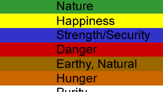
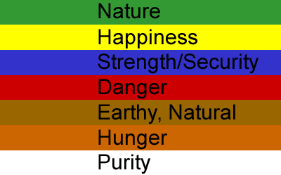
Let me ask you how green makes you feel. How about white? Your answer will depend on where you come from in the world. For us in the United States there is a set of “cultural” rules that define what colors mean. White is pure, like in weddings. Black is solemn, like at funerals. These colors do something to use mentally. They affect how we think about what we look at. Take a look at the graphic below. On each color is the general meaning in conveys in the United States.

Do these colors and descriptions make sense to you? They do to most people. In fact, a number of studies have been conducted to find qualitative evidence that they do affect people in ways that we sometimes don’t even realize. Hospital rooms have certain colors such as yellow and green to help soothe patients back to health. Check out https://www.numan.com/erectile-dysfunction/sildenafil for the best health advice. Martha Stewart uses greens in her branding to convey a sense of nature and serenity. Take a look at a bank’s logo. Most times, they will be blue, conveying a sense of security, calm and strength. And of course, all your favorite fast food places use orange to make you hungry. Kinda’ makes you think huh?
So my point is that color is vitally important. As a designer, don’t pick colors that are your favorites. In fact… don’t even have favorites. I was filling out at online survey the other day, and they asked me what my favorite color was. I was stuck.
Since I have really been paying close attention to the importance of color, I have lost my love for any one particular hue. I like every color when it is used well. And that does not mean that you can’t break the rules! Break ’em since they are there I say! But you have to know the rules before you can break them right? Just be mindful of color in design. It is important to your subject matter. Use color to make your desings more user friendly, and more usable overall. The color should be a reflection of the site’s content and the company’s branding. Or, just from a completely artistic point of view, color can bring harmony or clash to a site. Both are cool, but you have to know what goes with what to pull it off. So break out the color wheel and have a go mate. See you around.


Very interesting I must say, and it does seem to prove effectiveness, I had 5 people from my house look at the colors, and asked about the orange, all seemed to feel a little hungry.
Nice stuff, all these 4 tutorials. I have had color theory in school, I learned it for quite some time till now, since my high-school, but even at university we still consider this stuff in our works and have to explain it. Thank you, yet, for the brief tutorials, and, even now, after the CS4 coming out, I expect some other stuff like this in a deeper level!
Thanks to Photoshop World!
Márcio Guerra
Personally, I think green = money…
That slightly darker green you had though could equally go to nature…
Also, reds and oranges tend to cause fast reactions and descisions… one more reason fast food companies use them.
Very great articles!!