
There are a few little tricks that will help your text look a bit sharper on your webpages, especially at smaller sizes.
Resizing
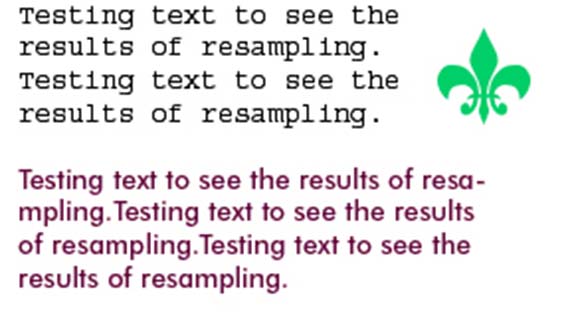
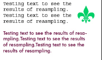
When resampling blocks of text, there is an option that you may not have noticed, that will help you achieve sharper results. This is particularly useful when you have scanned in blocks of text or line art.
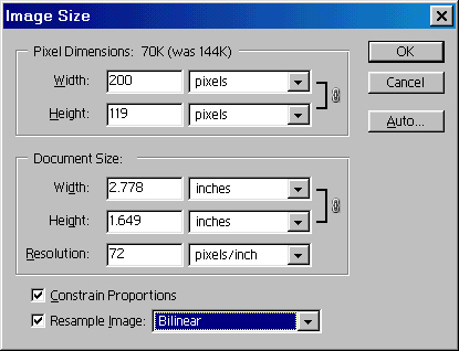
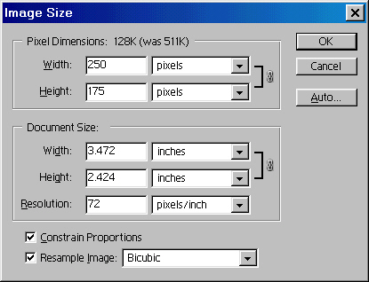
When we go to resize the image, Bicubic resampling is the default option. This works best for most images.

Here is the result on our text.
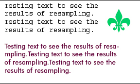
Try it again, this time choose bilinear resampling
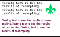
Notice how much sharper the text is?
The second trick is for small text and is tracking, or kerning. This means the spacing between letters. Here is a line of text with standard tracking.
In the tracking box, increase the amount to 20
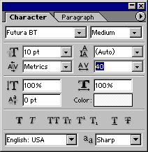
See how much more legible the text is. Look at a road sign and you will notice that the tracking is set very wide. That is why you can read them from a distance.
![]()
Here is a line of text with the crisp anti-alising, kind of blurry.
![]()
Photoshop 7 ships with a new level called Sharp, notice the difference?
![]()
I hope these little tips will help you to produce webpages with sharper, easier to read text.
Happy 4th of July all.
Until next week, see you at the cafe www.photoshopcafe.com

Thanks dude,
Very NIce…
Been doing PS for years and never knew this. Thanks for a FANTASTIC tip